Yellow is a color that radiates warmth, optimism, and energy, transforming any space into a welcoming haven. Whether you’re aiming to brighten up a room, add a cheerful touch to your home, or create a vibrant atmosphere, yellow offers a range of shades to suit every taste.
In this article, we’ll explore seven stunning yellow paint colors from Sherwin-Williams that can bring a fresh, lively feel to your interiors. Click the link below each color to get a peel and stick color sample from Samplize.
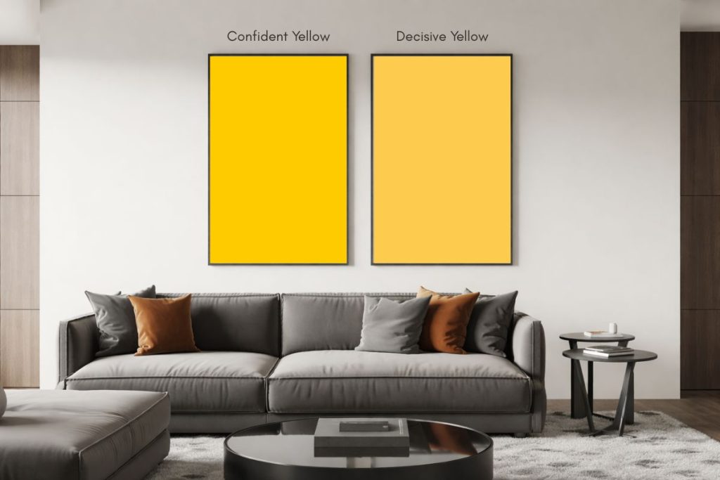
1. Confident Yellow (SW 6911)
Confident Yellow (SW 6911) by Sherwin-Williams is a vibrant, cheerful shade of yellow that exudes warmth and energy. This bold hue is perfect for creating a lively and inviting atmosphere in spaces where you want to uplift and energize.
It works beautifully in kitchens, playrooms, or dining areas, where its brightness can stimulate conversation and activity. Confident Yellow is also great for accent walls or as a complement to neutral tones to add a pop of sunshine and positivity to any room.
- R:254 G:203 B:1
- Hex Value: #fecb01
- LRV: 64

Need to know how much paint for your project?
Calculate gallons needed and estimated cost — free.
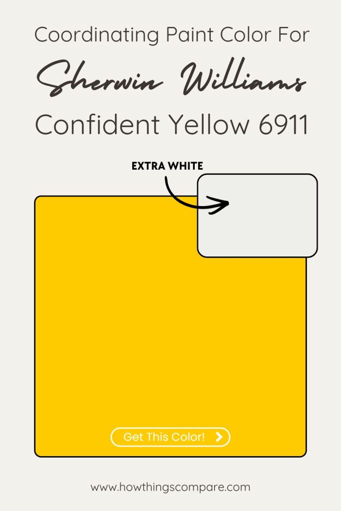
Confident Yellow coordinating colors
Extra White (SW 7006)
Extra White is a crisp, bright white with the faintest cool undertone that works beautifully alongside Confident Yellow’s warm, sunny intensity. The slight coolness in Extra White prevents the pairing from feeling too warm or saturated, instead creating a clean, high-contrast relationship that keeps the yellow feeling vibrant and energized. It’s the kind of pairing that reads as bold and modern — think graphic, sun-drenched interiors where the white trim and accents feel sharp and intentional against the strong yellow.
Teal Stencil (SW 0018)
Teal Stencil is the most dynamic pairing of the three and it works on pure color theory principles. The blue-green depth of teal sits in natural contrast to yellow on the color wheel, creating a complementary tension that feels lively and confident rather than clashing. Teal Stencil’s depth and coolness absorbs Confident Yellow’s warmth perfectly, producing a palette that feels bold, playful, and surprisingly sophisticated — the kind of combination that works beautifully in kitchens, children’s spaces, or any room designed around energy and personality.
Pure White (SW 7005)
Pure White brings a neutral, balanced brightness to Confident Yellow that differs subtly from Extra White — it sits in a slightly warmer, more middle-ground zone that harmonizes gently with the yellow rather than contrasting against it. Where Extra White creates crispness and graphic punch, Pure White creates cohesion and warmth, making the yellow feel more approachable and livable. It’s the most versatile pairing of the three and works equally well as trim, ceiling, or an adjacent wall color in a multi-room flow.
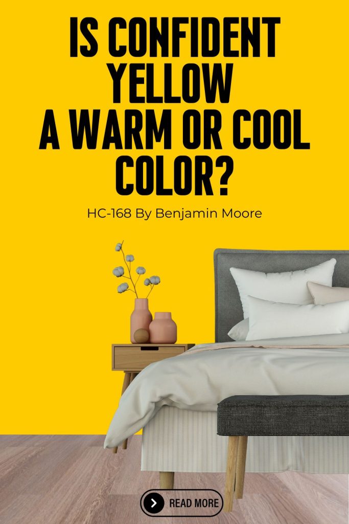
Is Confident Yellow a warm or cool color?
Confident Yellow (SW 6911) by Sherwin-Williams is a warm color. It’s a bold, golden yellow with strong orange undertones, which gives it a sunny, energetic, and welcoming feel rather than anything crisp or cool.
This warmth makes Confident Yellow feel lively and expressive, especially in well-lit spaces, where it can really glow on the walls. Because it lacks green or blue undertones, it stays firmly on the warm side of the spectrum and works best when paired with warm whites, natural wood tones, or other saturated, cheerful colors.
Confident Yellow SW 6911 By Sherwin Williams LRV
Confident Yellow has an LRV (Light Reflectance Value) of 64. This means that the color reflects 64% of the light that hits it. This color is moderately light, but not as bright or reflective as very pale colors.
Confident Yellow can brighten up a room while still providing some depth and warmth, without being as reflective as very high-LRV colors (like whites or very light pastels).
This color works well in rooms that need a balance between lightness and substance, making spaces feel open but not overwhelmingly bright.

Peel-and-Stick Paint Sample – Confident Yellow (6911) – Yellow – Sherwin-Williams
Paint Color Samples
Would you like to sample these paint colors? I recommend using a peel and stick paint sample from SAMPLIZE. Peel and stick paint samples are very affordable and easy to use. They are also clean and environmentally friendly!
Advantages of using peel and stick paint samples:
- EASY TO USE: Simply move your SAMPLIZE paint sample around the room to test under a variety of lighting conditions.
- AFFORDABLE: Budget-friendly solution and no more buying inaccurate swatches, rollers, wasted paint.
- SUPER FAST DELIVERY: Depending on your location, 1 day delivery is possible.
- ORDER FROM HOME: Save a trip to the store looking for samples.
- NO MESS: SAMPLIZE uses real paint samples with zero-mess
- NO WASTE: No leftover cans or wasted paint.
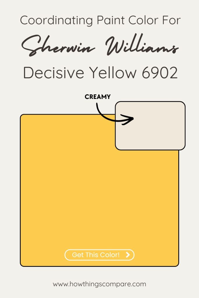
2. Decisive Yellow (SW 6902)
Decisive Yellow (SW 6902) by Sherwin-Williams is a vibrant and energetic hue that captures the essence of optimism and enthusiasm. This bold, sunny yellow shade brings warmth and a sense of cheerfulness to any space. Its vivid nature makes it perfect for creating a lively and inviting atmosphere.
Best Uses:
- Kitchens and Dining Areas: Adds a bright and stimulating touch, enhancing the mood during meals and gatherings.
- Children’s Rooms: Creates a fun and playful environment, stimulating creativity and joy.
- Accent Walls: Used sparingly, it can make a strong statement without overwhelming the space.
- Home Offices: Energizes the workspace, encouraging productivity and positivity.
- R:253 G:204 B:78
- Hex Value: #fdcc4e
- LRV: 65

Peel-and-Stick Paint Sample – Decisive Yellow (6902) – Yellow – Sherwin-Williams
Decisive Yellow coordinating colors
Creamy (SW 7012)
Creamy is a warm, soft white with distinct yellow undertones that creates a beautifully harmonious relationship with Decisive Yellow. Rather than contrasting against the yellow, Creamy echoes it — pulling from the same warm, golden base but expressing it in a much quieter, lighter way.
The result is a tonal pairing that feels cohesive and sunny, like a naturally lit space where the walls and trim belong to the same warm family. It softens the boldness of Decisive Yellow without diluting it, keeping the overall feel inviting and genuinely warm rather than stark.
African Gray (SW 9162)
African Gray is a warm, mid-tone gray with subtle earthy undertones that does something really interesting alongside Decisive Yellow — it provides grounding contrast without introducing coolness. Most grays would pull against a warm yellow, creating visual tension, but African Gray’s warmth keeps it in harmony with the yellow’s energy while still offering the depth and sophistication that a true neutral brings.
The pairing feels collected and intentional, the kind of combination that works beautifully in living spaces where you want warmth and personality balanced by a sense of quiet elegance.
Planning a paint project?
Having the right tools for the job is essential for getting smooth, professional results you’ll be proud of while saving time and avoiding costly mistakes.
Check out my list of pro painters tools here.
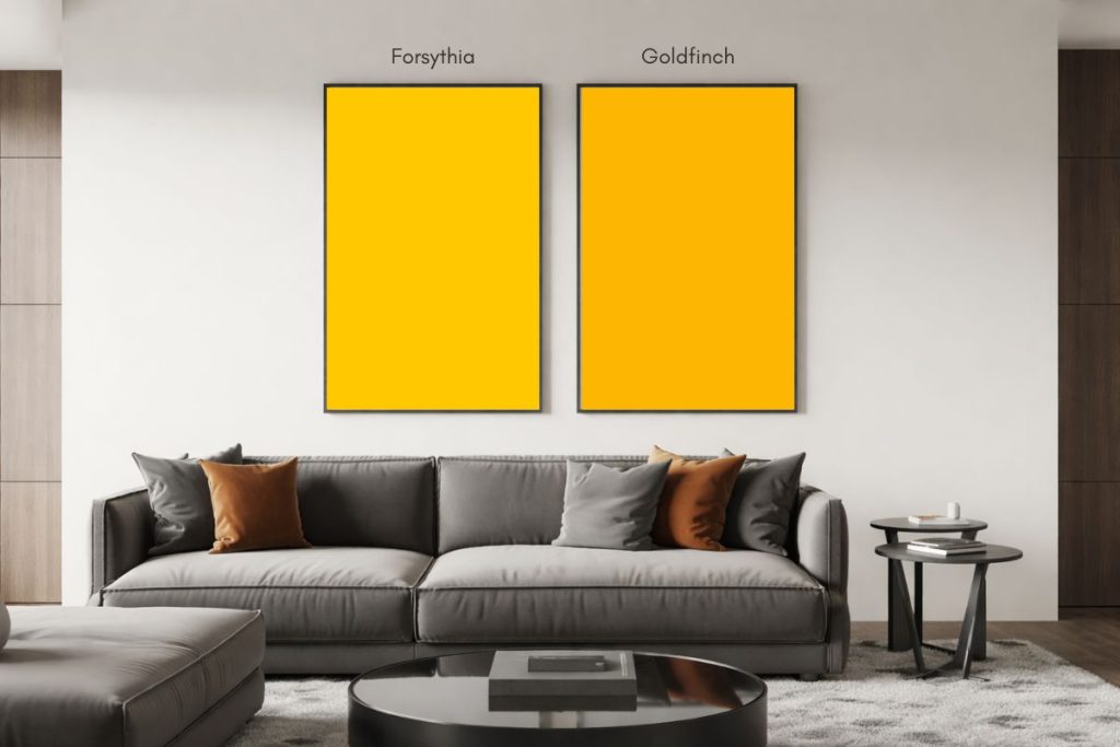
3. Forsythia (SW 6907)
Forsythia (SW 6907) by Sherwin-Williams is a vibrant, sunny yellow with a cheerful, invigorating quality. It brings a burst of warmth and energy to any space. This bold hue is perfect for creating an uplifting and lively atmosphere in rooms such as kitchens, dining areas, or sunrooms.
It also works well in playrooms or children’s bedrooms, where a bright and stimulating environment is desired. To balance its intensity, consider pairing Forsythia with neutral or complementary shades like soft grays or deep blues.
- R:255 G:200 B:1
- Hex Value: #ffc801
- LRV: 63

Peel-and-Stick Paint Sample – Forsythia (6907) – Yellow – Sherwin-Williams
Forsythia Coordinating colors
Nebulous White (SW 7063)
Nebulous White is a soft, warm white with subtle gray undertones that creates a gentle, sophisticated contrast against Forsythia’s bright, cheerful yellow. The slight gray in Nebulous White is key here — it quietly tones down the yellow’s exuberance without flattening it, creating a pairing that feels refined and airy rather than overly energetic.
It’s the kind of neutral that makes a bold color like Forsythia feel intentional and design-forward rather than simply loud, giving the palette a calm, curated quality that works beautifully in modern and transitional spaces alike.
Cityscape (SW 7067)
Cityscape is a deep, cool charcoal gray that creates a striking and unexpected contrast with Forsythia’s warm, vibrant yellow. The relationship works because the two colors sit at opposite ends of the light spectrum — Forsythia’s high LRV brightness against Cityscape’s dark, moody depth creates a bold, graphic tension that feels contemporary and confident.
The coolness of Cityscape also pulls against the warmth of the yellow in a way that makes both colors more vivid and pronounced, the way a stormy sky makes a field of wildflowers look even more intensely golden. Best used in spaces where drama and personality are the goal.
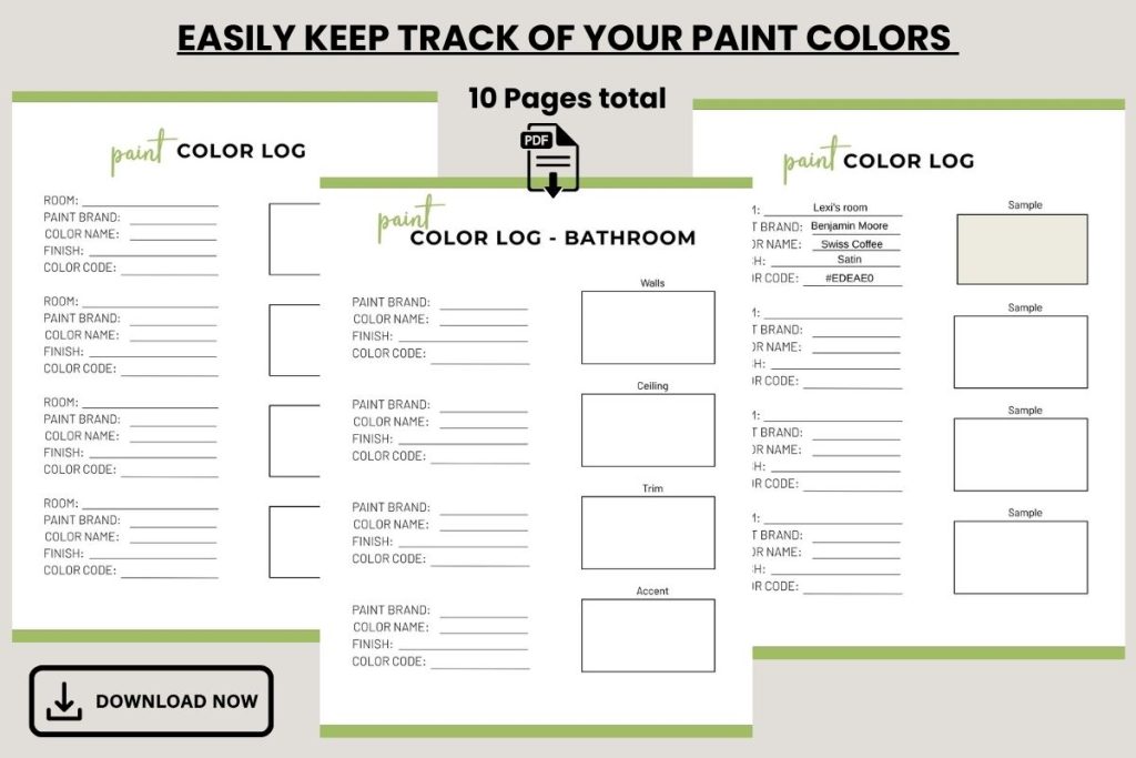
Paint Color Log
4. Goldfinch (SW 6905)
Goldfinch (SW 6905) by Sherwin-Williams is a vibrant, warm yellow that radiates cheerfulness and energy. With its lively, golden hue, it brings a sense of warmth and brightness to any space. Goldfinch is ideal for creating a bold, welcoming atmosphere in areas like kitchens, dining rooms, or sunrooms.
It also works well as an accent color in living rooms or entryways to add a touch of sunshine and optimism. Pair it with neutral tones or complementary shades of blue or gray to balance its intensity.
- R:253 G:183 B:2
- Hex Value: #fdb702
- LRV: 55
Coordinating colors:
- Dover White (SW 6385)
- Mariner (SW 6766)
- Pure White (SW 7005)

Goldfinch SW 6905 By Sherwin Williams LRV
Goldfinch has an LRV (Light Reflectance Value) of 55. This means that the color reflects 55% of the light that hits it.
This value falls in the mid-range of the LRV scale (0 to 100), meaning the color is neither too light nor too dark.
Goldfinch strikes a balance between reflecting and absorbing light, making it a medium-toned color. It can create a cozy, welcoming atmosphere without making a space feel too dark or overly bright.

Peel-and-Stick Paint Sample – Goldfinch (6905) – Sherwin-Williams
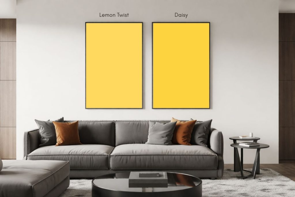
5. Lemon Twist (SW 6909)
Lemon Twist (SW 6909) by Sherwin-Williams is a vibrant, cheerful yellow with a lively, sunlit quality. Its warm, zesty hue brings a burst of energy and positivity to any space. Ideal for kitchens, dining rooms, or playrooms, Lemon Twist can brighten up the area and create a welcoming atmosphere.
It also works well as an accent color in living rooms or bathrooms to add a touch of brightness and fun. For a cohesive look, pair it with neutral tones like white or gray, or complement it with other lively colors for a more playful palette.
- R:254 G:217 B:93
- Hex Value: #fed95d
- LRV: 72
Coordinating colors:
- Extra White (SW 7006)
- Gray Matters (SW 7066)
- Pure White (SW 7005)

Peel-and-Stick Paint Sample – Lemon Twist (6909) – Sherwin-Williams
6. Daisy (SW 6910)
Daisy (SW 6910) by Sherwin-Williams is a vibrant, cheerful shade of yellow that exudes warmth and optimism. This bright, sunny hue is perfect for spaces where you want to infuse energy and a sense of happiness.
Best Uses:
- Kitchens & Breakfast Nooks: Adds a refreshing and lively touch to morning routines.
- Playrooms & Children’s Bedrooms: Creates a playful and stimulating environment for kids.
- Entryways & Hallways: Welcomes guests with a bright and inviting feel.
Daisy is ideal for spaces that benefit from a burst of sunshine, making them feel more open and joyful.
- R:254 G:211 B:64
- Hex Value: #fed340
- LRV: 68
Coordinating colors:
- Shell White (SW 8917)
- Acier (SW 9170)
- Pure White (SW 7005)

Peel-and-Stick Paint Sample – Daisy (6910) – Yellow – Sherwin-Williams

Do Light Bulbs Affect How Paint Colors Look?
Absolutely. Just like natural light, artificial lighting changes how paint appears. The color temperature of your light bulbs—measured in Kelvins (K)—plays a big role.
- Lower K (2700K–3000K) = warm, yellow light (soft white)
- Higher K (4000K–5000K+) = cool, white to bluish light (bright/daylight)
Choosing the right bulb can make a big difference in how your paint color looks on the wall.
I recommend using these types of light bulbs.
Check out my recommended pro painters tools here!
7. Cheerful (SW 6903)
Cheerful (SW 6903) by Sherwin-Williams is a vibrant, sunny yellow that brings an energetic and uplifting vibe to any space. With its bright and warm tone, it’s perfect for creating a lively atmosphere in areas like kitchens, dining rooms, and playrooms.
Cheerful can also be used to accentuate details or as an eye-catching feature wall in more neutral spaces. Its joyful hue is ideal for spaces where you want to inspire positivity and warmth.
- R:255 G:199 B:35
- Hex Value: #ffc723
- LRV: 63
- Sensible Hue (SW 6198)
- Andiron (SW 6174)
- Full Moon (SW 6679)

Peel-and-Stick Paint Sample – Cheerful (6903) – Yellow – Sherwin-Williams
