
Green is a versatile and timeless paint color that can transform any space into a calming, vibrant, or sophisticated retreat. Whether you’re aiming for a soft, muted hue or a bold, statement-making shade, Sherwin-Williams offers a variety of eye-catching greens perfect for every style.
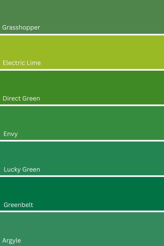
I have selected seven eye catching green paint colors from Sherwin-Williams that can elevate the look of any room, creating the perfect backdrop for your home’s personality.
You may be surprised by my top choice!
Click the link below each color to get a peel and stick color sample from Samplize.
Need to know how much paint for your project?
Calculate gallons needed and estimated cost — free.
1. Grasshopper SW 6733
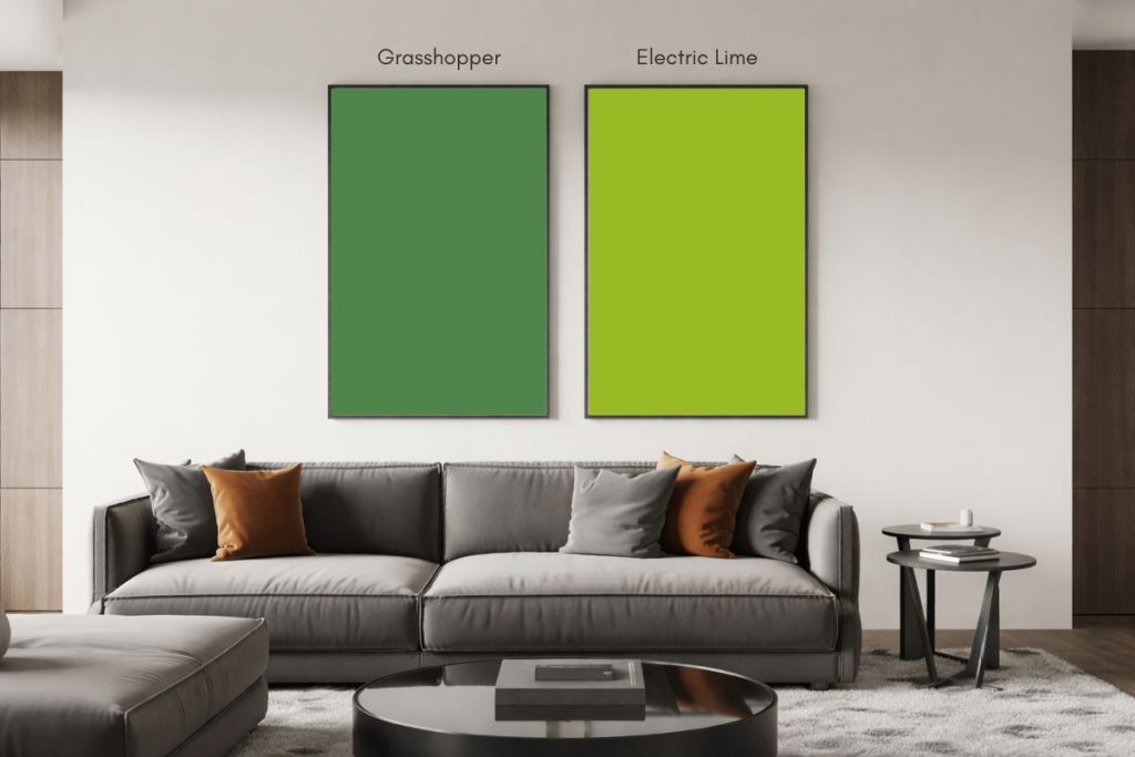
I absolutely love Grasshopper SW 6733 by Sherwin-Williams. This color is a vibrant, medium-toned green. It’s so fresh and lively, it instantly brightens up any space. It reminds me of springtime and summer days, lush, green lawns and sunlight filtering through leaves.
What I find really interesting about Grasshopper is how it balances warm and cool tones, thanks to its mix of yellow and blue undertones.
My personal favorite uses for Grasshopper are:
- As an accent wall in living rooms or bedrooms – it adds such a fun pop of color!
- In children’s playrooms or nurseries – it creates this amazing energetic and fun atmosphere.
- For sunrooms or enclosed porches – it really helps bring that outdoor feeling inside.
- In craft rooms or art studios – I find it really inspires creativity.
Hex Value: #4f854a
RGB: R:79 G:133 B:74

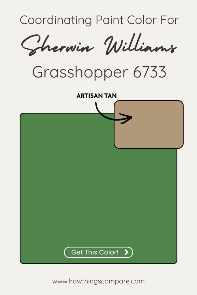
Grasshopper coordinating colors
Artisan Tan – SW 7540
Artisan Tan brings a warm, sandy neutrality that grounds Grasshopper’s bold olive-green energy without competing with it. The earthy brown undertones in Artisan Tan echo the natural, organic quality of Grasshopper, creating a palette that feels cohesive and rooted — like a forest floor meeting the canopy above it. It’s the anchor color that keeps the scheme feeling livable rather than overwhelming.
Pale Yellow – SW 7691
Pale Yellow works because it shares Grasshopper’s yellow undertone but expresses it in a much softer, lighter way. It lifts the palette and introduces airiness and light without introducing a color that feels disconnected from the green. The relationship between the two is almost tonal — they’re pulling from the same warm yellow base, just at very different depths — which makes the pairing feel harmonious and intentional rather than contrived.
Sprout – SW 6427
Sprout is a lighter, fresher green that sits in the same color family as Grasshopper but with significantly higher LRV, making it a natural tonal companion. Using Sprout alongside Grasshopper creates a layered, nature-inspired depth — the two greens read like light and shadow within the same landscape. It’s the kind of monochromatic pairing that feels sophisticated and deliberate, giving a room dimension without introducing visual tension.
Peel-and-Stick Paint Sample – Grasshopper (6733) – Green – Sherwin-Williams
Grasshopper SW 6733 By Sherwin Williams LRV
Grasshopper paint color has an LRV (Light Reflectance Value) of 19. This means that the paint color reflects 19% of the light that hits it, which is considered a dark shade.
On the LRV scale, which ranges from 0 (absolute black) to 100 (pure white), a lower LRV like 19 indicates that the color absorbs much more light than it reflects, giving it a rich, deep appearance.
Grasshopper is often used to create a cozy, intimate, or dramatic atmosphere, as it tends to make spaces feel more enclosed or grounded compared to lighter shades.

2. Electric Lime SW 6921
Electric Lime SW 6921 by Sherwin-Williams is a bold, vibrant, almost neon green that practically buzzes with excitement.
What I love about Electric Lime is its ability to instantly transform a space. It’s not a subtle color by any means, but that’s what makes it so fun and impactful. The brightness reminds me of tropical fruits and summer cocktails, bringing a zesty, refreshing feel to any room.
The best uses for Electric Lime SW 6921 include:
- Accent walls in modern living rooms or home offices – it’s a great way to add a punch of personality without overwhelming the entire space.
- Kitchen backsplashes or cabinet interiors – it adds a surprising pop of color when you open the doors.
- Teen bedrooms or playrooms – the vibrant energy of this color is perfect for younger, more adventurous tastes.
- Exterior accents on modern or contemporary homes – it can make architectural details really stand out.
- Fitness or yoga studios – the invigorating nature of the color can help boost energy and motivation.
You can also use it as an accessory color for throw pillows, lamp shades, or artwork to add a burst of color to neutral spaces.
Hex Value: #9aba25
RGB: R: 154 G: 186 B: 37

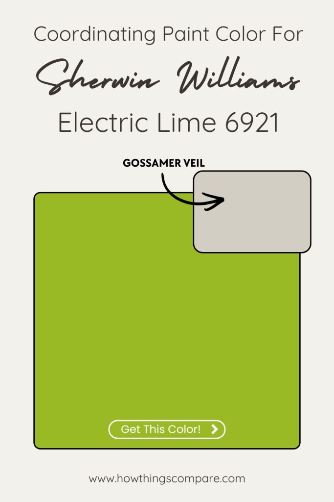
Electric Lime Coordinating colors
Gossamer Veil – SW 9165
Gossamer Veil is a soft, barely-there greige with subtle warm undertones that does something essential for Electric Lime — it calms it. Electric Lime is an intensely saturated, high-energy yellow-green, and Gossamer Veil provides a quiet, neutral breathing room that lets the lime command attention without the whole palette feeling chaotic. It’s the sophisticated backdrop that makes Electric Lime look intentional rather than jarring.
Merlot – SW 2704
This is the boldest and most unexpected pairing of the three, and it works because of color theory. Merlot’s deep red-purple sits nearly opposite yellow-green on the color wheel, making it a natural complementary contrast to Electric Lime. The richness and depth of Merlot absorbs the lime’s intensity rather than fighting it, creating a pairing that feels dramatic, jewel-toned, and genuinely striking. It’s a high-risk, high-reward combination best used in accent applications — think a deep burgundy accent wall against lime accessories, or vice versa.
Pure White – SW 7005
Pure White is the practical anchor of this palette and the most versatile of the three. Its clean, neutral brightness provides maximum contrast against Electric Lime without introducing any competing undertones — it simply lets the lime be the star. As a trim color, ceiling color, or adjacent wall color, Pure White keeps the scheme feeling fresh, modern, and crisp rather than overwhelming. It’s the reset button the palette needs to stay balanced.
Peel-and-Stick Paint Sample – Electric Lime (6921) – Sherwin-Williams
Electric Lime SW 6921 By Sherwin Williams LRV
Electric Lime paint color has an LRV (Light Reflectance Value) of 42. This means that the paint color reflects 42% of the light that hits it placing it in the mid-tone range.
Electric Lime will absorb more light than it reflects, making it appear richer or deeper in a room. This color is suitable for spaces where you want a moderate amount of light reflection, offering warmth and depth without overpowering brightness.
It works well in larger rooms or areas with ample natural light, as it won’t feel too dark but will still bring some richness to the space.

Planning a paint project?
Having the right tools for the job is essential for getting smooth, professional results you’ll be proud of while saving time and avoiding costly mistakes.
Check out my list of pro painters tools here.
3. Direct Green SW 6924
Direct Green SW 6924 by Sherwin-Williams is one of those colors that instantly grabs your attention. It’s a rich, bold green that feels both refreshing and grounding. When I see Direct Green, I think of lush forests and vibrant gardens – it’s a color that brings a sense of nature and vitality into any space.
Direct Green is very versatile. It’s strong and assertive without being overwhelming, making it a great choice for a variety of settings. Its deep, saturated tone pairs wonderfully with both neutral and bold color schemes.
Best uses for Direct Green SW 6924 include:
- Accent walls in living rooms or dining rooms – it creates a striking focal point that can make the space feel both cozy and dynamic.
- Kitchen cabinets or islands – it adds a unique, vibrant touch that can make your kitchen stand out.
- Front doors or shutters – it provides a welcoming and eye-catching entryway that stands out against more neutral exteriors.
- Home offices or study areas – the color can help create a focused, yet invigorating environment.
- Bathrooms or powder rooms – it gives a refreshing, spa-like feel, especially when paired with white fixtures and natural materials.
Use Direct Green in smaller doses to add a touch of nature-inspired color to any room.
Hex Value: #3f8a24
RGB: R 63 G: 138 B: 36

Direct Green Coordinating colors
Romaine – SW 6730
Romaine is a deeper, more muted olive-green that shares Direct Green’s yellow-green DNA but expresses it with more earthy restraint. Pairing the two creates a rich, layered tonal scheme where Romaine adds depth and grounding while Direct Green provides the energy and vibrancy. The relationship feels natural and botanical — like different shades of foliage within the same garden — giving a space dimension and sophistication without introducing color tension.
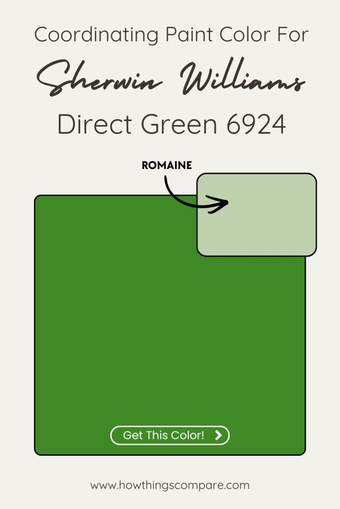
Unusual Gray – SW 7059
Unusual Gray is a cool, mid-tone gray with subtle green undertones that make it a surprisingly natural companion for Direct Green. Those quiet green hints in the gray create an understated connection between the two colors, keeping the palette cohesive rather than simply neutral. It softens the boldness of Direct Green without dulling it, acting as a sophisticated bridge between the vivid green and any whites or neutrals in the space. It’s the color that makes the whole palette feel considered and curated.
Pure White – SW 7005
Pure White earns its place here for the same reason it works with Electric Lime — Direct Green is a saturated, high-energy color that needs a clean, uncompromising neutral to balance it. Pure White provides crisp contrast that keeps the green feeling fresh and alive rather than heavy. As a trim, ceiling, or accent color it defines the architecture cleanly and gives the eye a place to rest, preventing the boldness of Direct Green from becoming visually exhausting.
Peel-and-Stick Paint Sample – Direct Green (6924) – Sherwin-Williams
Direct Green SW 6924 By Sherwin Williams LRV
Direct Green paint color has an LRV (Light Reflectance Value) of 19. This means that the paint color reflects 19% of the light that hits it.
Direct Green is quite dark, and absorbs most of the light and reflects only a small amount. This color is often used for accent walls, in smaller spaces where a more dramatic look is desired, or to create contrast against lighter colors.

4. Envy SW 6925
If I had to pick a favorite color from this list, it would be Envy. Envy SW 6925 by Sherwin-Williams is a captivating, rich green that exudes both elegance and energy. It brings a sense of luxury, vibrancy, and sophistication to any space.
What I love about Envy is its ability to make a bold statement while still feeling refined. It’s a versatile shade that can complement a variety of design styles, from modern to traditional. The depth of this green makes it a standout choice for anyone looking to create a memorable and stylish environment.
Best uses for Envy SW 6925:
- Accent walls in living rooms or bedrooms – it adds a touch of drama and sophistication, creating a focal point that draws the eye.
- Dining rooms – it creates an intimate and elegant atmosphere, perfect for entertaining guests.
- Front doors or exterior trim – it offers a welcoming and striking entryway that stands out against neutral exteriors.
- Home offices or study areas – the rich green can help create a focused and inspiring workspace.
- Bathrooms or powder rooms – it provides a luxurious and refreshing feel, especially when accented with white or metallic fixtures.
Hex Value: #358c3f
RGB: R: 53 G: 140 B: 63
Coordinating colors
- Restful White – SW 7563
- Tumblin’ Tumbleweed – SW 9120
- Pure White – SW 7005

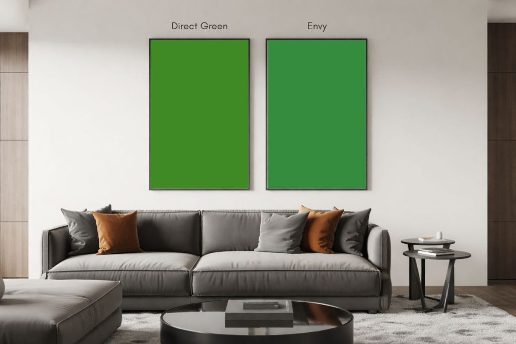
Peel-and-Stick Paint Sample – Envy (6925) – Sherwin-Williams
Envy SW 6925 By Sherwin Williams LRV
Envy paint color has an LRV (Light Reflectance Value) of 20. This means that the paint color reflects 20% of the light that hits it.
Similar to Direct Green, Envy is quite dark, and absorbs most of the light and reflects only a small amount. This color is often used for accent walls, in smaller spaces where a more dramatic look is desired, or to create contrast against lighter colors.
Both Direct Green and Envy (LRV 19 and 20), are often used to add balance, creating a cozy or grounded atmosphere.

5. Lucky Green SW 6926
Lucky Green SW 6926 by Sherwin-Williams is a vibrant, cheerful green that instantly brings a sense of freshness and vitality to any space. Lucky Green can energize a room and create a welcoming atmosphere.
Best uses for Lucky Green SW 6926:
- Accent walls in living rooms or bedrooms to add a lively focal point.
- Front doors or shutters to create a welcoming and eye-catching entryway.
- Children’s playrooms or nurseries to foster a fun and energetic environment.
- Home offices or study areas to promote creativity and focus.
- Bathrooms or powder rooms for a refreshing and invigorating atmosphere.
If you are looking to infuse your space with a lively, nature-inspired hue, go with Lucky Green. It’s energetic, welcoming, and incredibly versatile, making it a fantastic option for a wide range of decorating and painting projects.
Hex Value: #238652
RGB: R: 35 G: 134 B:82
Coordinating colors
- First Star – SW 7646
- Peppercorn – SW 7674
- Pure White – SW 7005

Peel-and-Stick Paint Sample – Lucky Green (6926) – Sherwin-Williams
Lucky Green SW 6926 By Sherwin Williams LRV
Lucky Green paint color has an LRV (Light Reflectance Value) of 18. This means that the paint color reflects 18% of the light that hits it.
Similar to Direct Green and Envy, Lucky Green is quite dark, and absorbs most of the light and reflects only a small amount. This color is often used for accent walls, in smaller spaces where a more dramatic look is desired, or to create contrast against lighter colors.
Lucky Green, Direct Green and Envy (LRV 18, 19 and 20), are often used to add balance, creating a cozy or grounded atmosphere.

6. Greenbelt SW 6927
Next on this list is Greenbelt SW 6927 by Sherwin-Williams. This color is a rich, deep green that exudes a sense of tranquility and natural beauty. Greenbelt is a color that brings a touch of nature indoors, creating a calming and grounded atmosphere.
If you enjoy making a strong, lively impact with your decor, Greenbelt is an eye-catching color that commands attention without being overly loud.
Greenbelt pairs nicely with warm neutrals like beige, soft whites, or light grays, allowing it to stand out without overwhelming the space.
Best uses for Greenbelt SW 6927:
- Accent walls in smaller rooms or powder rooms.
- Perfect color for entryways.
- Dining rooms to establish an elegant and intimate atmosphere.
- Front doors or shutters to offer a welcoming and distinguished entryway.
- Home offices or study areas to foster a focused and serene environment.
Hex Value: #017244
RGB: R: 1 G: 114 B: 68
Coordinating colors
- Extra White – SW 7006
- Grenadine – SW 6592
- Pure White – SW 7005

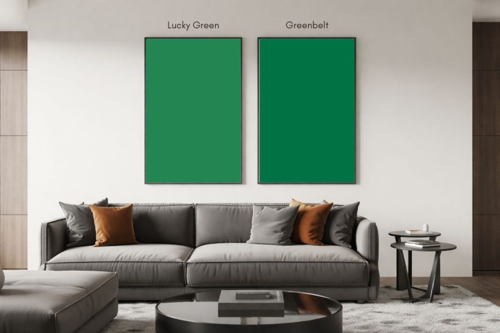
Peel-and-Stick Paint Sample – Greenbelt (6927) – Sherwin-Williams
Greenbelt SW 6927 By Sherwin Williams LRV
Greenbelt paint color has an LRV (Light Reflectance Value) of 12. This means that the paint color reflects 12% of the light that hits it.
As Greenbelt absorbs a significant amount of light, it will create a sense of depth or coziness in a space.
Greenbelt is perfect for rooms where a dramatic, intimate, or moody atmosphere is desired, as it tends to make a space feel smaller and more enclosed.

7. Argyle SW 6747
Argyle (SW 6747) by Sherwin-Williams is a vibrant, medium-toned green with a subtle hint of blue, evoking a fresh and lively feel. Its cool undertone makes it an energizing yet soothing color that works well in a variety of spaces.
Best uses for Argyle SW 6747:
- Living Areas: Ideal for living rooms or family spaces where you want a fresh, inviting atmosphere.
- Kitchens & Bathrooms: Adds a pop of color to kitchens or bathrooms, particularly when paired with white or light gray cabinetry.
- Accent Walls: Works beautifully as an accent wall in bedrooms, home offices, or dining areas to create a focal point.
- Outdoor Spaces: Perfect for exterior accents, such as shutters or doors, to give a natural, refreshing look to the home’s exterior.
Argyle offers a clean, invigorating vibe and pairs well with whites, soft neutrals, and natural wood tones.
Hex Value: #348a5d
RGB: R: 52 G: 138 B: 93
Coordinating colors
- Shell White – SW 8917
- Sunny Veranda – SW 9017
- White Mint – SW 6441

Peel-and-Stick Paint Sample – Argyle (6747) – Sherwin-Williams
Argyle SW 6747 By Sherwin Williams LRV
Argyle paint color has an LRV (Light Reflectance Value) of 20. This means that the paint color reflects 20% of the light that hits it.
Similar to Envy, use Argyle for accent walls, in smaller spaces where a more dramatic look is desired, or to create contrast against lighter colors.
Also use Argyle to add balance and create a cozy or grounded atmosphere.

