Picking the right paint color isn’t always easy—especially when you’re diving into the world of greige. That subtle mix of gray and beige can completely change how a space feels, and with so many options out there, it’s easy to feel overwhelmed.
I put together this guide featuring 6 of the most stunning greige paint colors that are as versatile as they are beautiful.
Click the link below each color to get a peel and stick color sample from Samplize.
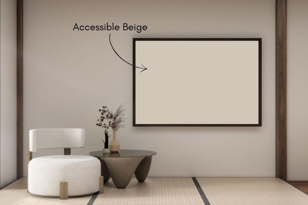
1. Accessible Beige 7036 Sherwin Williams
Accessible Beige by Sherwin Williams is a warm, versatile neutral that brings a soft, welcoming vibe to any space. With gentle gray undertones, this balanced beige leans slightly warm without feeling too yellow or too cool. Its Light Reflectance Value (LRV) of 58 means it reflects a fair amount of light, helping rooms feel open and airy while still adding subtle depth.
Accessible Beige pairs beautifully with crisp whites, warm woods, and soft blues, making it a perfect fit for modern, farmhouse, or traditional homes. It’s especially popular for living rooms, bedrooms, and open-concept spaces where you want a cozy, effortless backdrop.
- Paint name: Accessible Beige
- Manufacturer number: 7036
- Hex code: #D1C7B8
- RGB: 209 / 199 / 184
- LRV: 58
Need to know how much paint for your project?
Calculate gallons needed and estimated cost — free.

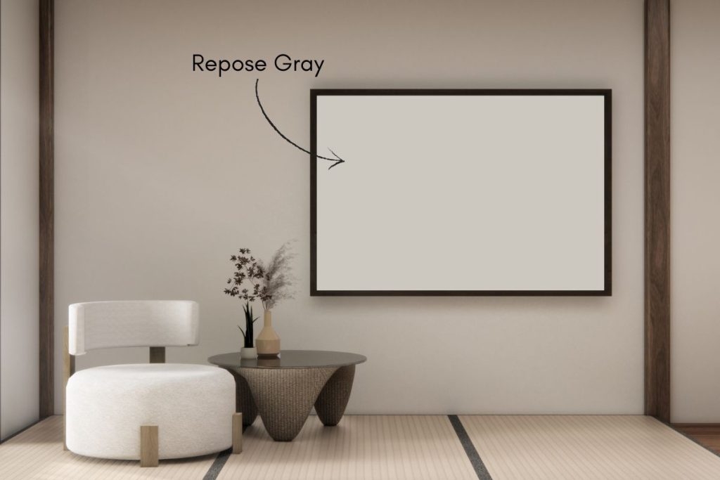
2. Repose Gray 7015 Sherwin Williams
Repose Gray SW 7015 is one of Sherwin-Williams’ most popular paint colors – and it’s easy to see why. This balanced greige sits right between gray and beige, giving it a versatility that works across almost any room in the house.
With an LRV of 58, it reflects a healthy amount of light, making it a comfortable choice for both smaller rooms and larger open spaces. It’s worth noting that Repose Gray shifts depending on your lighting -leaning grayer in natural light and picking up warmer beige undertones under artificial light.
Unlike some greiges that pull blue or green, Repose Gray stays reliably neutral, which makes it easy to pair with a wide range of furniture and decor. For trim, Pure White or Alabaster are both excellent choices for a clean, crisp finish. It also works well beyond just walls – cabinets and exteriors are both fair game.
Whether you’re painting a living room, bedroom, or kitchen, Repose Gray delivers a timeless, sophisticated backdrop that’s hard to get wrong.
- Paint name: Repose Gray
- Manufacturer number: 7015
- Hex code: #CCC8BF
- RGB: 204, 200, 191
- LRV: 58


Planning a paint project?
Having the right tools for the job is essential for getting smooth, professional results you’ll be proud of while saving time and avoiding costly mistakes.
Check out my list of pro painters tools here.
Peel And Stick Paint Color Samples
Would you like to sample these paint colors? I recommend using a peel and stick paint sample from SAMPLIZE. Peel and stick paint samples are very affordable and easy to use. They are also clean and environmentally friendly!
Advantages of using peel and stick paint samples:
- EASY TO USE: Simply move your SAMPLIZE paint sample around the room to test under a variety of lighting conditions.
- AFFORDABLE: Budget-friendly solution and no more buying inaccurate swatches, rollers, wasted paint.
- SUPER FAST DELIVERY: Depending on your location, 1 day delivery is possible.
- ORDER FROM HOME: Save a trip to the store looking for samples.
- NO MESS: SAMPLIZE uses real paint samples with zero-mess
- NO WASTE: No leftover cans or wasted paint.
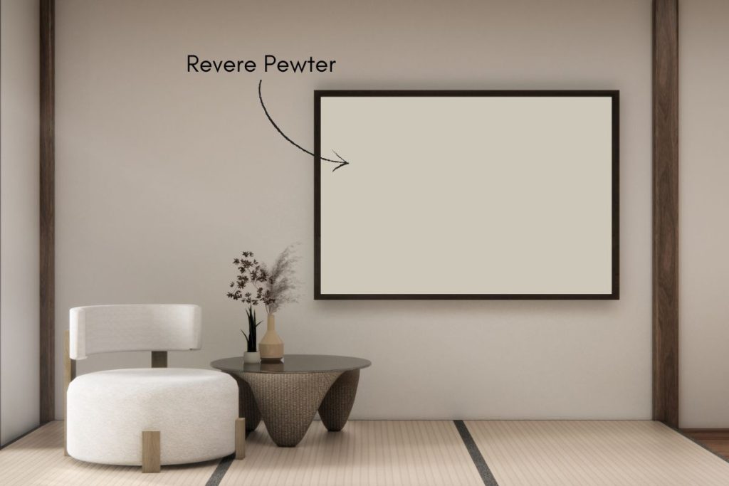
3. Revere Pewter HC-172 Benjamin Moore
Revere Pewter HC-172 is one of Benjamin Moore’s most recognized paint colors, pulled from their Historic Colors collection. It’s a warm greige – that familiar blend of gray and beige – that has earned a reputation as a reliable, go-to neutral for good reason.
Like most greiges, Revere Pewter shifts depending on your lighting. In rooms with plenty of natural light it reads as a soft, balanced neutral, while in darker spaces or under artificial light it can pull warmer and more beige. As always, testing a sample patch at different times of day before committing is a smart move.
Its warmth and versatility make it a natural fit across a range of rooms. In a living room it creates an inviting, grounded atmosphere, in a bedroom it feels calm and restful, and in a kitchen it bridges the gap comfortably between traditional and contemporary styles.
For trim and ceilings, White Dove is a classic pairing that keeps things soft and cohesive. If you’re looking to add contrast, Chelsea Gray works well on accent walls or furniture, and Hale Navy makes for a bold, striking combination.
- Paint name: Revere Pewter
- Manufacturer number: HC-172
- Hex code: #CCC4B8
- RGB: 204, 196, 184
- LRV: 56


Do Light Bulbs Affect How Paint Colors Look?
Absolutely. Just like natural light, artificial lighting changes how paint appears. The color temperature of your light bulbs—measured in Kelvins (K)—plays a big role.
- Lower K (2700K–3000K) = warm, yellow light (soft white)
- Higher K (4000K–5000K+) = cool, white to bluish light (bright/daylight)
Choosing the right bulb can make a big difference in how your paint color looks on the wall.
I recommend using these types of light bulbs.
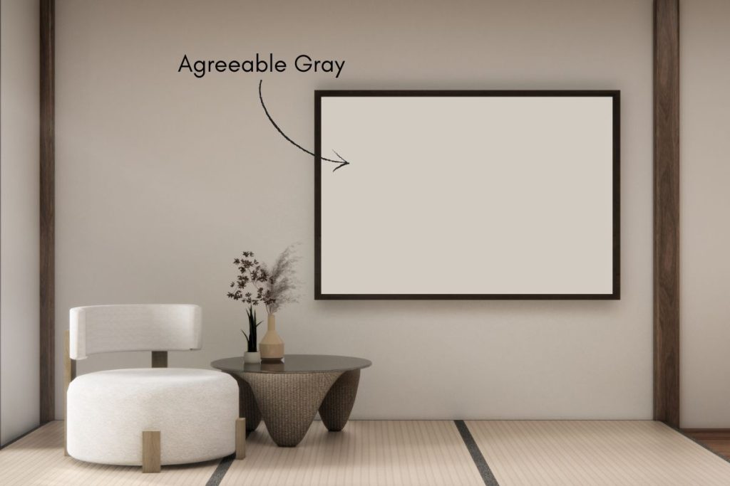
4. Agreeable Gray 7029 Sherwin Williams
Agreeable Gray is one of Sherwin-Williams’ best-selling paint colors, and it’s earned that reputation by being genuinely easy to live with. It sits in greige territory – that comfortable middle ground between gray and beige – with just enough warmth to feel inviting without tipping into yellow or brown.
With an LRV of 60, it reflects a solid amount of light, making it a workable choice for both bright, sun-filled rooms and spaces that rely more on artificial light. Like most greiges, it will shift slightly depending on your lighting conditions, so testing a sample patch first is always a good idea.
It’s a natural fit for living rooms, bedrooms, and kitchens, and its balanced, neutral character means it plays well with a wide range of furniture and decor styles. For trim, a crisp white works beautifully alongside it, and it’s flexible enough to be accented with both cool and warm tones without feeling off.
- Paint name: Agreeable Gray
- Manufacturer number: 7029
- Hex code: #D1CBC1
- RGB: 209, 203, 193
- LRV: 60


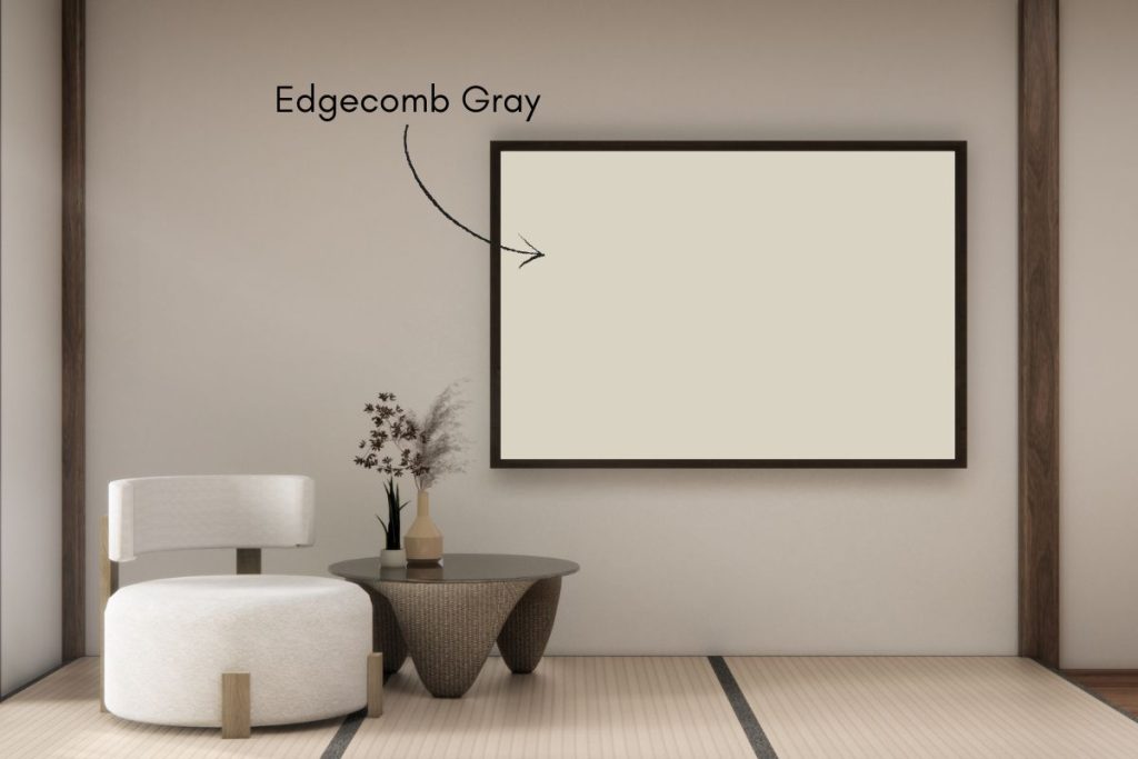
5. Edgecomb Gray HC-173 Benjamin Moore
Edgecomb Gray HC-173 is a warm, softly beige-leaning greige from Benjamin Moore’s Historic Colors collection. It sits on the lighter end of the greige spectrum, with an LRV of 63 that gives it an airy, open feel without losing the warmth that makes greiges so appealing.
Its behavior in different lighting is worth noting – in rooms with plenty of natural light it reads as a soft, warm neutral, while in darker spaces it can shift toward a deeper taupe. As with any greige, sampling it on the wall at different times of day will give you the clearest picture before committing.
Edgecomb Gray feels at home in living rooms, bedrooms, and hallways, and its gentle warmth makes it easy to pair with both modern and traditional decor. White trim is a natural complement, and it accepts both cool and warm accent colors without any trouble.
- Paint name: Edgecomb Gray
- Manufacturer number: HC-173
- Hex code: #D9D3C4
- RGB: 217, 211, 196
- LRV: 63
Color Comparisons
| Paint Color | LRV | Undertones |
|---|---|---|
| Edgecomb Gray | 63 | Warm, Beige |
| Revere Pewter | 55 | Warm, Gray |
| Pale Oak | 70 | Warm, Light |

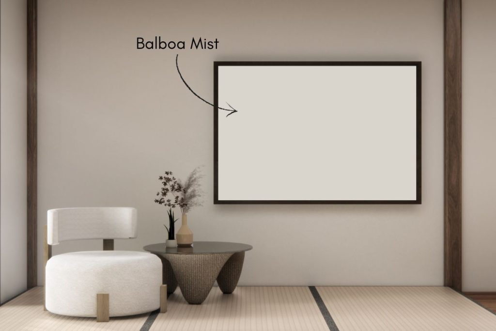
6. Balboa Mist 1549 Benjamin Moore
Balboa Mist OC-27 is a soft, understated greige from Benjamin Moore that sits closer to the lighter end of the spectrum. It blends gray and beige in a way that feels effortless and calm rather than stark or flat, making it one of those reliable neutrals that works in almost any setting.
One of its strengths is how consistently it holds its tone across different lighting conditions. Unlike some greiges that shift dramatically between natural and artificial light, Balboa Mist stays relatively true to itself throughout the day – a quality that makes it particularly easy to work with.
It suits a wide range of decor styles, from modern and minimalist to rustic and traditional, and provides a clean, warm backdrop that lets furniture and accessories take center stage. White trim is a natural pairing for a classic, cohesive finish, while darker accent colors can add depth and contrast if you want something with a bit more drama.
If your looking for a calming, versatile neutral that doesn’t demand too much attention, Balboa Mist is a dependable choice.
- Paint name: Balboa Mist
- Manufacturer number: 1549
- Hex code: #DAD5CC
- RGB: 218, 213, 204
- LRV: 63