When it comes to making a bold statement in your home, few colors have the impact of red. Sherwin-Williams offers a stunning array of red paint colors that can transform any space, adding warmth, energy, and a touch of sophistication. Whether you’re looking for a deep, dramatic hue or a bright, cheerful shade, there’s a red that can perfectly match your vision.
In this article, we’ll explore seven of the most stunning red paint colors by Sherwin-Williams, each offering unique characteristics that can enhance your home’s interior design.
Click the link below each color to get a peel and stick color sample from Samplize.
Need to know how much paint for your project?
Calculate gallons needed and estimated cost — free.
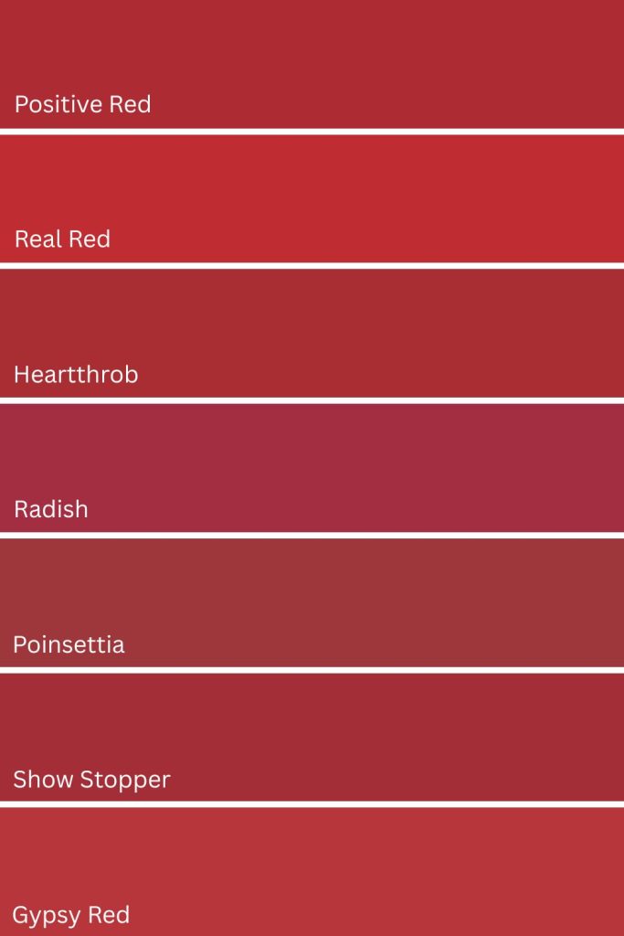
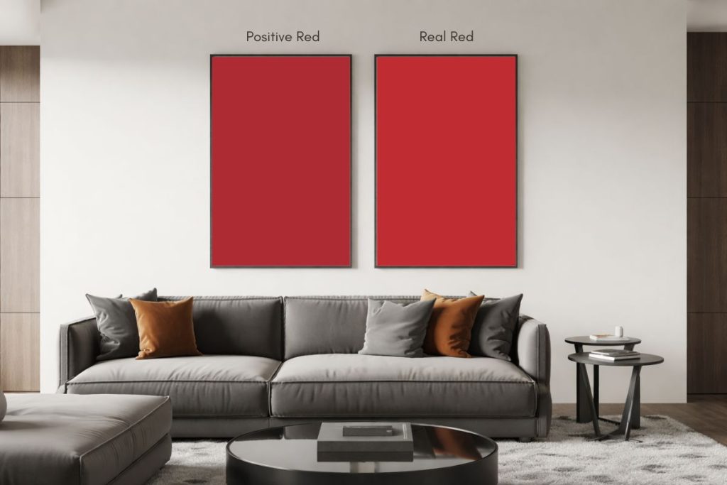
1. Positive Red (SW 6871)
Positive Red (SW 6871) by Sherwin-Williams is a vibrant and energetic red with a slight pink undertone. This bold color brings warmth and excitement to any space, making it an excellent choice for accent walls, front doors, or areas where a pop of color is desired.
Positive Red works beautifully in modern and eclectic spaces, and pairs well with neutral tones like gray, white, or soft beige to create a balanced and striking look. It’s also a great choice for creating a lively atmosphere in dining rooms, kitchens, or creative spaces.
- R:173 G:44 B:52
- Hex Value: #ad2c34
- LRV: 11
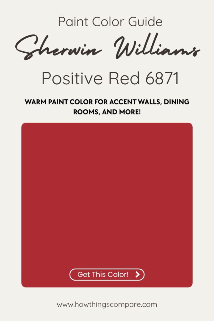
Positive Red coordinating colors:
- Toque White (SW 7003)
- Gauntlet Gray (SW 7019)
- lbis White (SW 7000)
Paint Samples:
Peel-and-Stick Paint Sample – Positive Red (6871) – Sherwin-Williams
2. Real Red (SW 6868)
Real Red (SW 6868) by Sherwin-Williams is a bold, vibrant red that exudes energy and passion. It’s a true red with a slightly warm undertone, making it a striking choice for spaces that need a pop of color.
Real Red is perfect for creating accent walls in living rooms, dining rooms, or even home offices where you want to make a statement.
It can also be used in smaller doses, such as on cabinetry, doors, or trim, to add a touch of drama. This color pairs well with neutral tones like white or gray, as well as with deeper shades of blue for a balanced yet dynamic look.
- R:191 G:45 B:50
- Hex Value: #bf2d32
- LRV: 13
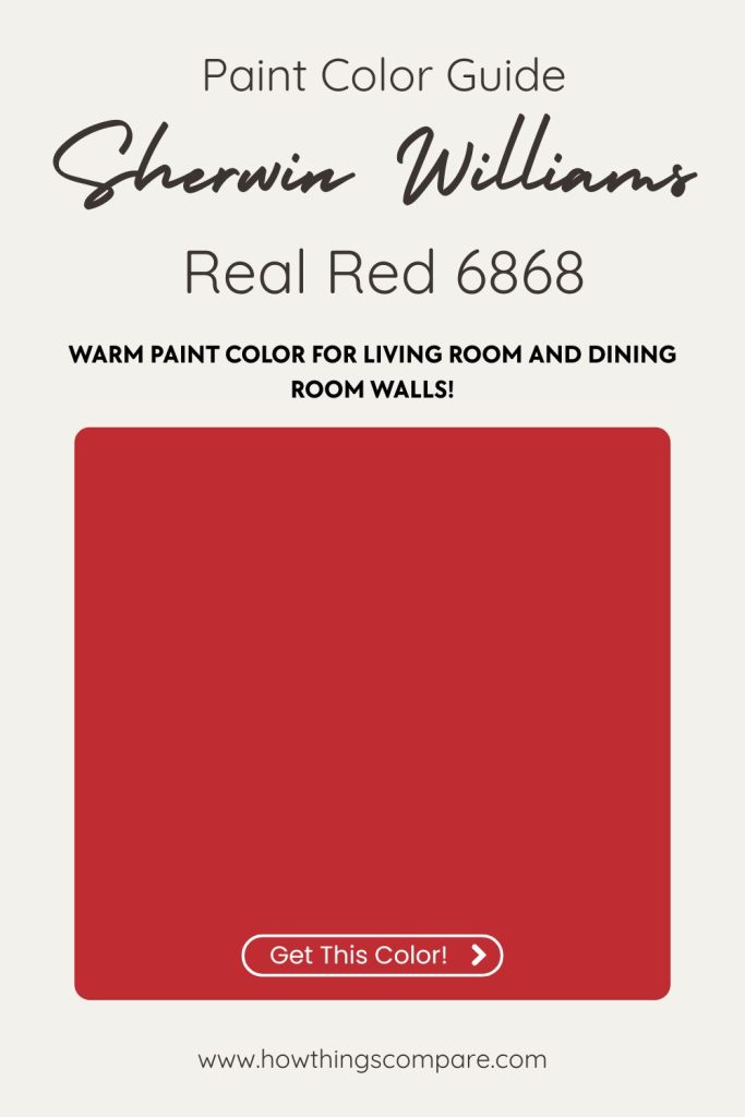
Real Red coordinating colors:
- Site White (SW 7070)
- Software (SW 7074)
- Ibis White (SW 7000)
Peel-and-Stick Paint Sample – Real Red (6868) – Sherwin-Williams
Paint Color Samples
Would you like to sample these paint colors? I recommend using a peel and stick paint sample from SAMPLIZE. Peel and stick paint samples are very affordable and easy to use. They are also clean and environmentally friendly!
Advantages of using peel and stick paint samples:
- EASY TO USE: Simply move your SAMPLIZE paint sample around the room to test under a variety of lighting conditions.
- AFFORDABLE: Budget-friendly solution and no more buying inaccurate swatches, rollers, wasted paint.
- SUPER FAST DELIVERY: Depending on your location, 1 day delivery is possible.
- ORDER FROM HOME: Save a trip to the store looking for samples.
- NO MESS: SAMPLIZE uses real paint samples with zero-mess
- NO WASTE: No leftover cans or wasted paint.

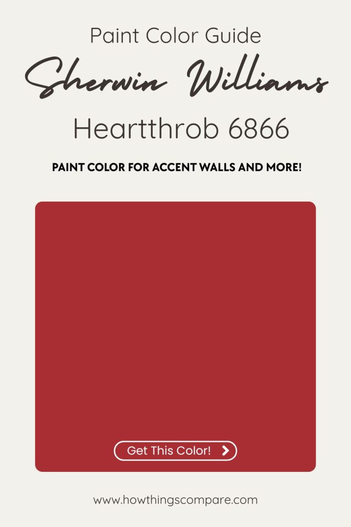
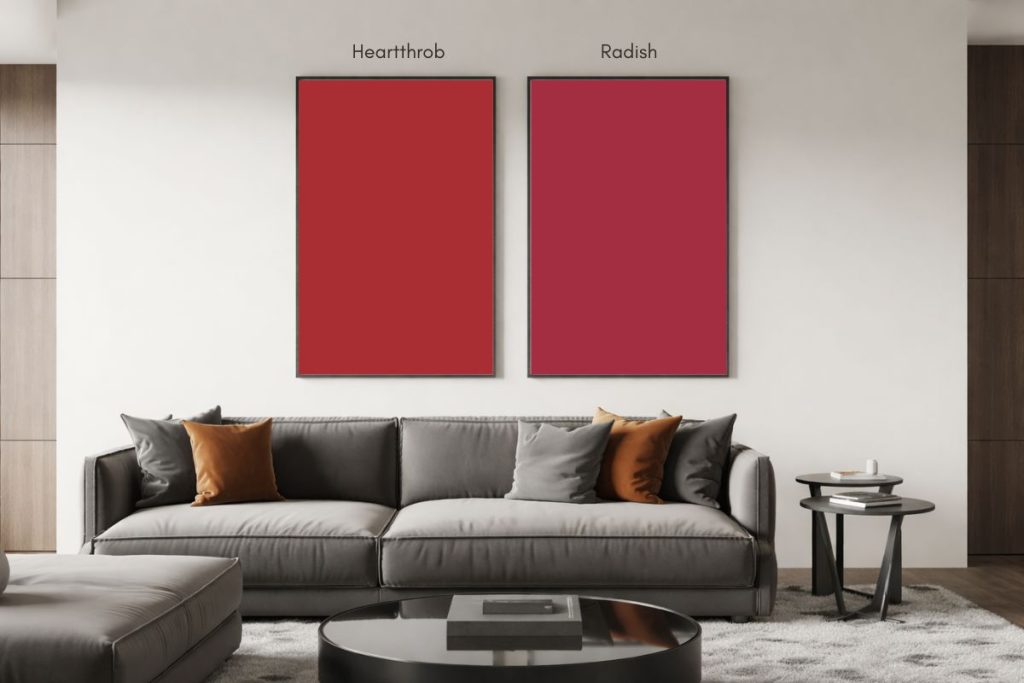
3. Heartthrob (SW 6866)
Heartthrob (SW 6866) by Sherwin-Williams is a bold and passionate red with warm undertones, exuding a sense of energy and confidence. This vibrant color is perfect for making a statement in spaces like accent walls, front doors, or even a dining room where you want to create an inviting and dynamic atmosphere.
It pairs well with neutral tones like whites, grays, or soft beige, allowing the red to stand out while maintaining balance in the space. Heartthrob is also an excellent choice for adding a pop of color in smaller areas, such as a powder room or a piece of furniture, where it can add warmth and character without overwhelming the space.
- R:168 G:46 B:51
- Hex Value: #a82e33
- LRV: 11
Heartthrob coordinating colors:
- Windfresh White (SW 7628)
- Colonnade Gray (SW 7641)
Paint Samples:
Peel-and-Stick Paint Sample – Heartthrob (6866) – Red – Sherwin-Williams
Planning a paint project?
Having the right tools for the job is essential for getting smooth, professional results you’ll be proud of while saving time and avoiding costly mistakes.
Check out my list of pro painters tools here.
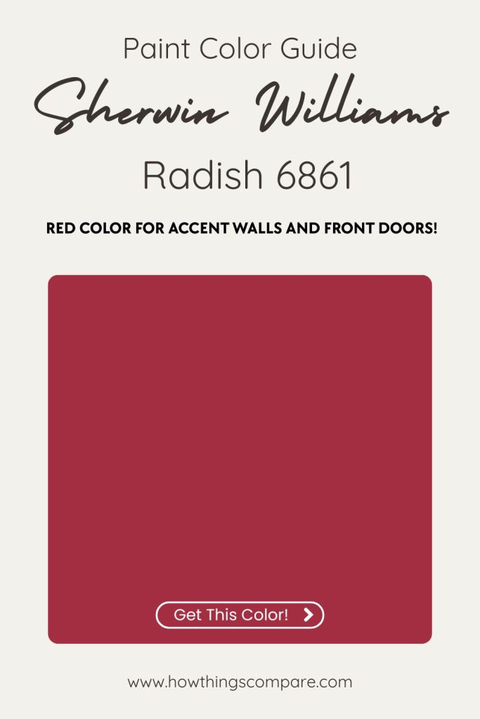
4. Radish (SW 6861)
Radish (SW 6861) by Sherwin-Williams is a vibrant and energetic reddish-pink hue with a bold and cheerful personality.
This color brings warmth and dynamism to any space, making it an excellent choice for accent walls, front doors, or statement furniture pieces.

Radish can also be used in creative spaces like home offices or craft rooms to inspire creativity and productivity.
It pairs well with neutrals like soft grays or whites, or with complementary colors such as teal or navy to create a striking contrast.
- R:164 G:46 B:65
- Hex Value: #a42e41
- LRV: 10
Radish coordinating colors:
- Reflection (SW 7661)
- Wall Street (SW 7665)
Paint Samples:
Peel-and-Stick Paint Sample – Radish (6861) – Red – Sherwin-Williams
Do Light Bulbs Affect How Paint Colors Look?
Absolutely. Just like natural light, artificial lighting changes how paint appears. The color temperature of your light bulbs—measured in Kelvins (K)—plays a big role.
- Lower K (2700K–3000K) = warm, yellow light (soft white)
- Higher K (4000K–5000K+) = cool, white to bluish light (bright/daylight)
Choosing the right bulb can make a big difference in how your paint color looks on the wall.
I recommend using these types of light bulbs.
Check out my recommended pro painters tools here!
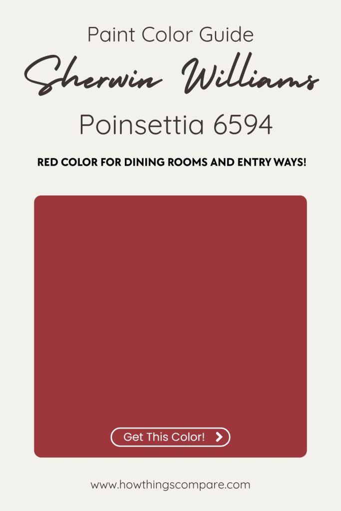
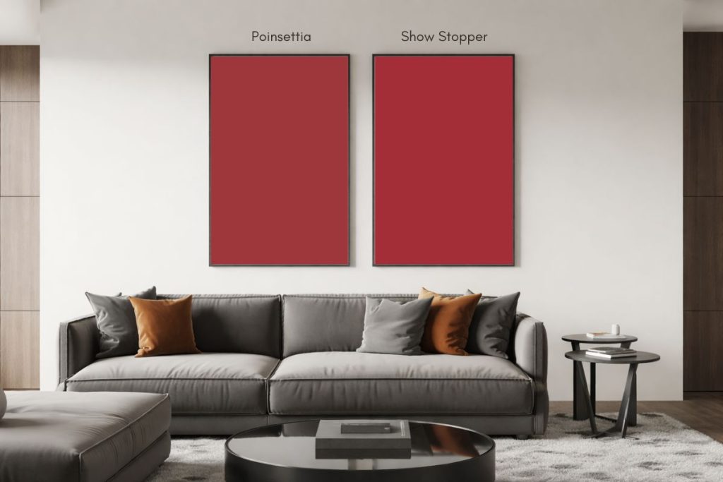
5. Poinsettia (SW 6594)
Poinsettia (SW 6594) by Sherwin-Williams is a vibrant, bold red with warm undertones, reminiscent of the festive hue of poinsettia flowers.
This striking color makes a powerful statement and is perfect for creating a focal point in a space. Best used as an accent wall in living rooms, dining rooms, or entryways, Poinsettia can add warmth and energy to a room.
It also works well in exterior applications, such as front doors or shutters, to create a welcoming and eye-catching entrance. Pair it with neutral tones like soft grays, whites, or beiges to balance its intensity and create a harmonious look.
- R:157 G:55 B:60
- Hex Value: #9d373c
- LRV: 10
Coordinating colors:
- Egret White (SW 7570)
- Midnight SW (SW 6264)
Paint Samples:
Peel-and-Stick Paint Sample – Poinsettia (6594) – Red – Sherwin-Williams
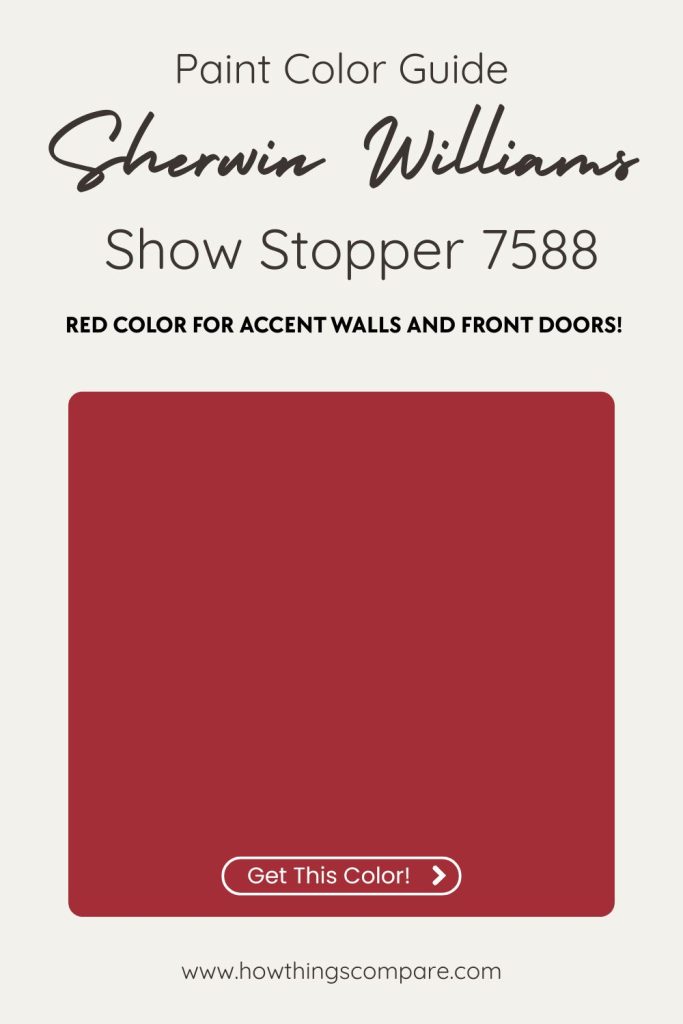
6. Show Stopper (SW 7588)
Show Stopper (SW 7588) by Sherwin-Williams is a bold and vibrant red that commands attention. This intense shade brings energy and drama to any space, making it ideal for accent walls, front doors, or statement furniture pieces.

It’s a perfect choice for adding a pop of color to modern and contemporary designs, or for creating a focal point in more traditional settings.
Pair Show Stopper with neutral tones like soft grays, whites, or even deep charcoals to let the red truly stand out, or with other bold colors for a more eclectic look.
- R:164 G:46 B:55
- Hex Value: #a42e37
- LRV: 10
Show Stopper coordinating colors:
- Origami White (SW 7636)
- Taupe Tone (SW 7633)
Paint Samples:
Peel-and-Stick Paint Sample – Show Stopper (7588) – Sherwin-Williams
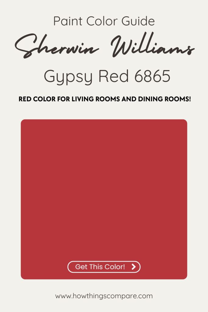
7. Gypsy Red SW 6865
Gypsy Red SW 6865 by Sherwin-Williams is a bold and vibrant red with warm undertones, offering a dynamic and energetic feel. It’s an excellent choice for creating an accent wall, adding warmth and depth to living rooms, dining areas, or entryways.
This color works well in both modern and traditional settings, where it can bring a touch of drama or a pop of color. Gypsy Red pairs beautifully with neutrals like beige, cream, or soft grays, and it can also complement deep wood tones or metallic accents for a sophisticated look.
- R:182 G:54 B:59
- Hex Value: #b6363b
- LRV: 13
Gypsy Red coordinating colors:
- Urbane Bronze (SW 7048)
- Dromedary Camel (SW 7694)