The colors you put on your bedroom walls do more than just set a mood, they can genuinely affect how well you sleep. Soft blues, muted greens, and quiet lavenders tend to lower stress and help your mind settle. Bold, saturated colors like red and orange do the opposite. They stimulate the nervous system and make it harder to wind down.
Color temperature matters too. Cool tones naturally evoke calm, think of the feeling of being near water or in a shaded forest. Warm tones are cozier but more energizing, which is why the best bedroom palettes often blend both. A soft blue-green wall with warm wood tones or earthy accents gives you that settled, comfortable feeling without tipping into sterile or cold.
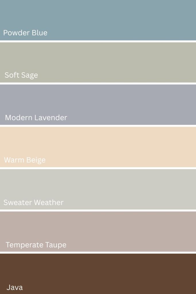
The seven colors below are all popular in bedrooms. Each one creates a different kind of calm, so there’s something here whether you’re drawn to airy and light or moody and cocoon-like.
Click the link below each color to get a peel and stick color sample from Samplize.
Need to know how much paint for your project?
Calculate gallons needed and estimated cost — free.
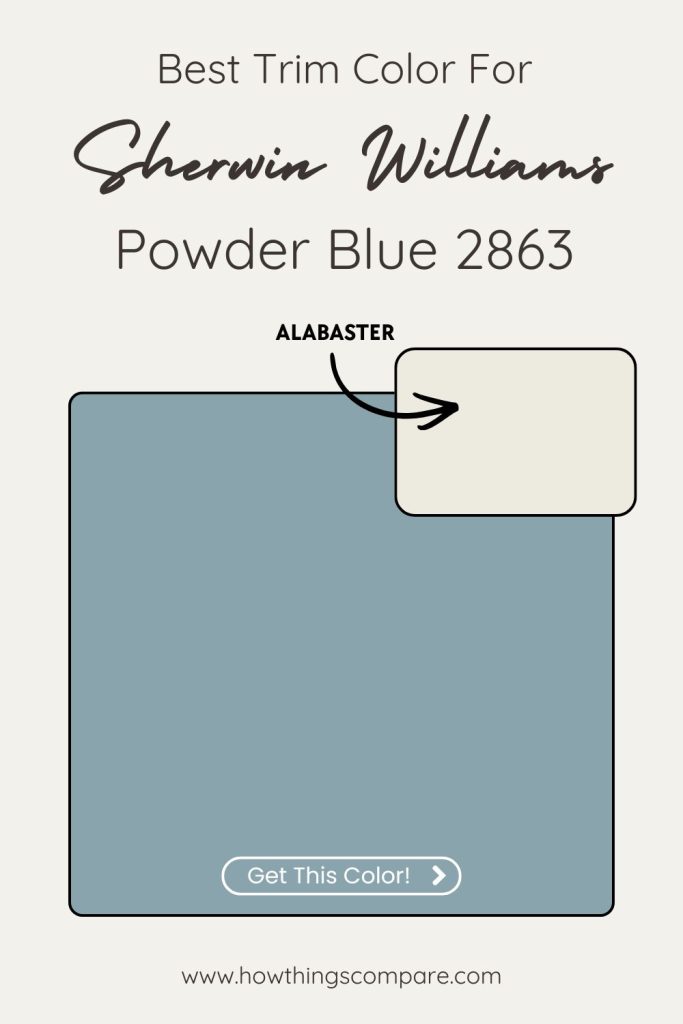
1. Powder Blue SW 2863 Sherwin Williams
Powder Blue is one of those colors that does exactly what you want a bedroom color to do — it slows the room down. Its soft, airy quality evokes clear skies and open water, which is why blue has long been the go-to choice for bedrooms designed around rest and recovery.
This particular shade sits in the lighter end of the blue spectrum, keeping the room feeling bright and open rather than heavy. It pairs naturally with white trim and soft gray accents for a clean, unfussy look, or with warm linen and natural wood tones if you want something with a little more warmth and texture.
For bedding, look for soft blue or white cotton duvet covers — they’ll complement the walls without overwhelming the color story you’re building.
- Paint name: Powder Blue
- Manufacturer number: 2863
- Hex code: #89A4AD
- RGB: 137 / 164 / 173
- LRV: 35

Powder Blue SW 2863 By Sherwin Williams LRV
Powder Blue has an LRV (Light Reflectance Value) of 35. This means that the paint color reflects 35% of the light that hits it. This places Powder Blue in the medium to darker range on the LRV scale (which runs from 0 to 100).
A color with an LRV of 35 will absorb more light than it reflects, making it feel richer and more saturated, and often contributing to a cozier, more intimate atmosphere in a space.

Powder Blue SW 2863 Best Trim Color: Alabaster SW 7008
Alabaster is the go-to here, and for good reason. It’s a warm, creamy white with an LRV of 82 that softens Powder Blue’s cool edge just enough to feel curated rather than cold. That slight warmth in Alabaster creates a gentle contrast — the trim reads as crisp and clean without competing with the wall color, and the warm/cool interplay gives the room a polished, lived-in quality rather than feeling sterile.
Pure white trims (like Extra White SW 7006) would work technically, but they can make Powder Blue feel a bit flat or institutional by leaning into the coolness rather than balancing it. Alabaster brings just enough cream to ground the pairing and make the blue feel intentional and inviting.
It also happens to be one of Sherwin-Williams’ most popular trim colors, so it pairs beautifully with a wide range of flooring and furniture tones — a practical bonus for a real room.
Get a peel and stick paint sample of Alabaster SW 7008 here.
Read: Alabaster SW 7008 paint color guide
Paint Color Samples
Would you like to sample these paint colors? I recommend using a peel and stick paint sample from SAMPLIZE. Peel and stick paint samples are very affordable and easy to use. They are also clean and environmentally friendly!
Advantages of using peel and stick paint samples:
- EASY TO USE: Simply move your SAMPLIZE paint sample around the room to test under a variety of lighting conditions.
- AFFORDABLE: Budget-friendly solution and no more buying inaccurate swatches, rollers, wasted paint.
- SUPER FAST DELIVERY: Depending on your location, 1 day delivery is possible.
- ORDER FROM HOME: Save a trip to the store looking for samples.
- NO MESS: SAMPLIZE uses real paint samples with zero-mess
- NO WASTE: No leftover cans or wasted paint.
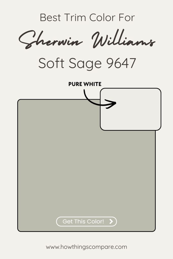
2. Soft Sage SW 9647 Sherwin Williams
Sage is having a moment in bedroom design right now, and it’s easy to understand why. It sits in that sweet spot between green and gray, earthy enough to feel grounded, muted enough to feel restful. Where brighter greens can feel fresh and energizing, sage leans quiet. It brings the outside in without making your bedroom feel like a greenhouse.
Soft Sage works particularly well with natural materials. Light oak furniture, linen bedding, and woven textures all sit comfortably alongside it — the overall effect is calm and organic without trying too hard. If you want to add a little depth, warm terracotta or dusty clay accents complement the green undertones beautifully without disrupting the restful mood.
For bedding, linen duvet covers in warm white or oatmeal are a natural pairing — they soften the green rather than competing with it and keep the room feeling layered and considered.
- Paint name: Soft Sage
- Manufacturer number: 9647
- Hex code: #BCBCAE
- RGB: 188 / 188 / 174
- LRV: 50

Soft Sage SW 9647 By Sherwin Williams LRV
Soft Sage has an LRV (Light Reflectance Value) of 50. This means that the paint color reflects 50% of the light that hits it. This puts the color right in the middle of the LRV scale, which ranges from 0 (absolute black, reflecting no light) to 100 (pure white, reflecting all light).
Soft Sage is considered a mid-tone color. It neither reflects a lot of light like lighter colors nor absorbs a lot of light like darker colors. This makes it a balanced choice that works well in various lighting conditions, offering versatility for different spaces. Mid-tone colors like this can create a cozy, grounded atmosphere without making a room feel too dark or too bright.

Soft Sage SW 9647 Best Trim Color: Pure White SW 7005
Pure White is the standout choice for Soft Sage, and here’s why: Soft Sage already leans cool and muted, so you want a trim that’s clean and bright without adding more warmth (which can muddy the sage and pull it toward brown). Pure White has an LRV of 84 and sits in a neutral zone — not stark, not creamy — that lets the green-gray complexity of Soft Sage take center stage.
Alabaster (the warm cream) would be the instinct for many, but with a color like Soft Sage it risks making the whole room feel slightly murky, since the warm yellow in Alabaster can clash subtly with the cool gray-green. Pure White avoids that tension entirely and keeps the sage looking fresh and intentional.
The result is a pairing that feels organic and serene — think nature-inspired interiors, Scandinavian-adjacent design, or modern farmhouse spaces where the sage reads like something pulled from a quiet woodland palette.
Planning a paint project?
Having the right tools for the job is essential for getting smooth, professional results you’ll be proud of while saving time and avoiding costly mistakes.
Check out my list of pro painters tools here.
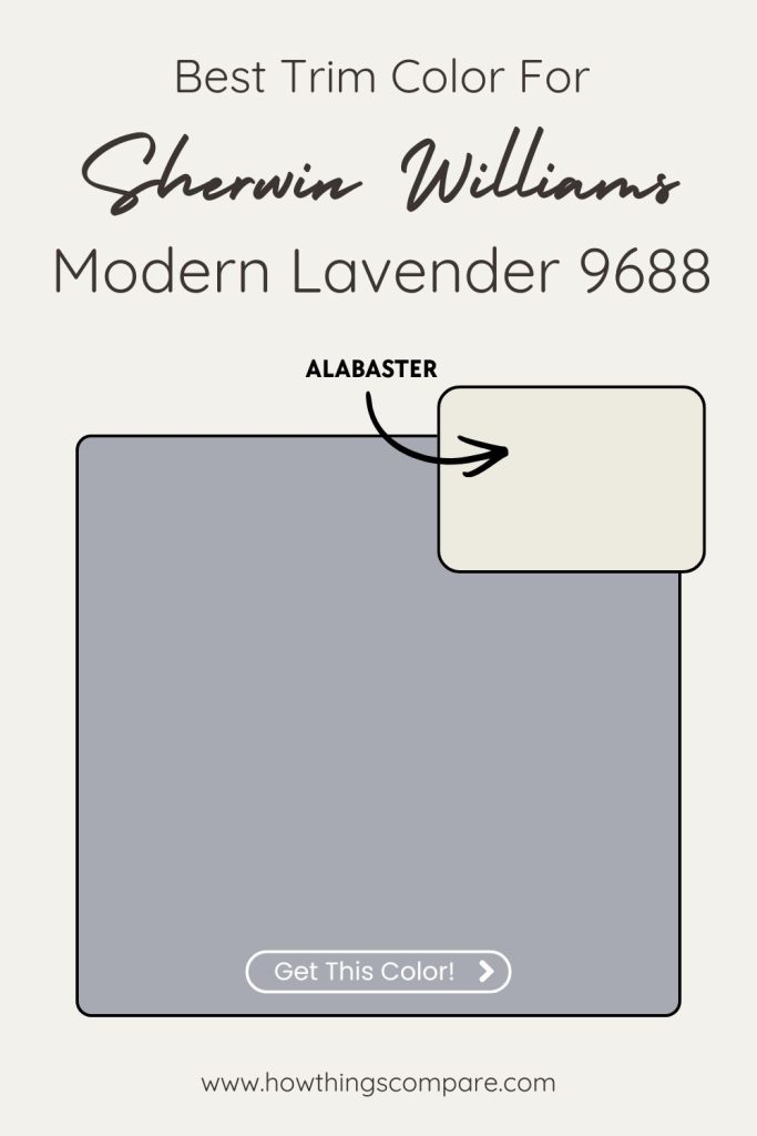
3. Modern Lavender SW 9688 Sherwin Williams
Lavender is one of the few colors that manages to feel both elegant and genuinely restful — no small feat in a bedroom. Modern Lavender sits on the softer, more muted end of the purple spectrum, which keeps it from feeling overly feminine or bold.
It pairs naturally with warm whites and soft creams, and lavender or soft lilac curtains are an easy way to carry the color through the room without committing to more wall color.
- Paint name: Modern Lavender
- Manufacturer number: 9688
- Hex code: #A8AAB3
- RGB: 168 / 170 / 179
- LRV: 40

Modern Lavender SW 9688 By Sherwin Williams LRV
Modern Lavender has an LRV (Light Reflectance Value) of 40. This means that the color reflects 40% of the light that hits it.
Modern Lavender will absorb more light than it reflects, making it a bit darker and more muted compared to lighter shades. It is not too dark or too light, offering a balanced tone that can work well in spaces where you want a bit of richness and depth without making the room feel too heavy.

Modern Lavender SW 9688 Best Trim Color: Alabaster SW 7008
Alabaster is the best choice. Modern Lavender has a cool, slightly moody quality, and Alabaster’s warm cream undertone does something really interesting with it — it softens the purple just enough to make it feel luxurious rather than stark, and the warm/cool contrast gives the pairing a refined, almost European elegance.
Pure White would be too cold alongside Modern Lavender — it would amplify the cool gray in the lavender and push the whole room toward feeling chilly and flat. Alabaster instead adds a gentle glow that makes the lavender feel rich and intentional, the way candlelight flatters a room.
This pairing works especially well in bedrooms, reading nooks, or any space where you want a sense of calm sophistication. The cream of Alabaster also plays nicely with natural wood tones, aged brass, and linen textures — all of which complement Modern Lavender beautifully and give you strong affiliate product recommendation angles.
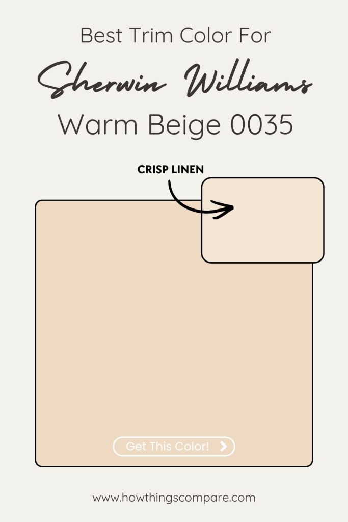
4. Warm Beige SW 0035 Sherwin Williams
Beige gets unfairly dismissed as boring, but a warm, well-chosen beige like this one creates something that cooler, trendier colors often can’t — genuine comfort. It wraps a room rather than decorating it. Warm Beige works particularly well paired with darker wood furniture and rich textures like wool and cotton, which give the neutral something to lean against and keep it from feeling flat.
For accents, warm gold or rust-toned throw pillows are the easiest way to add depth without breaking the calm. A set of terracotta or warm rust pillow covers does exactly that — enough color to make the room feel considered, not so much that it disrupts the restful mood you’re building.
- Paint name: Warm Beige
- Manufacturer number: 0035
- Hex code: #EEDAC3
- RGB: 238 / 218 / 195
- LRV: 73

Warm Beige SW 0035 By Sherwin Williams LRV
Warm Beige has an LRV (Light Reflectance Value) of 73. This means that the color reflects 73% of the light that hits it. This color is fairly light, but not as bright or reflective as whites or very pale shades.
With an LRV of 73, Warm Beige will contribute to a light and open feel in a room, helping to brighten up spaces without being too stark or overwhelming. It’s a good choice for rooms where you want a balance between light reflection and a bit of warmth or depth in the color.

Warm Beige SW 0035 Best Trim Color: Crisp Linen SW 6378
This is where the conventional wisdom like “just use Alabaster” gets set aside. Alabaster is warm, but it’s also quite light and creamy — and against Warm Beige’s golden undertones, it can blend together too closely, making the trim feel like it’s disappearing into the wall rather than defining the space.
Crisp Linen SW 6378 is the better choice to pair with Warm Beige. It’s a warm white with a slightly toasty, almost sandy quality that harmonizes with the golden base of Warm Beige while still providing enough contrast to read clearly as trim. It complements rather than competes — the two colors feel like they belong to the same family, which gives the room a cohesive, intentional warmth rather than a mismatched layering of neutrals.
The result is a space that feels genuinely enveloping. Think traditional interiors, warm transitional spaces, or cozy cottage aesthetics where everything from the walls to the woodwork feels unified and soft.
If you want a touch more contrast and definition, Pure White SW 7005 works as an alternative.
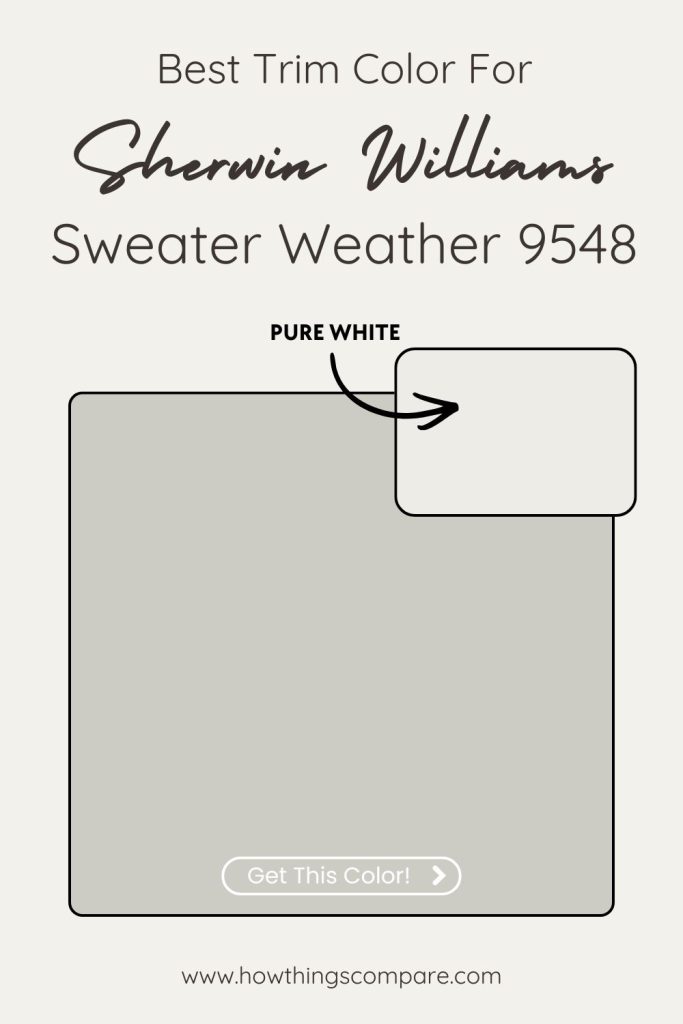
5. Sweater Weather SW 9548 Sherwin Williams
I often get asked if a gray color like Sweater Weather can be calming. The answer is yes! Sweater Weather is a cool, soft gray with just enough blue-green in its undertones to keep it from feeling flat or corporate. It creates a different kind of calm than the warmer colors on this list — less cozy and enveloping, more serene and clearheaded. If Warm Beige wraps a room, Sweater Weather stills it.
It works best when you let the cool tones breathe. White trim, light oak or ash furniture, and minimal clutter all complement it well. For bedding, soft blue or cool gray linen duvet covers carry the color story through without doubling down too heavily on the gray — the result feels layered and intentional rather than monotone.
*One thing worth knowing before you head to the store — At the time of writing, Sweater Weather is part of Sherwin-Williams’ Designer Edition, which means it can only be mixed in Emerald paint.
- Paint name: Sweater Weather
- Manufacturer number: 9548
- Hex code: #CCCCC5
- RGB: 204 / 204 / 197
- LRV: 60

Sweater Weather SW 9548 By Sherwin Williams LRV
Sweater Weather has an LRV (Light Reflectance Value) of 60. This means that the color reflects 60% of the light that hits it putting it in the medium-light range.
Sweater Weather will reflect a fair amount of light, making a space feel bright but not overwhelmingly so. It’s often a good choice for rooms where you want a balance between lightness and depth. Colors in this range can work well in both larger spaces that need warmth and smaller rooms where a bit of light reflection can help them feel more open.

Sweater Weather SW 9548 Best Trim Color: Pure White SW 7005
With a dark, warm-toned color like Sweater Weather, you want trim that creates real contrast and lets the wall color breathe and Pure White delivers that cleanly. Its neutral-to-slightly-cool base stops it from blending into the warmth of Sweater Weather, instead creating a crisp, defined edge that makes the deep greige look intentional and sophisticated rather than cave-like.
Alabaster could also be used, but at this depth of color the extra warmth in Alabaster can get lost, the contrast softens to the point where trim stops doing its job of defining the architecture. Pure White keeps things sharp and gives the room a tailored, high-contrast finish that lets Sweater Weather’s richness fully express itself.
This pairing suits moody living rooms, home offices, dining rooms, and bedroom feature walls especially well — anywhere you want depth and drama balanced by clean, precise detailing. It also photographs beautifully, which matters for Pinterest content.
For an even bolder, more modern look, Tricorn Black SW 6258 as trim is worth considering — it leans fully into the drama and works especially well in contemporary or maximalist spaces.
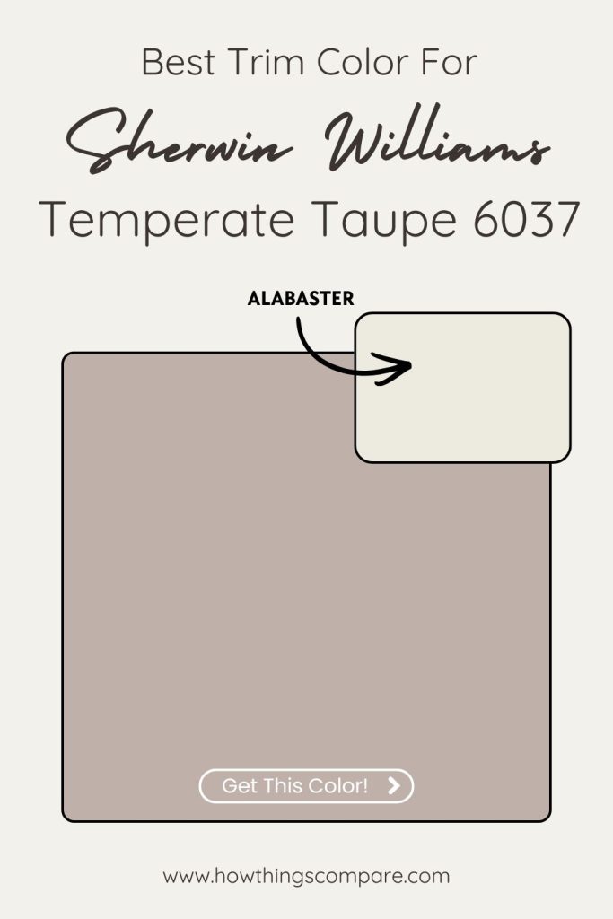
6. Temperate Taupe SW 6037 Sherwin Williams
Taupe is one of the most underrated bedroom colors precisely because it doesn’t announce itself. Temperate Taupe sits in that comfortable middle ground between warm brown and soft gray — earthy enough to feel grounded, neutral enough to let everything else in the room breathe. It’s the kind of color that makes a bedroom feel like it was put together thoughtfully rather than decorated.
It pairs naturally with the kinds of materials you’d find in nature — raw wood, linen, stone, woven textures. Dark walnut furniture grounds it, while lighter oak keeps it feeling airy.
For a finishing touch, warm taupe or camel throw pillows add just enough tonal variation to keep the room from feeling one-note without disturbing the calm you’re building.
- Paint name: Temperate Taupe
- Manufacturer number: 6037
- Hex code: #BFB1AA
- RGB: 191 / 177 / 170
- LRV: 46

Temperate Taupe SW 6037 By Sherwin Williams LRV
Temperate Taupe has an LRV (Light Reflectance Value) of 46. This means that the color reflects 46% of the light that hits it making it a medium-toned color.
Temperate Taupe isn’t too dark or too light, making it versatile for various spaces. This color will absorb a good amount of light without making a room feel too dark, while also reflecting enough light to keep the space from feeling overly heavy or closed-in. It’s a great color for creating a balanced atmosphere in rooms with moderate lighting.

Temperate Taupe SW 6037 Best Trim Color: Alabaster SW 7008
Alabaster again for the win! It works for a specific reason: Temperate Taupe’s warm brown base needs a trim color that echoes that warmth rather than fighting it. Alabaster’s creamy undertone aligns perfectly with the taupe’s brown-leaning character, creating a pairing that feels cohesive, layered, and naturally elegant — like the room was designed rather than decorated.
Pure White would work functionally, but against Temperate Taupe’s warmth it can feel slightly disconnected — the cooler white sits in mild tension with the brown undertones and can make the taupe look a touch muddy by comparison. Alabaster sidesteps that entirely by staying in the same warm family while still providing enough contrast at LRV 82 to define the trim clearly.
This pairing suits traditional, transitional, and warm contemporary spaces beautifully — think coffered ceilings, wainscoting, and built-ins where the creamy trim against the taupe wall creates genuine architectural richness. It also pairs naturally with wood floors, leather, and aged brass, giving you strong styling angles for affiliate content.
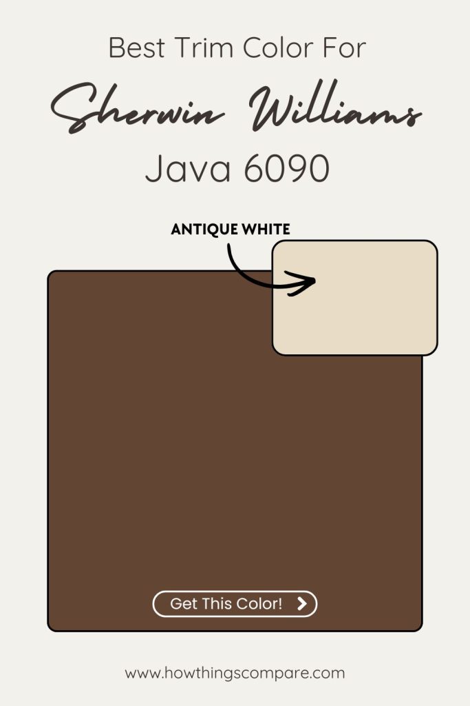
7. Java SW 6090 Sherwin Williams
Java is the darkest color on this list and the most cocoon-like. It’s a deep, rich espresso brown that turns a bedroom into a genuine retreat — the kind of room that feels intentionally separate from the rest of the house. Where lighter colors create calm by opening a space up, Java does it by closing it in, in the best possible way.
It works best with warm, natural materials that match its depth. Linen bedding in warm cream or oatmeal stops the room from feeling too heavy, while light oak or rattan furniture keeps it from tipping into cave-like territory. For bedding, a warm cream or ivory cotton duvet is the natural counterbalance to a dark wall like this — enough contrast to keep the room feeling rich rather than oppressive.
- Paint name: Java
- Manufacturer number: 6090
- Hex code: #634533
- RGB: 99 / 69 / 51
- LRV: 7

Java SW 6090 By Sherwin Williams LRV
Java has an LRV (Light Reflectance Value) of 7. This means that the color reflects 7% of the light that hits it. This indicates that the color is quite dark, as it absorbs the majority of light rather than reflecting it.
Most colors with low LRVs, like Java, which is 7, tend to create a more intimate, cozy, or dramatic atmosphere in a space. They are often used to make rooms feel smaller, moodier, or more grounded, as opposed to light, bright, and open.

Java SW 6090 Best Trim Color: Antique White SW 6119
At this depth of color, the trim conversation shifts entirely. You’re not just picking a white — you’re picking a warm anchor that stops the room from feeling like it’s closing in, while honoring the richness of the wall color rather than working against it.
Antique White SW 6119 is the move. It’s a soft, warm white with creamy yellow undertones that creates beautiful contrast against Java’s near-black depth without the clinical sharpness that a brighter white would introduce. The warmth in Antique White echoes the brown base of Java, so the two colors feel like they belong together — the trim frames the walls rather than cutting against them.
Pure White or Extra White would be technically high-contrast, but against something as dark and warm as Java they can read as harsh and slightly cold — the stark brightness competes with the espresso richness rather than complementing it. Alabaster is closer but still a touch light and neutral; Antique White’s deeper creaminess is the better match at this intensity.
This pairing works exceptionally well in dining rooms, libraries, home offices, and moody bedrooms. Spaces where you want full immersion in a dark, enveloping atmosphere that still feels warm and refined rather than heavy.
For a bolder, fully committed look, matching the trim to Java itself (a monochromatic approach) is increasingly popular and eliminates the contrast question entirely — deeply dramatic and very on-trend.