Decorating small spaces can be tricky, but I’ve found that the right paint color can make a world of difference. Whether you want to brighten up a cozy corner or make a room feel bigger than it is, your color choice plays a major role.
In this article, I’ll share seven amazing paint colors that are perfect for small spaces. These colors can help transform even the tiniest areas into stylish, inviting spots you’ll love. From light neutrals to bold accents, they’ll work wonders in opening up your space and adding personality.
Click the link below each color to get a peel and stick color sample from Samplize.
Need to know how much paint for your project?
Calculate gallons needed and estimated cost — free.
1. Deep Ocean 2058-30 Benjamin Moore
Deep Ocean 2058-30 by Benjamin Moore is a bold, rich navy blue that can work surprisingly well in small spaces. Although darker colors are often thought to make rooms feel smaller, Deep Ocean actually creates depth and intimacy, making a small room feel cozier rather than cramped. When used thoughtfully, this color can make walls recede, giving the illusion of more space — especially in rooms with ample natural light or paired with lighter furnishings and accents.
This deep blue also adds a sense of sophistication and tranquility, making it an excellent choice for areas where you want a calm, serene atmosphere, such as a small bedroom or reading nook. Its rich, confident tone proves that small spaces can handle bold color beautifully — and that going dark doesn’t have to mean going heavy.
To balance the intensity, complement Deep Ocean with crisp whites, soft grays, or even metallic accents, which will brighten the space and keep it feeling fresh and open. Warm wood furniture and minimal decor help ground the look without overcrowding it.
Overall, Deep Ocean 2058-30 is perfect for small spaces where you want to create a cozy, elegant retreat. This color transforms a compact room into something that feels intentional, immersive, and anything but ordinary.
Hex Code: #006E83
RGB: 1 / 106 / 134

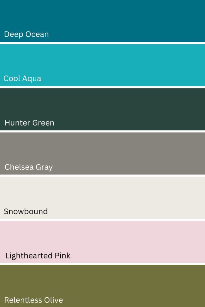
Is Deep Ocean a warm or cool color?
Deep Ocean (2058-30) by Benjamin Moore is a cool-toned paint color. It’s a rich, saturated blue with strong blue and subtle green undertones, which firmly place it on the cool side of the color spectrum.
This depth gives Deep Ocean a crisp, moody feel rather than a soft or cozy warmth. Depending on lighting, it can lean slightly more teal or more navy, but it never shifts into warm territory.
Because of its cool nature, Deep Ocean works especially well in spaces where you want a calm, dramatic, or modern atmosphere, and it pairs beautifully with clean whites, cool grays, and natural wood accents for balance.
Deep Ocean 2058-30 By Benjamin Moore LRV
Deep Ocean has a LRV (Light Reflectance Value) of 14.04. This means the paint color reflects only 14.04% of the light that hits it. This indicates that the color is quite dark and absorbs a significant amount of light, making it a deeper, more intense shade.

Paint Color Samples
Would you like to sample these paint colors? I recommend using a peel and stick paint sample from SAMPLIZE. Peel and stick paint samples are very affordable and easy to use. They are also clean and environmentally friendly!
Advantages of using peel and stick paint samples:
- EASY TO USE: Simply move your SAMPLIZE paint sample around the room to test under a variety of lighting conditions.
- AFFORDABLE: Budget-friendly solution and no more buying inaccurate swatches, rollers, wasted paint.
- SUPER FAST DELIVERY: Depending on your location, 1 day delivery is possible.
- ORDER FROM HOME: Save a trip to the store looking for samples.
- NO MESS: SAMPLIZE uses real paint samples with zero-mess
- NO WASTE: No leftover cans or wasted paint.
2. Cool Aqua 2056-40 Benjamin Moore
Cool Aqua 2056-40 by Benjamin Moore is an excellent choice for small spaces because it brings a refreshing and calming atmosphere that helps make a room feel more open and inviting. The light, airy tone of this aqua blue has a subtle vibrancy that brightens a space without overwhelming it — striking that perfect balance between bold and breezy that small rooms need.
Cool Aqua reflects natural light beautifully, which can help visually expand the dimensions of a smaller room and make walls feel further apart than they actually are. Its cool undertone pairs beautifully with neutral furniture or white accents, enhancing the feeling of spaciousness and keeping the overall look fresh and uncluttered.
Beyond its practical benefits, Cool Aqua brings a soothing, beach-like quality to any space it touches — making it an ideal choice for small bedrooms and bathrooms where you want to feel calm and at ease the moment you walk in. Its clean, watery tone evokes the kind of effortless relaxation that transforms a compact room into a genuine retreat.
Overall, Cool Aqua 2056-40 is a smart, beautiful choice for small spaces — a color that works hard to make a room feel bigger, brighter, and more serene all at once.
Hex Code: #18AFBB
RGB: 25 / 176 / 188

Cool Aqua 2056-40 By Benjamin Moore LRV
Cool Aqua has a LRV (Light Reflectance Value) of 36.77. This means that the color reflects 36.77% of the light that hits it. This places the color in the mid-range of the LRV scale, meaning it is neither too light nor too dark.

Planning a paint project?
Having the right tools for the job is essential for getting smooth, professional results you’ll be proud of while saving time and avoiding costly mistakes.
Check out my list of pro painters tools here.
3. Hunter Green 2041-10 Benjamin Moore
Hunter Green by Benjamin Moore is a bold yet refined color that can make a striking impact in small spaces. Although darker shades are often thought to shrink a room, Hunter Green has the opposite effect when used thoughtfully — its deep, rich tone adds depth and drama, creating a cozy, intimate atmosphere that makes small spaces feel more inviting rather than cramped.
In a small room, Hunter Green works best as an accent wall or in spaces with plenty of natural light, where its dark hue won’t overwhelm but instead will add sophistication and warmth. Its deep, saturated tone gives any compact space an immediate sense of intention and character that lighter colors simply can’t replicate.
Pairing Hunter Green with lighter neutrals like soft whites, creams, or pale grays creates contrast and balance, keeping the space feeling open while adding real personality. Its richness also means it responds beautifully to both natural and warm artificial light — shifting subtly throughout the day in a way that keeps the room feeling dynamic and alive.
Hunter Green also pairs beautifully with natural wood tones, brass, and gold accents, making it an ideal choice for reading nooks, small bedrooms, or a stylish home office where you want a space that feels curated, grounded, and quietly luxurious. Overall, Hunter Green is a fearless yet sophisticated choice for small spaces — proving that going bold and going small are not mutually exclusive.
Hex Code: #2A453D
RGB: 42, 69, 61

Hunter Green 2041-10 By Benjamin Moore LRV
Hunter Green has a LRV (Light Reflectance Value) of 6.39. This means the paint color reflects only 6.39% of the light that hits it. This is a very low LRV, indicating that the color is quite dark and absorbs most of the light rather than reflecting it.

4. Chelsea Gray HC-168 Benjamin Moore
Chelsea Gray by Benjamin Moore is a sophisticated, medium-toned gray that can work wonders in small spaces. Its rich yet balanced hue adds depth and dimension without overwhelming the room — and while some people shy away from darker colors in compact spaces, Chelsea Gray actually creates a cozy, intimate atmosphere that makes the space feel well-defined and purposeful rather than closed in.
What makes Chelsea Gray particularly effective in small spaces is its cool, balanced undertone that reads as polished and refined without ever feeling cold or flat. It gives any compact room an immediate sense of grown-up sophistication that lighter, more neutral shades can struggle to achieve on their own.
Paired with light-colored furniture, white trim, or metallic accents, Chelsea Gray offers a striking contrast that helps visually expand the room and keep it feeling fresh. Its versatility as a neutral backdrop makes it a stylish and practical choice for small living rooms, bedrooms, and home offices alike — adapting effortlessly to a wide range of furniture styles and decor preferences.
The key to making Chelsea Gray shine in a small space is balancing it with ample lighting — whether natural or artificial — to prevent the space from feeling too enclosed. With the right light and the right accents, Chelsea Gray transforms a compact room into something that feels intentional, elegant, and anything but small.
Hex Code: #86847C
RGB: 134, 131, 123

Paint Color Log
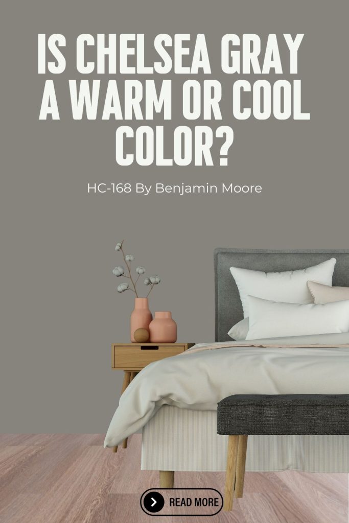
Is Chelsea Gray a warm or cool color?
Chelsea Gray (HC-168) by Benjamin Moore is generally considered a warm gray. While it’s a deep, rich gray, it carries noticeable brown and subtle green undertones that give it warmth rather than a cool, steely feel.
In most lighting, Chelsea Gray reads cozy and grounded, making it feel more inviting than blue-based grays. That warmth allows it to pair beautifully with wood tones, creamy whites, and earthy finishes. Depending on the light and surrounding colors, it can appear slightly more neutral, but it rarely feels cool, which is why it’s often chosen for spaces where a classic, sophisticated, and comfortable look is the goal.
Chelsea Gray HC-168 By Benjamin Moore LRV
Hunter Green has a LRV (Light Reflectance Value) of 23.33. This means that the paint color reflects 23.33% of the light that hits it. This indicates that the color is relatively dark, absorbing more light than it reflects.

5. Snowbound SW 7004 Sherwin Williams
Snowbound SW 7004 by Sherwin-Williams is a fantastic choice for small spaces because of its crisp, clean look and its ability to make a room feel more open and airy. This soft white carries a subtle warmth that prevents it from feeling too stark or clinical — striking that perfect balance between bright and inviting that small spaces need most.
In small spaces, Snowbound reflects both natural and artificial light beautifully, enhancing the sense of spaciousness and making walls feel further apart than they actually are. Its soft, luminous quality means it works just as well in rooms with limited natural light as it does in sun-drenched spaces — consistently delivering that fresh, open feel regardless of the conditions.
One of Snowbound’s greatest strengths is its effortless versatility. It pairs seamlessly with almost any color palette, allowing you to introduce pops of color through furniture, accents, and decor without overwhelming the room. Whether your style leans modern, traditional, coastal, or eclectic, Snowbound provides a clean, adaptable backdrop that lets everything else shine.
This versatile white works beautifully in small bedrooms, kitchens, and bathrooms alike, and can be used on walls, trim, or even cabinetry to create a seamless, cohesive look throughout. Overall, Snowbound is one of those rare whites that makes every small space it touches feel brighter, bigger, and more beautifully put-together.
Hex Code: #EDEAE4
RGB: 237, 234, 228

Snowbound SW 7004 By Sherwin Williams LRV
Snowbound has a LRV (Light Reflectance Value) of 82.56. This means that the paint color reflects 82.56% of the light that hits it. This places the color in the light range, indicating that it is bright and will help make a room feel open and airy by reflecting a lot of natural or artificial light. Colors with high LRVs, like 82.56, are often used to brighten up spaces, especially in areas that need more light or a sense of spaciousness.

6. Lighthearted Pink SW 6568 Sherwin Williams
Lighthearted Pink by Sherwin-Williams is a soft, playful color that makes an excellent choice for small spaces. This blush-toned pink creates a light and airy atmosphere that helps open up compact areas by reflecting more light — bringing warmth and charm to a room without any of the heaviness that bolder colors can sometimes carry.
Its subtle warmth gives any space a cozy and inviting feel without being overwhelming, making it ideal for small bedrooms, nurseries, and reading nooks where you want color that feels gentle, nurturing, and quietly beautiful. Unlike brighter or more saturated pinks, Lighthearted Pink stays soft and muted enough to work in a wide range of spaces and styles without ever feeling too sweet or too bold.
Lighthearted Pink also pairs beautifully with neutral furnishings and soft whites, creating a balanced and soothing palette that adds real personality without overpowering the room. Warm wood accents, natural textures, and simple decor all complement it effortlessly — making it one of the most versatile blush tones available for smaller spaces.
Overall, Lighthearted Pink SW 6568 is a perfect way to introduce color into a small space while maintaining a light, spacious, and welcoming feel. It proves that even the most compact rooms can carry color beautifully — as long as that color is chosen with as much care and thoughtfulness as this one deserves.
Hex code: #EED6DC
RGB: 237 / 213 / 221

Lighthearted Pink SW 6568 By Sherwin Williams LRV
Lighthearted Pink has a LRV (Light Reflectance Value) of 71. This means that the paint color reflects 71% of the light that hits it. A value of 71 indicates that the color is fairly light but not as bright as off-whites or pure whites.
Lighthearted Pink will reflect a good amount of light, helping to make a room feel bright and spacious, but still has enough depth to add warmth and contrast, depending on the surrounding colors and lighting.

7. Relentless Olive SW 6425 Sherwin Williams
Relentless Olive by Sherwin-Williams is a bold yet earthy shade of green that works surprisingly well in small spaces. Rather than making a compact room feel closed in, this rich, deep olive brings a warmth and depth that creates a cozy, intimate atmosphere — the kind that makes a small space feel intentional and curated rather than simply small.
Its warm undertones help foster a soothing, grounded atmosphere that is ideal for spaces where relaxation and comfort are the priority. There is a natural, organic quality to Relentless Olive that feels calming without being flat — giving any small room a sense of quiet sophistication that lighter, more neutral colors can struggle to achieve on their own.
Paired with lighter accents or crisp whites, Relentless Olive creates a striking contrast that makes a small room feel dynamic and layered without overwhelming the space. Natural wood tones, warm brass accents, and linen textures all complement it beautifully — adding depth and richness to the overall look while keeping the space feeling grounded and livable.
Overall, Relentless Olive is a perfect choice for reading nooks, small living rooms, and compact bedrooms where you want a touch of nature-inspired sophistication. It proves that bold, earthy colors and small spaces are not at odds — and that the right shade of green can transform even the most modest room into something that feels warm, beautiful, and full of character.
Hex code: #71713e
RGB: 113 / 113 / 62

Relentless Olive (SW 6425) by Sherwin-Williams LRV
Relentless Olive has a LRV (Light Reflectance Value) of 16. This means that the paint color reflects 16% of the light that hits it. This indicates the color is quite dark, as it absorbs most of the light and reflects only a small amount. These colors are often used for accent walls, in smaller spaces where a more dramatic look is desired, or to create contrast against lighter colors.
