
Need to know how much paint for your project?
Calculate gallons needed and estimated cost — free.
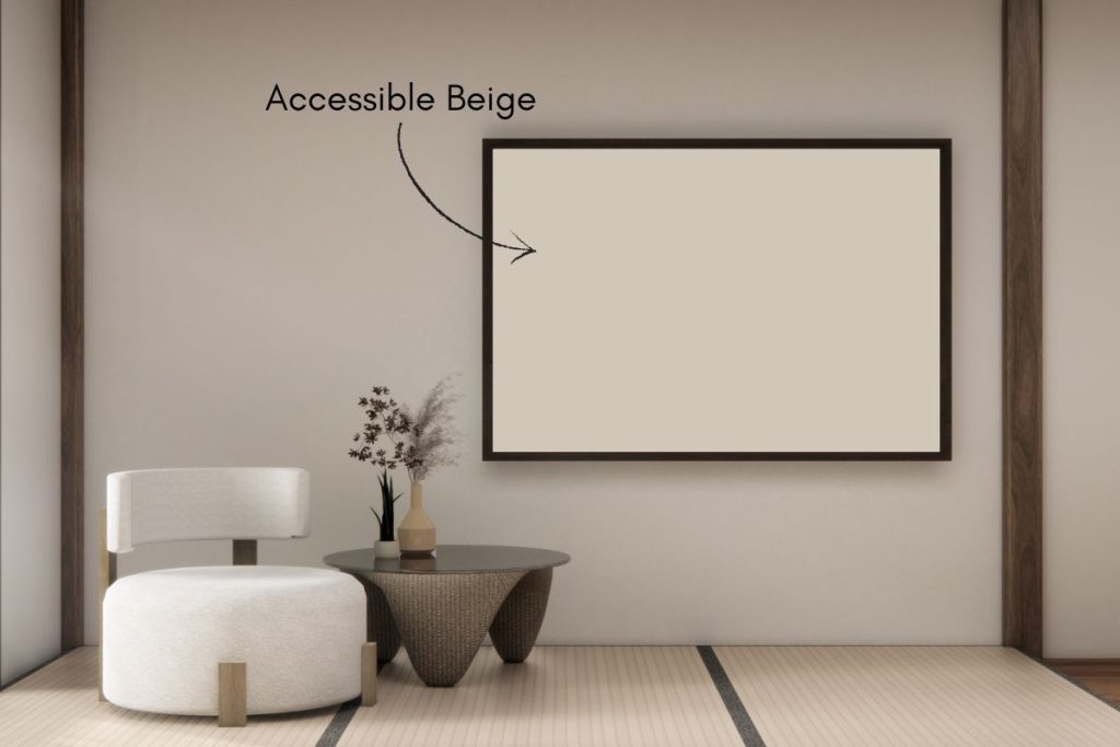
Accessible Beige color description
Accessible Beige by Sherwin Williams is a warm, versatile neutral that brings a soft, welcoming vibe to any space. With gentle gray undertones, this balanced beige leans slightly warm without feeling too yellow or too cool. Its Light Reflectance Value (LRV) of 58 means it reflects a fair amount of light, helping rooms feel open and airy while still adding subtle depth.
Accessible Beige pairs beautifully with crisp whites, warm woods, and soft blues, making it a perfect fit for modern, farmhouse, or traditional homes. It’s especially popular for living rooms, bedrooms, and open-concept spaces where you want a cozy, effortless backdrop.
Is Accessible Beige a warm or cool color?
Accessible Beige has a hue value of 36°, which places it in the warm color family. This means it has a soft, subtle orange influence that gives it a gentle warmth without feeling too bold or overpowering.

Paint Color Log
Accessible Beige LRV
Light Reflectance Value (LRV) is a measurement, expressed as a percentage from 0 to 100, that indicates how much light a color reflects. An LRV of 0 means the color absorbs all light (pure black), while an LRV of 100 means the color reflects all light (pure white).
In practical terms, lighter colors with higher LRVs make spaces feel brighter and more open, while darker colors with lower LRVs create a more intimate, cozy atmosphere by absorbing more light.
Accessible Beige has a Light Reflectance Value (LRV) of 58, which means it reflects 58% of the light that hits it. This makes it a balanced mid-tone color that’s not too light or too dark. It helps spaces feel open and soft while still adding warmth and subtle depth. In bright rooms, it can appear lighter and more airy, while in darker spaces, it creates a cozy, grounded feel. This versatility makes Accessible Beige a great choice for a wide range of rooms and lighting conditions.


Accessible Beige coordinating colors

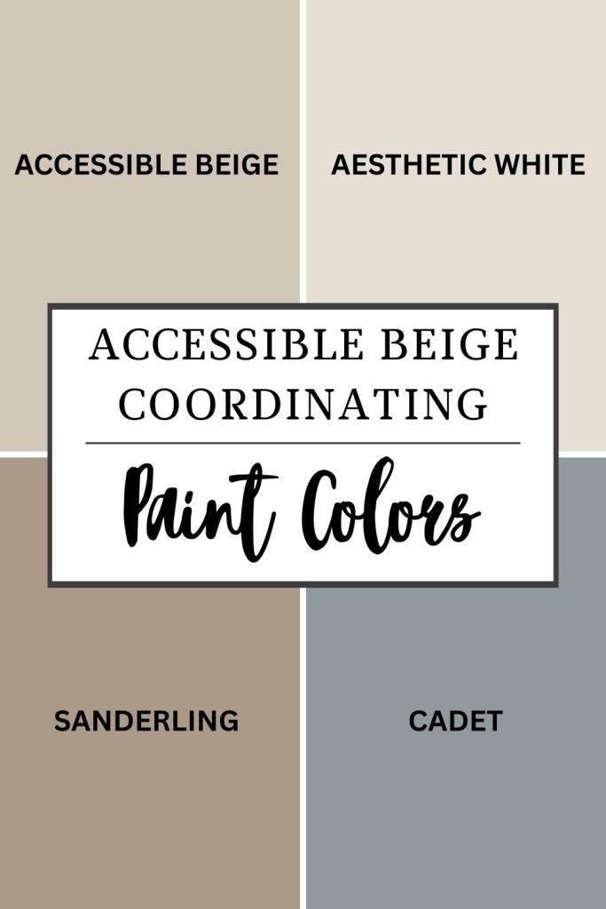
Paint Samples:
Peel-and-Stick Paint Sample – Accessible Beige (7036) – Sherwin-Williams
Peel-and-Stick Paint Sample – Aesthetic White (7035) – Sherwin-Williams
Peel-and-Stick Paint Sample – Sanderling (7513) – Gray – Sherwin-Williams
Peel-and-Stick Paint Sample – Cadet (9143) – Gray – Sherwin-Williams
How Natural Lighting Affects Accessible Beige
The way a color looks can really change depending on where the natural light is coming from:
North-facing rooms
In north-facing rooms, the light is naturally cool and a bit bluish. Accessible Beige’s warm greige undertones work to soften that coolness, though the color may lean slightly more toward its gray side in this lighting. It won’t look cold or stark, but rather creates a sophisticated, calm atmosphere. The beige warmth keeps the room from feeling too chilly, making it an excellent neutral that feels grounded and serene.
South-facing rooms
In south-facing rooms, you get plenty of bright, warm sunshine all day long. This abundant light really amplifies the warm beige undertones in Accessible Beige, making it look richer and more golden-tan. The color takes on a beautiful, sun-kissed quality that makes the space feel inviting and cozy. It’s a perfect choice for living rooms, bedrooms, or dining areas where you want a warm, enveloping atmosphere without the color looking too intense or yellow.
East-facing rooms
In east-facing rooms, the light starts out warm and yellow in the morning but turns cooler and slightly blue by the afternoon. Accessible Beige responds beautifully to this shift—it will appear warmer and more beige-forward in the morning light, creating a welcoming start to your day. As afternoon arrives and the light cools, the color reveals more of its greige character, looking more balanced and neutral. This natural transformation adds depth and interest to the room throughout the day.
West-facing rooms
In west-facing rooms, the light changes from cool in the morning to a warm, golden glow in the late afternoon and evening. Accessible Beige adapts beautifully to these changes. In the morning’s cooler light, it appears as a soft, neutral greige that feels fresh and understated. As the day progresses and warm golden light floods in, the beige undertones come alive, creating a rich, cozy atmosphere that’s perfect for unwinding. This makes it an ideal choice for family rooms, home offices, or bedrooms where you spend time throughout the entire day.

Do Light Bulbs Affect How Paint Colors Look?
Absolutely. Just like natural light, artificial lighting changes how paint appears. The color temperature of your light bulbs—measured in Kelvins (K)—plays a big role.
- Lower K (2700K–3000K) = warm, yellow light (soft white)
- Higher K (4000K–5000K+) = cool, white to bluish light (bright/daylight)
Choosing the right bulb can make a big difference in how your paint color looks on the wall.
I recommend using these types of light bulbs.
Check out my recommended pro painters tools here!
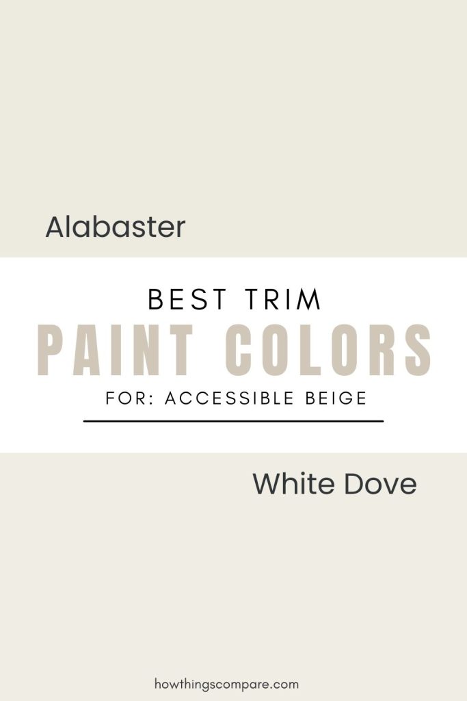
Best Trim Color Combinations for Accessible Beige
For a soft, cohesive look, pair Accessible Beige with a warm white trim rather than a bright or cool white. Warm whites complement the beige and greige undertones in Accessible Beige without creating harsh contrast that can make the walls look dingy by comparison.
Great options to consider are Sherwin-Williams Alabaster (SW 7008) and Marshmallow (SW 7001), or Benjamin Moore White Dove and Cotton Balls (OC-122). All of these sit in the warm white family and will keep your space feeling pulled together and harmonious. Just avoid bright, cool whites like Extra White or Chantilly Lace as they can clash with Accessible Beige’s warm undertones and make the overall palette feel disconnected.
Accessible Beige similar colors


Paint samples:
Peel-and-Stick Paint Sample – Agreeable Gray (7029) – Sherwin-Williams
Peel-and-Stick Paint Sample – Balanced Beige (7037) – Sherwin-Williams
Peel-and-Stick Paint Sample – Natural Linen (9109) – Sherwin-Williams
Peel-and-Stick Paint Sample – Natural Tan (7567) – Sherwin-Williams
Paint Color Samples
Would you like to sample these paint colors? I recommend using a peel and stick paint sample from SAMPLIZE. Peel and stick paint samples are very affordable and easy to use. They are also clean and environmentally friendly!
Advantages of using peel and stick paint samples:
- EASY TO USE: Simply move your SAMPLIZE paint sample around the room to test under a variety of lighting conditions.
- AFFORDABLE: Budget-friendly solution and no more buying inaccurate swatches, rollers, wasted paint.
- SUPER FAST DELIVERY: Depending on your location, 1 day delivery is possible.
- ORDER FROM HOME: Save a trip to the store looking for samples.
- NO MESS: SAMPLIZE uses real paint samples with zero-mess
- NO WASTE: No leftover cans or wasted paint.
Planning a paint project?
Having the right tools for the job is essential for getting smooth, professional results you’ll be proud of while saving time and avoiding costly mistakes.
Check out my list of pro painters tools here.