Choosing the right paint color can transform any space, giving it personality and style.
Sherwin Williams offers a wide range of colors, but one that stands out in its collection is the brave purple hue.
This color strikes a balance between boldness and sophistication, making it a versatile choice for both residential and commercial interiors.
Before deciding on this vibrant shade, it’s important to consider the various aspects that come with incorporating purple into your decor.
The hue can influence the ambiance of a room, evoking creativity and luxury when used effectively.
Additionally, understanding the paint’s properties, such as its finish and how it interacts with different lighting, is crucial for achieving the desired effect.
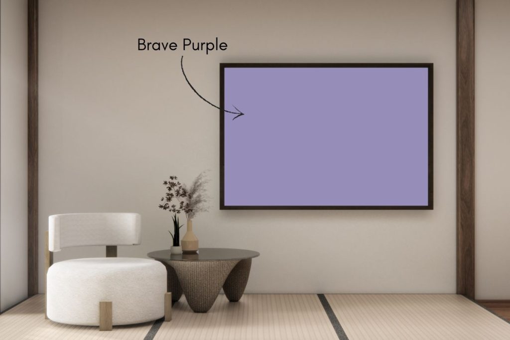
Sherwin Williams’ Brave Purple is more than just a paint color; it’s a design statement.
It complements a wide range of styles, from modern minimalism to bohemian chic, offering decorators a unique opportunity to make a space truly their own.
Whether it’s used for an accent wall or as a bold room feature, this purple paint color guides homeowners towards creating a space that is as daring as it is delightful.

Need to know how much paint for your project?
Calculate gallons needed and estimated cost — free.
Paint name: Brave Purple
Manufacturer number: 6823
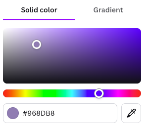
Hex code: #968DB8
RGB: 150, 141, 184
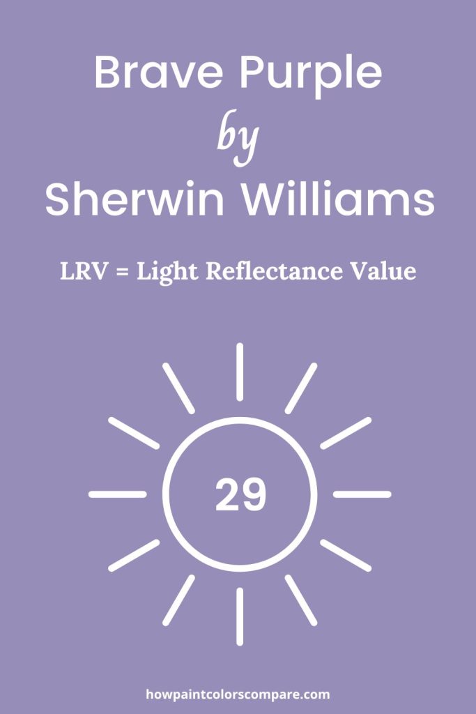
LRV: 29
Brave Purple color description
Brave Purple (SW 6823) is a rich, saturated violet with cool, jewel-toned depth that brings a bold, dramatic energy to any space. With a Light Reflectance Value (LRV) of 29, it absorbs more light than it reflects, creating an intimate, enveloping atmosphere that feels both moody and sophisticated.
This striking shade pairs beautifully with crisp whites, warm metallics like gold and brass, deep charcoals, and natural wood tones, making it a stunning choice for accent walls, dining rooms, or any space where you want to make a statement.
Is Brave Purple a warm or cool color?
Brave Purple is generally a cool color. Purple sits on the cool side of the color wheel, leaning into blue-violet territory, which gives it that bold, jewel-toned quality. This cool undertone is part of what makes it feel so dramatic and vibrant in a space.
That said, some purples can read warmer depending on how much red is in them. Brave Purple, being a true, saturated violet, leans cool rather than warm — which is why pairing it with warm neutrals like beige or warm white helps balance it out and keeps the space from feeling too cold or stark.
Brave Purple LRV
Light Reflectance Value (LRV) is a measurement, expressed as a percentage from 0 to 100, that indicates how much light a color reflects. An LRV of 0 means the color absorbs all light (pure black), while an LRV of 100 means the color reflects all light (pure white).
In practical terms, lighter colors with higher LRVs make spaces feel brighter and more open, while darker colors with lower LRVs create a more intimate, cozy atmosphere by absorbing more light.
Brave Purple has a Light Reflectance Value (LRV) of 29, meaning it reflects just 29% of the light that hits it. This makes it a medium-dark color that absorbs more light than it reflects, giving it that rich, immersive quality that can make a space feel intimate and cocooning.
In bright, well-lit rooms, Brave Purple’s true vibrancy comes alive, showing off its bold violet depth. In darker spaces or lower light, it deepens further into a moodier, more dramatic tone. This sensitivity to lighting conditions means it’s worth testing in your specific space before committing, as the difference between a sun-drenched room and a north-facing one can significantly shift how the color reads on your walls.

Brave Purple Paint Color Samples
Would you like to sample Brave Purple paint color? I recommend using a peel and stick paint sample from SAMPLIZE. Peel and stick paint samples are very affordable and easy to use. They are also clean and environmentally friendly!
Advantages of using peel and stick paint samples:
- EASY TO USE: Simply move your SAMPLIZE paint sample around the room to test under a variety of lighting conditions.
- AFFORDABLE: Budget-friendly solution and no more buying inaccurate swatches, rollers, wasted paint.
- SUPER FAST DELIVERY: Depending on your location, 1 day delivery is possible.
- ORDER FROM HOME: Save a trip to the store looking for samples.
- NO MESS: SAMPLIZE uses real paint samples with zero-mess
- NO WASTE: No leftover cans or wasted paint.
Get your peel-and-stick real paint sample of Brave Purple here.
Peel-and-Stick Paint Sample – Brave Purple (6823) – Sherwin-Williams

Visit SAMPLIZE store here to see all of the available color options.
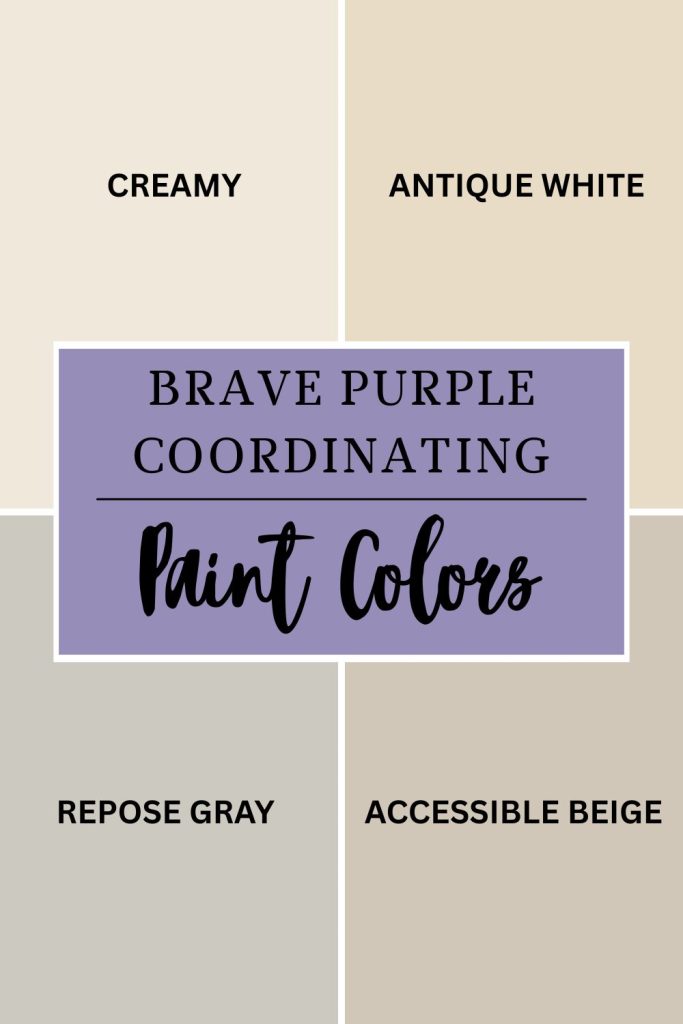
Brave Purple coordinating colors
When you choose a bold color like Brave Purple, the colors around it matter just as much as the star of the show. Coordinating colors are the supporting cast — shades that work in harmony with your main color to create a space that feels intentional and balanced rather than chaotic.
The right coordinating colors can do a lot of heavy lifting. They can dial back Brave Purple’s intensity in rooms where you want the vibe to feel sophisticated rather than overwhelming, or they can lean into its richness and help it shine even brighter. Either way, the goal is a space where every color feels like it belongs.
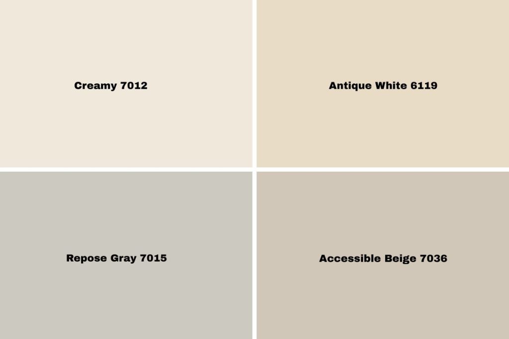
SW 7012 Creamy – A soft, warm white with just enough creaminess to soften Brave Purple’s cool intensity without competing with it.
SW 6119 Antique White – A gentle, warm off-white that grounds the boldness of Brave Purple and adds a classic, balanced feel.
SW 7015 Repose Gray – A popular neutral gray with slight violet undertones that naturally complement Brave Purple, making it one of the most harmonious pairings you can find.
SW 7036 Accessible Beige – a warm, greige neutral that takes the edge off Brave Purple’s intensity while keeping the overall look feeling polished and put-together.
Paint Samples:
Sherwin-Williams Large Peel-and-Stick Paint Sample – Creamy (7012)
Sherwin-Williams Large Peel-and-Stick Paint Sample – Antique White (6119)
Sherwin-Williams Large Peel-and-Stick Paint Sample – Repose Gray (7015)
Sherwin-Williams Large Peel-and-Stick Paint Sample – Accessible Beige (7036)
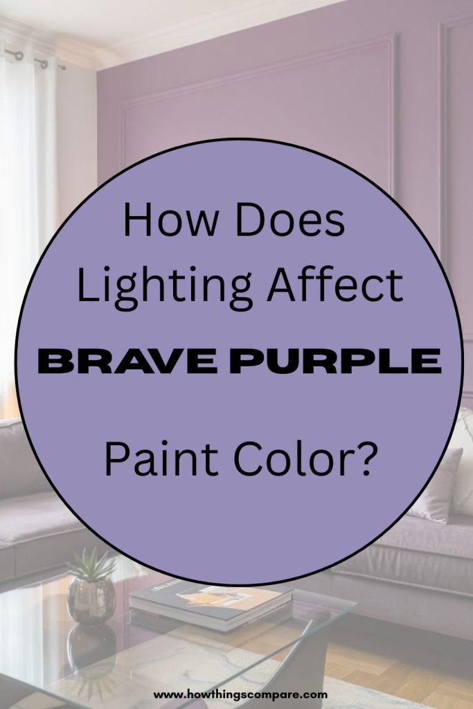
How Lighting Affects Brave Purple
Light has a surprisingly powerful influence on how color appears to the eye. The color itself stays the same, but the way we perceive it can shift dramatically depending on the light source illuminating it.
Let’s look at artificial and natural lighting.
Artificial lighting can pull Brave Purple in very different directions. Warm-toned bulbs draw out a softer, more sumptuous side of the color, wrapping the room in a cozy, intimate feel. Switch to cooler daylight bulbs and the purple shifts — becoming more vivid and energetic, giving the space a livelier, more dynamic edge.
Natural light tells a different story throughout the day. In the morning, softer light gives Brave Purple a gentle, approachable quality. By midday, with stronger direct sunlight flooding in, the color hits its most vibrant and saturated point. Come evening, as daylight fades, it settles into something deeper and more luxurious — almost like a completely different color than what you saw at sunrise.
Here’s something worth knowing before you commit to Brave Purple — the direction your room faces can completely change how the color feels to live with day to day.
North-facing rooms get the least direct sunlight, which can make Brave Purple lean cooler and slightly more muted. It still looks gorgeous, but expect a moodier, more subdued version of the color. Layering in warm lighting and cozy textures can really help here.
South-facing rooms are where Brave Purple gets to truly strut its stuff. Bathed in consistent, generous light throughout the day, the color stays vibrant and rich, feeling bold and inviting all at once — a real showstopper.
East-facing rooms offer a beautiful morning moment where Brave Purple glows with warmth and softness as the morning sun streams in. As the day moves on and the light shifts away, it gradually settles into something cooler and more relaxed — almost like two different moods in one room.
West-facing rooms flip that experience entirely. Mornings are quieter and more subdued, but come afternoon and evening, the setting sun floods in and transforms Brave Purple into something truly dramatic and warm — perfect if you spend your evenings in that space.
Planning a paint project?
Having the right tools for the job is essential for getting smooth, professional results you’ll be proud of while saving time and avoiding costly mistakes.
Check out my list of pro painters tools here.
Do Light Bulbs Affect How Paint Colors Look?
Absolutely. Just like natural light, artificial lighting changes how paint appears. The color temperature of your light bulbs—measured in Kelvins (K)—plays a big role.
- Lower K (2700K–3000K) = warm, yellow light (soft white)
- Higher K (4000K–5000K+) = cool, white to bluish light (bright/daylight)
Choosing the right bulb can make a big difference in how your paint color looks on the wall.
I recommend using these types of light bulbs.
Check out my recommended pro painters tools here!
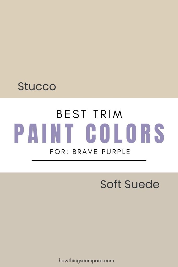
Best Trim Color Combinations for Brave Purple
Trim colors are one of those details that might seem minor but can make or break the finished look of a room. Think of trim as the frame around a painting — it defines the edges, ties everything together, and draws the eye to the features that matter most. Door frames, window casings, baseboards, and crown molding all act as visual boundaries in a space, and the color you choose for them quietly shapes how the entire room is perceived.
With a bold wall color like Brave Purple, trim becomes especially important. The right trim color can ground the boldness of the purple, giving the eye a place to rest and preventing the space from feeling too intense. It can also sharpen the room’s architectural details, making ceilings feel taller, windows feel larger, and the overall space feel more polished and intentional. Whether you go for a clean contrast or a softer, more tonal approach, a well-chosen trim color is what takes a room from simply painted to genuinely designed.
I recommend Stucco SW 7569 and Soft Suede SW 9577.
Stucco SW 7569 is a warm, greige neutral that provides just enough contrast against Brave Purple without competing with it, creating a grounded, sophisticated look that feels intentional and polished. Its earthy warmth counterbalances the cool boldness of the purple, making the two work together in a way that feels natural and cohesive.
Soft Suede SW 9577 brings a similar warmth but with a slightly deeper, more velvety quality that echoes the richness of Brave Purple beautifully. Rather than creating sharp contrast, it offers a more tonal, layered pairing that feels luxurious and refined — perfect for spaces where you want elegance over drama.
Brave Purple similar colors
Paint Samples:
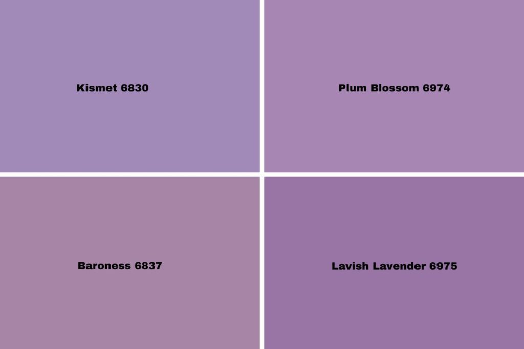
Sherwin-Williams Peel-and-Stick Paint Sample by Samplize – Kismet (6830)
Sherwin-Williams Peel-and-Stick Paint Sample by Samplize – Baroness (6837)