Iron ore is a strong and versatile color that fits well in many design schemes. Let’s explore some colors that pair beautifully with it. One great color to complement iron ore is crisp white. The contrast between these two gives a clean and modern look.
We also love how iron ore works with a soft, light gray. This combination creates a sleek, calming atmosphere that’s perfect for any room. Another stunning match is a deep, rich green. It adds a touch of nature and sophistication.
Bright colors can also work wonders with iron ore. For instance, vibrant yellow can provide a lively and cheerful burst that brightens up the whole space. Each of these combinations can transform your home and highlight the unique features of the iron ore color.
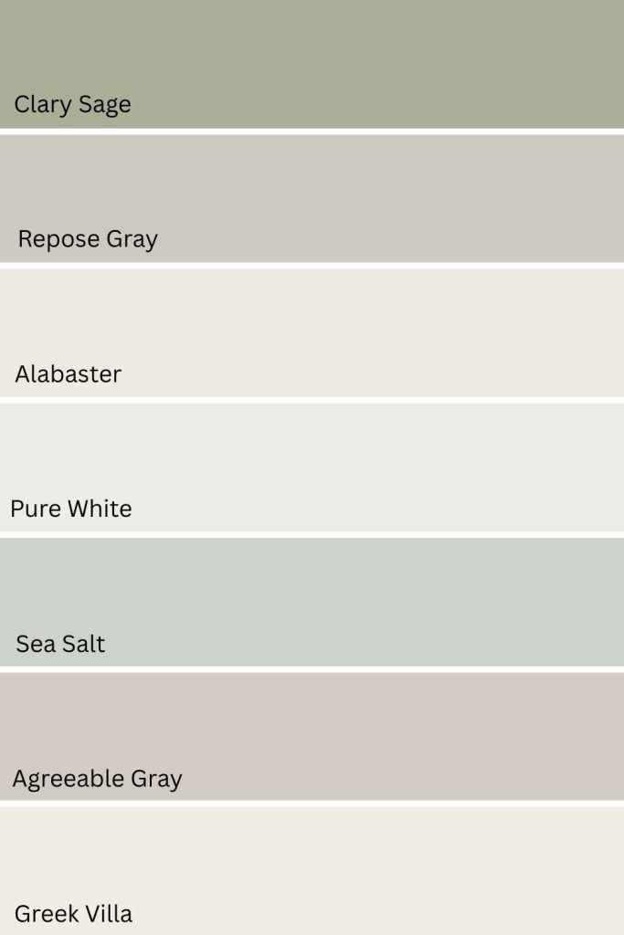
Here are 7 colors that go with Iron Ore. Click the link below each color to get a peel and stick color sample from Samplize.
Need to know how much paint for your project?
Calculate gallons needed and estimated cost — free.
Iron Ore


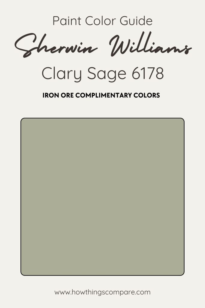
1. Clary Sage SW 6178
Clary Sage is a soothing, muted green with enough grey in its undertones to sit comfortably alongside Iron Ore’s deep charcoal intensity.
Rather than competing with such a bold color, Clary Sage softens the palette and brings a quiet, nature-inspired calm to the space — keeping it from feeling too heavy or one-dimensional.
It pairs beautifully with natural wood finishes and warm metallic accents, and works just as naturally in a modern living room as it does in a traditional bedroom or kitchen.
For rooms that lean into an organic, earthy aesthetic, this is a pairing worth considering.
- Paint name: Clary Sage
- Manufacturer number: 6178
- Hex code: #ACAD97
- RGB: 172 / 173 / 151
- LRV: 41
Clary Sage

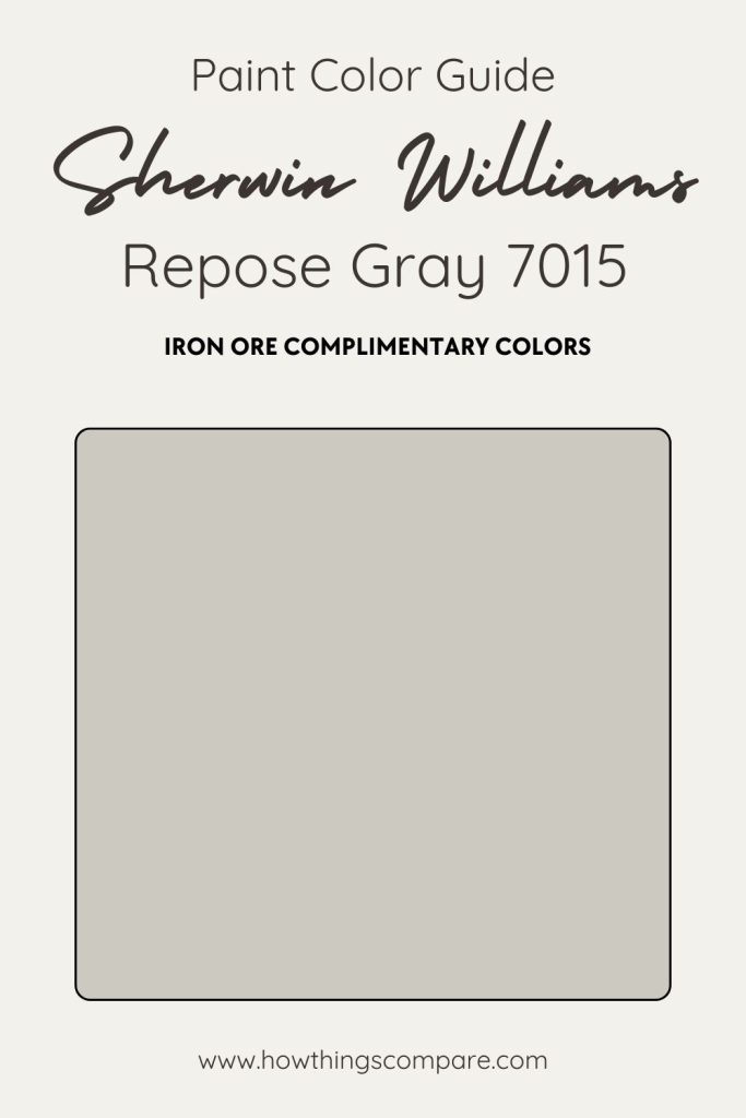
2. Repose Gray SW 7015
Repose Gray is one of Sherwin-Williams’ most popular neutrals for good reason. It’s a soft, balanced warm gray that brings a calm, refined quality to any space.
Its undertones are subtle and complex, leaning slightly warm with a hint of violet that can shift depending on your lighting and surrounding finishes, so it’s worth testing a sample before committing. Paired with Iron Ore, it creates a sophisticated contrast that feels intentional and cohesive — the lighter, airy quality of Repose Gray balancing beautifully against Iron Ore’s deep charcoal weight.
This is a pairing that works across living rooms, bedrooms, and kitchens alike. Repose Gray’s versatility means it responds well to crisp white trim, warm wood tones, and soft furnishings without competing with any of them — letting Iron Ore remain the bold anchor of the space while keeping the overall palette feeling polished and livable.
- Paint name: Repose Gray
- Manufacturer number: 7015
- Hex code: #CCC9C0
- RGB: 204 / 201 / 192
- LRV: 58
Repose Gray

Peel And Stick Paint Color Samples
Would you like to sample these paint colors? I recommend using a peel and stick paint sample from SAMPLIZE. Peel and stick paint samples are very affordable and easy to use. They are also clean and environmentally friendly!
Advantages of using peel and stick paint samples:
- EASY TO USE: Simply move your SAMPLIZE paint sample around the room to test under a variety of lighting conditions.
- AFFORDABLE: Budget-friendly solution and no more buying inaccurate swatches, rollers, wasted paint.
- SUPER FAST DELIVERY: Depending on your location, 1 day delivery is possible.
- ORDER FROM HOME: Save a trip to the store looking for samples.
- NO MESS: SAMPLIZE uses real paint samples with zero-mess
- NO WASTE: No leftover cans or wasted paint.

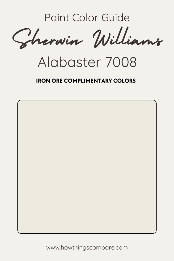
3. Alabaster SW 7008
Alabaster is one of Sherwin-Williams’ most beloved warm whites — a soft, creamy shade that creates a striking yet balanced contrast alongside Iron Ore’s deep charcoal intensity.
Where Iron Ore anchors a space with weight and drama, Alabaster lifts it, keeping the overall palette from feeling too heavy or closed in. It’s one of those pairings that works precisely because the two colors couldn’t be more different — and yet they complement each other effortlessly.
What makes Alabaster particularly well-suited to this combination is its warmth. Unlike a crisp, cool white that might feel stark against Iron Ore’s cool-dark tone, Alabaster brings just enough creaminess to keep the contrast feeling inviting rather than jarring.
It works beautifully on trim, ceilings, or cabinetry alongside Iron Ore walls, and pairs naturally with warm wood tones and natural textures for a space that feels both sophisticated and lived-in.
- Paint name: Alabaster
- Manufacturer number: 7008
- Hex code: #EDEAE0
- RGB: 237 / 234 / 224
- LRV: 82
Alabaster

Planning a paint project?
Having the right tools for the job is essential for getting smooth, professional results you’ll be proud of while saving time and avoiding costly mistakes.
Check out my list of pro painters tools here.
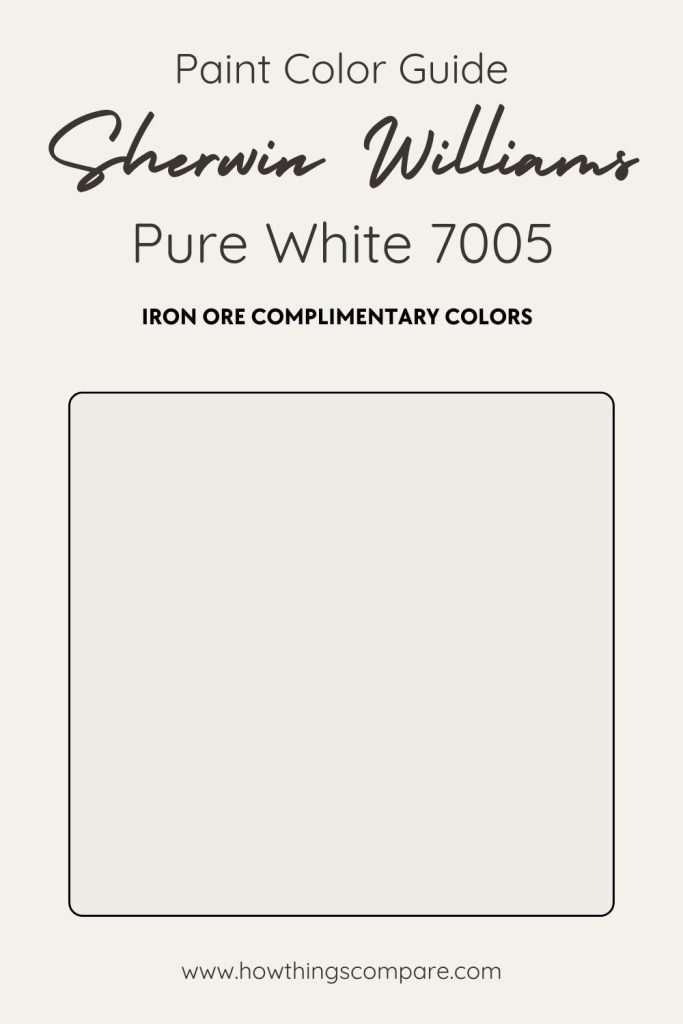
4. Pure White SW 7005
Pure White is a clean, bright white with just enough warmth to keep it from feeling cold or stark. That balance is exactly what makes it such a natural companion to Iron Ore.
The contrast between the two is bold and deliberate, the kind of pairing that defines a space rather than simply decorating it. Iron Ore brings the depth and drama while Pure White provides the crisp, airy counterpoint that stops the room from feeling too heavy or enclosed.
It’s an especially effective combination in modern and minimalist interiors, where the clean lines of Pure White trim or cabinetry against Iron Ore walls create a graphic, high-contrast look that feels intentional and refined.
In rooms with generous natural light, Pure White reflects beautifully, amplifying the brightness and keeping the space feeling open despite the presence of such a deep anchor color. It works just as well on exteriors too. Pure White siding or trim alongside Iron Ore accents creates a striking curb appeal that feels both timeless and contemporary.
- Paint name: Pure White
- Manufacturer number: 7005
- Hex code: #EDECE6
- RGB: 237 / 236 / 230
- LRV: 84
Pure White

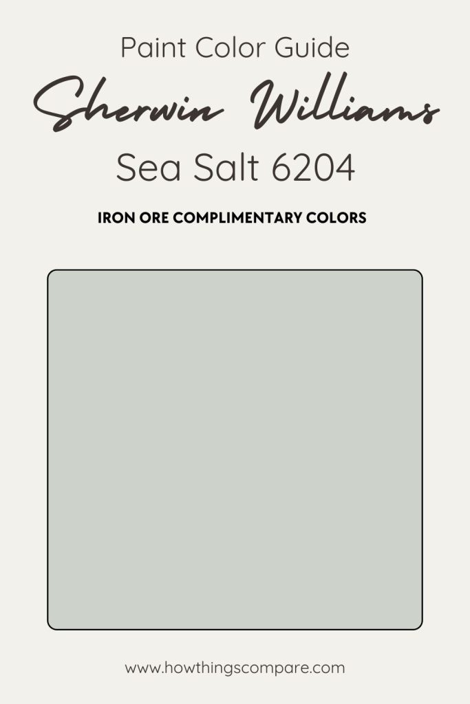
5. Sea Salt SW 6204
Sea Salt is a soft, spa-inspired blue-green that brings a quietly refreshing quality to any pairing with Iron Ore. Its cool, muted undertones work in interesting contrast to Iron Ore’s deep charcoal weight — where Iron Ore feels grounded and dramatic, Sea Salt feels airy and restorative, creating a balance that is both visually compelling and surprisingly calming.
This combination works particularly well in bathrooms and bedrooms where a spa-like atmosphere is the goal. Sea Salt’s cool, watery quality amplifies that sense of tranquility while Iron Ore accents on vanities, doors, or trim add definition and sophistication.
In living rooms and kitchens it’s equally effective, lending a fresh, coastal-inspired energy that keeps the space feeling light and open despite the presence of such a deep anchor color. It’s a pairing that feels considered and cohesive rather than expected, making it a strong choice for anyone wanting something beyond the standard neutral palette.
- Paint name: Sea Salt
- Manufacturer number: 6204
- Hex code: #CDD2CA
- RGB: 205 / 210 / 202
- LRV: 63
Sea Salt

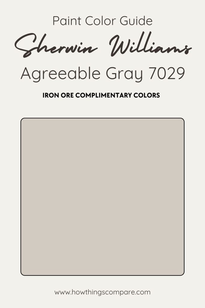
6. Agreeable Gray SW 7029
Agreeable Gray is one of Sherwin-Williams’ most trusted neutrals, and its warm greige tone makes it a natural companion to Iron Ore.
The pairing works because the two colors occupy opposite ends of the tonal spectrum without clashing. Agreeable Gray’s soft warmth providing a livable backdrop that lets Iron Ore’s deep charcoal presence anchor the space without overwhelming it.
In kitchens, Iron Ore cabinets against Agreeable Gray walls strikes a balance that feels both grounded and bright, especially alongside stainless steel appliances or warm brass hardware. In living rooms and bedrooms, Agreeable Gray walls with Iron Ore trim or doors create a sophisticated contrast that works equally well in traditional, transitional, and modern interiors.
- Paint name: Agreeable Gray
- Manufacturer number: 7029
- Hex code: #D1CBC1
- RGB: 209 / 203 / 193
- LRV: 60
Agreeable Gray

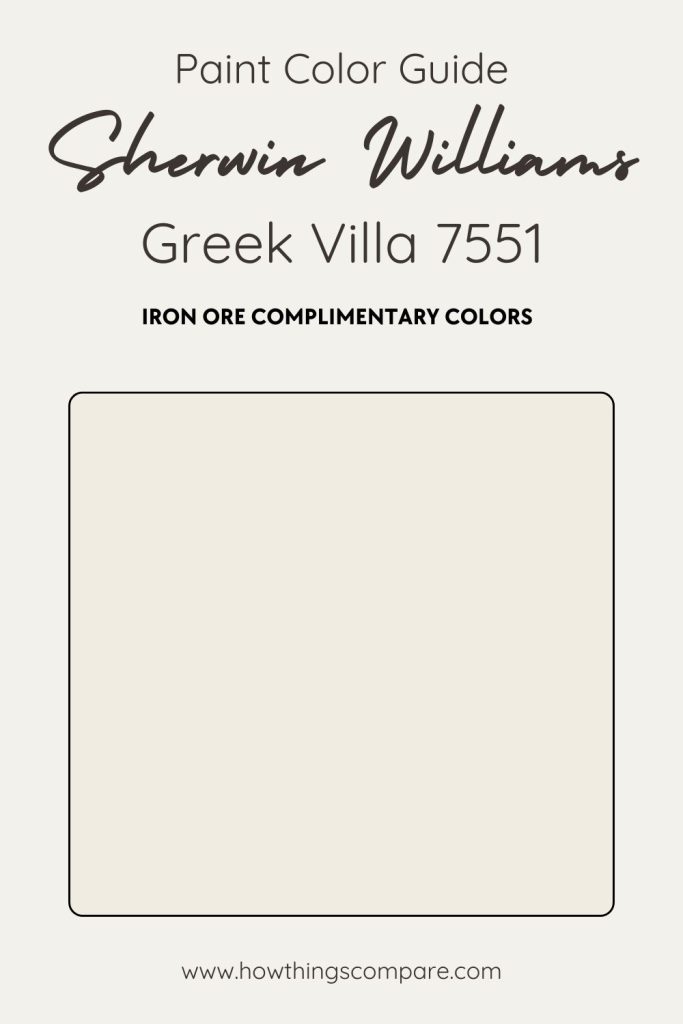
7. Greek Villa SW 7551
Greek Villa is a warm, inviting white with creamy undertones that create a beautifully soft contrast alongside Iron Ore’s deep charcoal intensity.
Unlike cooler whites that can feel stark against such a dark anchor color, Greek Villa’s warmth keeps the pairing feeling balanced and inviting — bright enough to lift the space without stripping away the cozy, grounded atmosphere that Iron Ore brings.
It works particularly well on trim, ceilings, and doors where a warm white is needed to complement rather than compete with Iron Ore walls. The combination sits naturally alongside wood tones and natural stone, making it a strong choice for kitchens, living rooms, and bathrooms where warmth and texture are part of the design story.
On exteriors, Greek Villa siding or trim against Iron Ore accents creates a timeless, high-contrast look that feels both classic and fresh.
- Paint name: Greek Villa
- Manufacturer number: 7551
- Hex code: #F0ECE2
- RGB: 240 / 236 / 226
- LRV: 84
Greek Villa