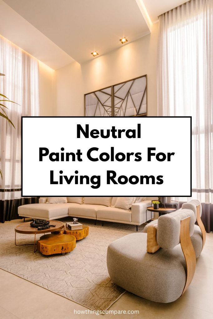
In this article, you’ll learn more about the paint colors Barely Beige, Windsor Cream, and Impressive Ivory. These warm, versatile neutrals are excellent choices for living room walls because they create a welcoming and timeless look that works with many styles and lighting conditions.
If you’re considering one of these shades for your home, be sure to test it first. You can click the link below each color to order a peel-and-stick paint sample from Samplize, so you can see how it looks in your space before making a final decision.
Need to know how much paint for your project?
Calculate gallons needed and estimated cost — free.
Definitions
Hex Code
A hex code is a six-character alphanumeric code used to represent a specific color by defining the combination of red, green, and blue (RGB) values that make it up. Each pair of characters in the code corresponds to one of the three color channels. Hex codes are widely used by web designers and developers because they offer a compact, standardized way to specify colors in HTML, CSS, and other digital design tools, making color referencing faster and more efficient than writing out full RGB values.
RGB Code
RGB stands for Red, Green, and Blue — the three primary colors of light. Every color on a digital screen is created by combining these three channels at varying intensities, each ranging from 0 to 255. The RGB color model has roots in the early study of light and color perception and became widely adopted in print media throughout the 20th century, appearing in everything from cartoons to advertisements.
It is worth noting an important distinction between paint colors and digital colors. In painting and print, the traditional primary colors are red, blue, and yellow, and combining all pigments together produces black. In the light spectrum, however, the primary colors are red, green, and blue, and combining all light together produces white. This is why a prism can split white light into the full visible color spectrum.
LRV
LRV, or Light Reflectance Value, measures how much light a paint color reflects off a surface. It is expressed on a scale from 0 to 100, where 0 represents absolute black, which absorbs all light, and 100 represents absolute white, which reflects all light. In practical terms, the higher a color’s LRV, the brighter and lighter it will appear on your walls. LRV is a useful tool when selecting paint colors, as it helps predict how light or dark a color will look in a space under real lighting conditions.
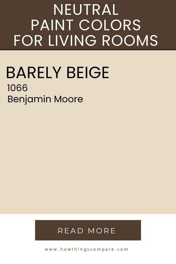
Barely Beige (1066) by Benjamin Moore
Barely Beige (1066) by Benjamin Moore is a warm, light beige color that offers a soft and inviting appearance that can enhance a variety of spaces. It provides a subtle hint of color that is versatile and adaptable, making it a popular choice for a variety of interior settings.
Pair Barely Beige with complementary colors to create a balanced and cohesive design, suitable for any room in your home.
Hex Code: #EADBC4
RGB: 234, 219, 196
LRV: 71.32

Best uses for Barely Beige:
- Living Rooms: Creates a warm and welcoming atmosphere, serving as a perfect neutral backdrop for furniture and decor.
- Bedrooms: Offers a calming and restful environment, ideal for creating a cozy and comfortable space.
- Kitchens: Works well with both modern and traditional kitchen designs, pairing beautifully with white or wooden cabinetry.
- Bathrooms: Provides a clean and fresh look, enhancing a sense of space and light.
- Hallways and Entryways: Gives a bright and airy feel, making these transitional spaces more inviting.
- Dining Rooms: Adds a touch of elegance without overpowering the room, allowing dining furniture and accents to stand out.
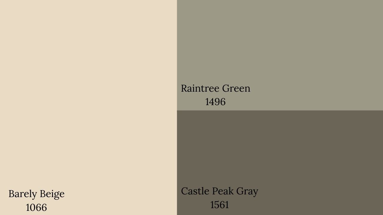
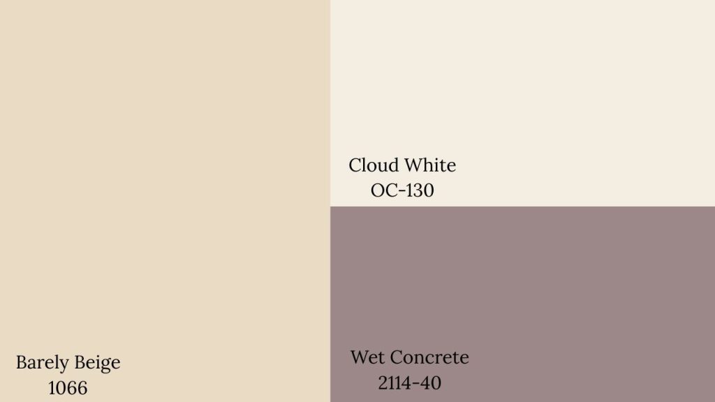
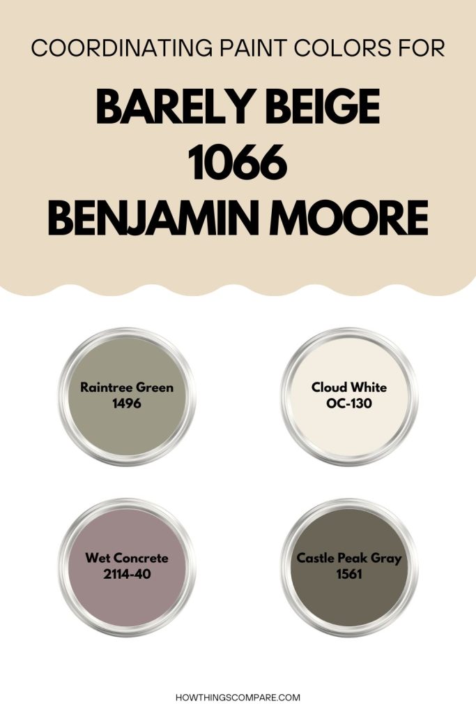
Barely Beige coordinating colors:
Coordinating colors for Barely Beige include:
- Raintree Green 1496 by Benjamin Moore
- Castle Peak Gray 1561 by Benjamin Moore
- Cloud White OC-130 by Benjamin Moore
- Wet Concrete 2114-40 by Benjamin Moore
Get a peel and stick paint sample of Barely Beige (1066) here.
Paint Color Samples
Would you like to sample these paint colors? I recommend using a peel and stick paint sample from SAMPLIZE. Peel and stick paint samples are very affordable and easy to use. They are also clean and environmentally friendly!
Advantages of using peel and stick paint samples:
- EASY TO USE: Simply move your SAMPLIZE paint sample around the room to test under a variety of lighting conditions.
- AFFORDABLE: Budget-friendly solution and no more buying inaccurate swatches, rollers, wasted paint.
- SUPER FAST DELIVERY: Depending on your location, 1 day delivery is possible.
- ORDER FROM HOME: Save a trip to the store looking for samples.
- NO MESS: SAMPLIZE uses real paint samples with zero-mess
- NO WASTE: No leftover cans or wasted paint.

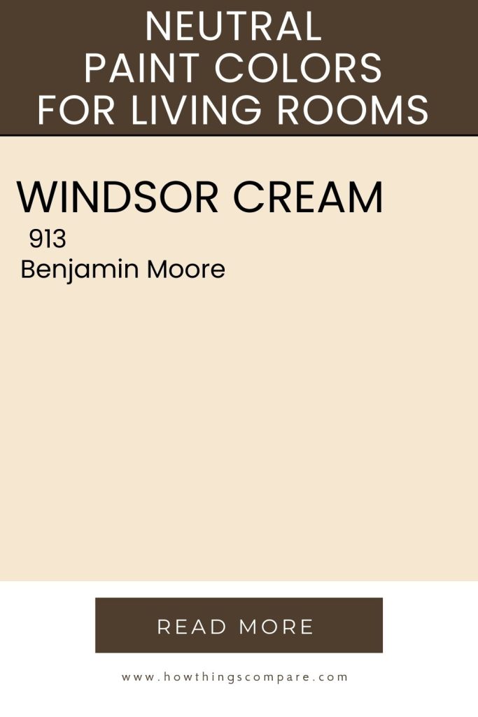
Windsor Cream (913) by Benjamin Moore
Windsor Cream (913) by Benjamin Moore is a warm, soft cream with yellow undertones that brings a bright, cozy, and inviting feel to any space. Its versatility makes it well-suited for a variety of interior settings, where it can enhance both the warmth and elegance of a room when paired with complementary colors for a balanced, harmonious design.
Hex Code: #F6E7D1
RGB: 246, 231, 209
LRV: 80.53

Best uses for Windsor Cream:
- Living Rooms: Creates a welcoming and comfortable atmosphere, perfect for relaxation and socializing.
- Bedrooms: Offers a serene and restful environment, ideal for a cozy and comfortable space.
- Kitchens: Works well with both modern and traditional kitchen designs, pairing beautifully with white or natural wood cabinetry.
- Bathrooms: Provides a clean, fresh look, enhancing the sense of space and light.
- Dining Rooms: Adds a touch of warmth and elegance, allowing dining furniture and accents to stand out.
- Hallways and Entryways: Gives a bright and airy feel, making these transitional spaces more inviting.
- Ceilings and Trim: Can be used on ceilings and trim to add warmth and coordinate with other warm tones in the room.
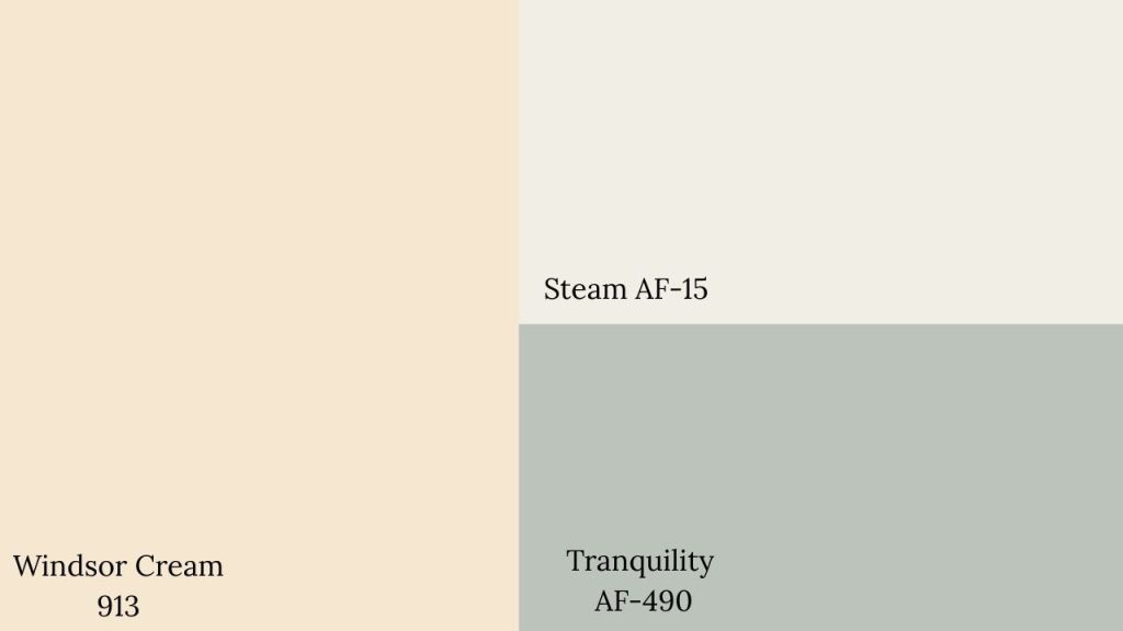
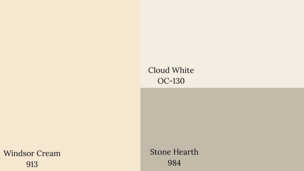
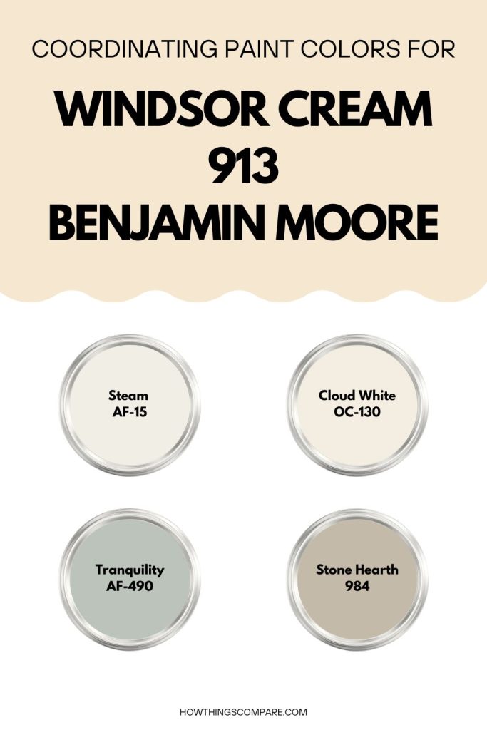
Windsor Cream coordinating colors
Coordinating colors for Windsor Cream include:
- Steam AF-15 by Benjamin Moore
- Tranquility AF-490 by Benjamin Moore
- Cloud White OC-130 by Benjamin Moore
- Stone Hearth 984 by Benjamin Moore
Get a peel and stick paint sample of Winsdor Cream (913) here.
Do Light Bulbs Affect How Paint Colors Look?
Absolutely. Just like natural light, artificial lighting changes how paint appears. The color temperature of your light bulbs—measured in Kelvins (K)—plays a big role.
- Lower K (2700K–3000K) = warm, yellow light (soft white)
- Higher K (4000K–5000K+) = cool, white to bluish light (bright/daylight)
Choosing the right bulb can make a big difference in how your paint color looks on the wall.
I recommend using these types of light bulbs.
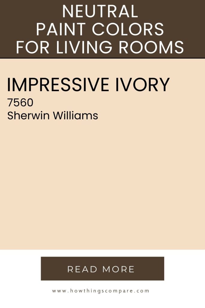
Impressive Ivory (SW 7560) by Sherwin-Williams
Impressive Ivory (SW 7560) by Sherwin-Williams is a warm, soft ivory color with subtle yellow undertones. It offers a light and inviting feel, making spaces look bright and cheerful. This versatile color is suitable for various interior and exterior settings and can enhance the warmth and elegance of a room. Pair it with complementary colors to create a balanced and cohesive design, suitable for any room in your home.
Hex Code: #F4DFC5
RGB: 244 / 222 / 195
LRV: 75.92

Best uses for Impressive Ivory:
Living Rooms: Creates a warm and welcoming atmosphere, serving as a perfect neutral backdrop for furniture and decor.
Bedrooms: Provides a calming and restful environment, ideal for creating a cozy and comfortable space.
Kitchens: Works well with both modern and traditional kitchen designs, pairing beautifully with white or natural wood cabinetry.
Bathrooms: Offers a clean, fresh look, enhancing the sense of space and light.
Dining Rooms: Adds a touch of warmth and elegance, allowing dining furniture and accents to stand out.
Hallways and Entryways: Gives a bright and airy feel, making these transitional spaces more inviting.
Ceilings and Trim: Can be used on ceilings and trim to add warmth and coordinate with other warm tones in the room.
Exterior: Works beautifully on exterior siding, trim, or front doors, creating a timeless and welcoming appearance.
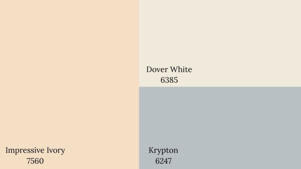
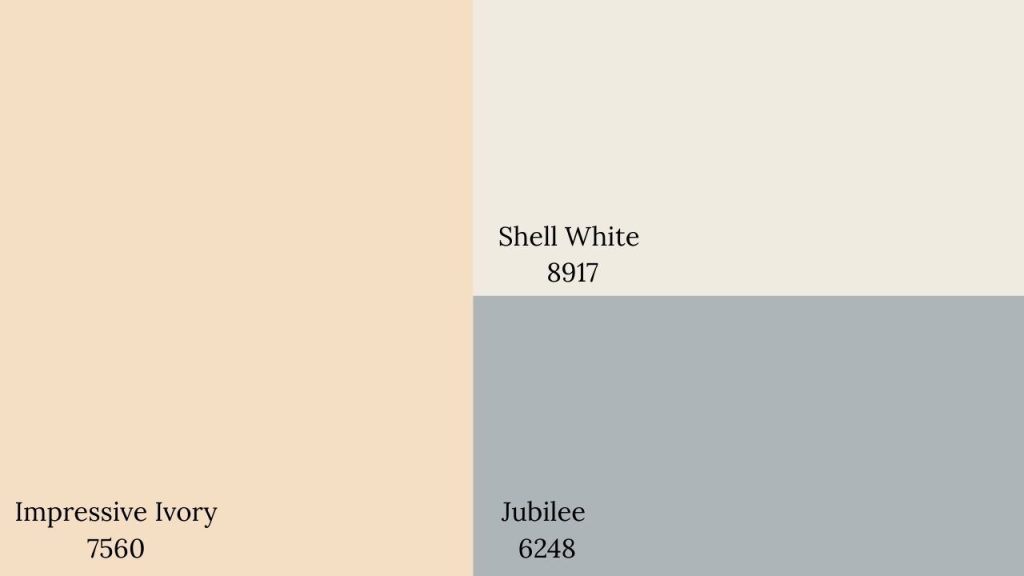
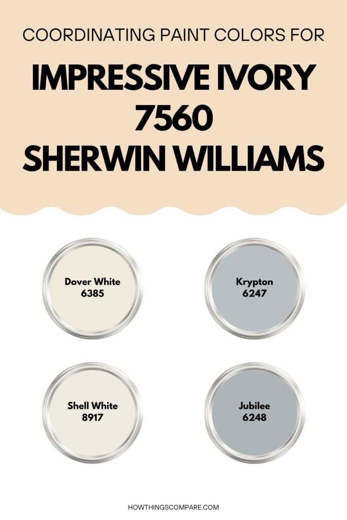
Impressive Ivory coordinating colors
Coordinating colors for Impressive Ivory include:
- Dover White 6385 by Sherwin Williams
- Krypton 6247 by Sherwin Williams
- Shell White 8917 by Sherwin Williams
- Jubilee 6248 by Sherwin Williams
Get a peel and stick paint sample of Impressive Ivory here.
Planning a paint project?
Having the right tools for the job is essential for getting smooth, professional results you’ll be proud of while saving time and avoiding costly mistakes.
Check out my list of pro painters tools here.