In this article, you will learn about Hale Navy, Polo Blue, and Charcoal Blue paint colors including a side-by-side comparison. If you are considering either of these colors, the following information will help you make the right decision.

Need to know how much paint for your project?
Calculate gallons needed and estimated cost — free.
Hale Navy vs Polo Blue vs Charcoal Blue Paint Colors
Deep, cool shades of blue and gray can turn your sleeping space into a cozy nest. These colors can also be effectively used on an accent wall or to cover all the walls in a family room.
To make sure you get the best results from such colors, pay careful attention to the amount of natural light these rooms will get.
Natural light tends to have a warm or yellow tint. If you want your dark blue-gray walls to read blue rather than gray, yellow light will not be helpful; sunlight can muddy up the blue in the mix.
For family rooms and bedrooms, often only used in the evenings and overnight, this yellow light may not be an issue.
However, it’s always a good idea to paint a sizable sample and study it in all lights before you put strong colors on several walls.


Visit OUR SHOP for stunning paint color palettes!
Click the image or link here.
Hale Navy HC-154
Hale Navy from Benjamin Moore is a slightly chalky blue-gray with a velvety edge. This color will pair beautifully with bright, clean whites. Because this color is not as saturated as other shades in this listing, you can also get creative with metals.
Rooms painted in deep colors need lots of light, but a single bright light source can be quite jarring. Instead, look for ways to add many small sources of light.
For example, soft lighting above shelf units is a wonderful way to add indirect light. Look for bulbs that offer cool light and consider adding filters to reduce any harsh glare.
Once you have the necessary lighting in place, look for ways to bounce it around. Brushed metals in the cool color spectrum, such as silver and nickel, would be very effective against Hale Navy.
Mirrors are always a wonderful way to boost indirect lighting, as are frosted glass shades over candles and other light sources.

Carefully review the condition of your walls before applying this color or any other dark shade. Scars, dents and nail holes will show up when you apply this paint.
A simple way to make sure your walls are completely smooth is described below.
Before you paint, wash your walls with a large sponge and a mild detergent. As you wash, use a small bit of masking tape on the floor under any damaged area of sheetrock or plaster.
When you rinse the wall, take another look to make sure you note all the areas that need patched. When the wall is dry, lightly circle the damaged area with a pencil. Patch and pull the tape.
Always prime fresh patches. A small foam roller will give you a nice smooth finish. If it’s been a while since you’ve painted, go ahead and prime the walls completely.
Your top coat will look much better over a fully primed wall.
RGB: 67, 75, 86
Hex Code: #434B56

Paint Color Samples
Would you like to sample these paint colors? I recommend using a peel and stick paint sample from SAMPLIZE. Peel and stick paint samples are very affordable and easy to use. They are also clean and environmentally friendly!
Advantages of using peel and stick paint samples:
- EASY TO USE: Simply move your SAMPLIZE paint sample around the room to test under a variety of lighting conditions.
- AFFORDABLE: Budget-friendly solution and no more buying inaccurate swatches, rollers, wasted paint.
- SUPER FAST DELIVERY: Depending on your location, 1 day delivery is possible.
- ORDER FROM HOME: Save a trip to the store looking for samples.
- NO MESS: SAMPLIZE uses real paint samples with zero-mess
- NO WASTE: No leftover cans or wasted paint.
Hale Navy HC-154 LRV
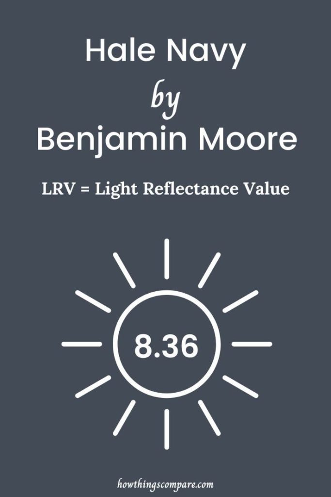
Hale Navy has an LRV (Light Reflectance Value) of 8.36. This means that the color reflects 8.36% of the light that hits it. In plain terms, this is a very dark color. The lower the LRV number, the less light a color reflects, making the space feel more enclosed, cozy, or dramatic. With an LRV of 8.36, Hale Navy absorbs most of the light in a room, which is why it can appear rich and bold but might also make small or dimly lit spaces feel even darker.

Polo Blue 2062-10
Fans of both blue and gray will love Polo Blue from Benjamin Moore. This rich and stable gray will be a wonderful foil for many other colors and tones.
Like Hale Navy, you can bring out the combination of blue and gray in this paint by bumping against it with other colors.
Light this color with cool tones. If you want to bring out the blue, push it with warm colors. Bold pink and cherry red, both warm shades that contain a lot of blue, will help this color read navy.
Don’t be bashful; you want to use deeply saturated colors against this rich tone.
If you want to help the gray along, look for rich blended colors. Rich forest green shades will boost the gray of this color. Wine, burgundy and even rust will also help this gray stay true.
Avoid pairing this color with blue unless you choose a very dark shade. Sky blue will muddy up the gray. Navy or cobalt will be more effective. Pastels may look tired against this gray.

If you want to use lighter shades against it, look for coral, salmon, and mauve.
There is little chalk to this paint color. It will soak up, rather than reflect, light. If you enjoy trying new painting techniques, this may be a fun shade to use in different sheens.
In addition to using tape to create stripes, you may want to add wooden trim to your walls to create a wainscoting effect. You can paint the wood in a semigloss and use a flat or eggshell on the walls.
Take care if you plan to pair this color with another gray. Gray tones can seem simple, but blending them is not easy. For those who like to mix their own paint colors for special finishes, the white that you blend in matters a great deal.
Your white paint may be “bright” and contain blue or it could be tinted for ease of application with a touch of pink that will fade when it dries.
If you want to do a custom mix, create a small sample in a container you can seal and let it dry completely before you act.
Lightening gray paint can produce a wonderful shade or a bucket of a muddy, unusable color.
RGB: 50, 58, 67
Hex Code: #323A43

Polo Blue 2062-10 LRV
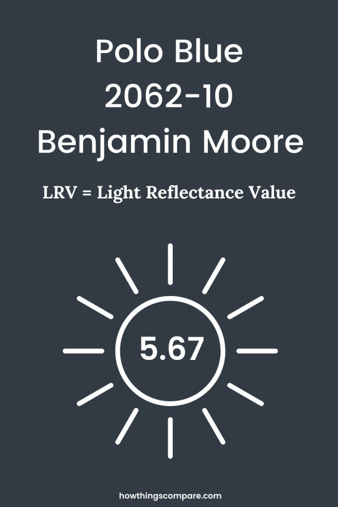
Polo Blue has an LRV (Light Reflectance Value) of 5.67. This means that the color reflects 5.67% of the light that hits it. Even darker than Hale Navy, this color will absorb most of the light in the room.

Peel-and-Stick Paint Sample – Polo Blue (2062-10) – Blue – Benjamin Moore
Charcoal Blue SW 2739
Charcoal Blue from Sherwin-Williams is a smoky navy with a lot of personality. Fans of minimalism can put this color on the walls and let it stand in isolation. Like a great suit or an elegant black dress, it needs little to no adornment.
Because this color is both sturdy and stable, you can let it serve as a foil for many other colors. Be aware that this color will lean gray if you push it with warm shades.
To that end, do your best to not create visual confusion in your decor. Ivory and white together against this color may cause it to go a bit muddy.
Charcoal Blue has a velvety edge and a lovely shadow tone. If you like to play with textures, this color could be intensified with silicone sand. You could even create a sanded accent wall and paint the others flat.
Because the shadow tones of this color are quite pretty, take the time to play with your light sources. White or silver gray filtering sheers could add a lot of drama to this color, as could sconces in silver or nickel.

As you can, direct light up against such strong colors, rather than down from the ceiling.
Speaking of ceilings, this color would be an excellent base for a coffered ceiling. There are trim pieces and kits designed to add the elegant look of beams across your ceiling and a base coat of Charcoal Blue would be a wonderful foil for white trim.
Whenever you work on ceilings, do make sure you schedule in several breaks. Even with an extender pole, painting ceilings is very hard on the upper back and neck.
Any time you are applying a very deep color to walls or ceilings, the lighting you use in the workspace is critical. If at all possible, paint in the brightest natural light you can bring into the room.
Set up work lights at the corners and direct them diagonally across the wall. Even if you plan for two coats, proper lighting can guarantee that you will not leave any bare patches.
As you apply dark colors to your walls, make sure you also review what you just completed. All paint drips and dark paint can be hard to notice.
If you have to paint under electric light, consider using a flashlight to check back on your work to make sure that there are no long, sticky drips to mar your walls.
RGB: 61, 68, 80
Hex Code: #3D4450

Planning a paint project?
Having the right tools for the job is essential for getting smooth, professional results you’ll be proud of while saving time and avoiding costly mistakes.
Check out my list of pro painters tools here.
Charcoal Blue SW 2739 LRV
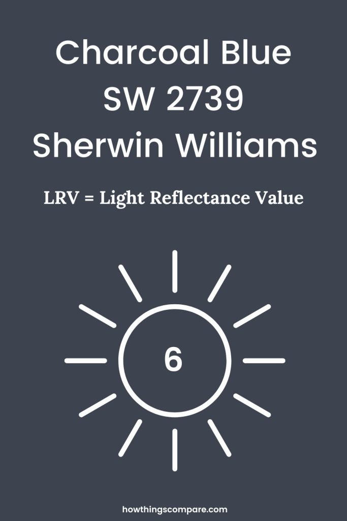
Charcoal Blue has an LRV (Light Reflectance Value) of 6. This means that the color reflects 6% of the light that hits it. Charcoal Blue is not quite as dark as Polo Blue, but very close.

Peel-and-Stick Paint Sample – Charcoal Blue (2739) – Blue – Sherwin-Williams
Do Light Bulbs Affect How Paint Colors Look?
Absolutely. Just like natural light, artificial lighting changes how paint appears. The color temperature of your light bulbs—measured in Kelvins (K)—plays a big role.
- Lower K (2700K–3000K) = warm, yellow light (soft white)
- Higher K (4000K–5000K+) = cool, white to bluish light (bright/daylight)
Choosing the right bulb can make a big difference in how your paint color looks on the wall.
I recommend using these types of light bulbs.
