This guide covers a range of gray paint colors to suit different styles, lighting conditions, and furniture — so you can find the perfect shade to transform any room into a calm, considered, and effortlessly stylish space.
Here are 7 popular gray paint colors for walls. Click the link below each color to get a peel and stick color sample from Samplize.
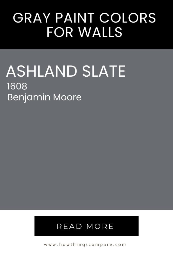
1. Ashland Slate (1608) by Benjamin Moore
Ashland Slate (1608) by Benjamin Moore is a deep, rich gray with subtle blue undertones. This sophisticated color brings a sense of elegance and depth to any space. Its versatility allows it to be used in a variety of settings, creating a dramatic yet calming ambiance.
Need to know how much paint for your project?
Calculate gallons needed and estimated cost — free.
Hex code: #696d72
RGB: 105,109,115
LRV: 16.12
Get a peel and stick paint sample of Ashland Slate (1608) by Benjamin Moore here.
Paint Color Samples
Would you like to sample these paint colors? I recommend using a peel and stick paint sample from SAMPLIZE. Peel and stick paint samples are very affordable and easy to use. They are also clean and environmentally friendly!
Advantages of using peel and stick paint samples:
- EASY TO USE: Simply move your SAMPLIZE paint sample around the room to test under a variety of lighting conditions.
- AFFORDABLE: Budget-friendly solution and no more buying inaccurate swatches, rollers, wasted paint.
- SUPER FAST DELIVERY: Depending on your location, 1 day delivery is possible.
- ORDER FROM HOME: Save a trip to the store looking for samples.
- NO MESS: SAMPLIZE uses real paint samples with zero-mess
- NO WASTE: No leftover cans or wasted paint.

2. Agreeable Gray SW 7029 Sherwin Williams
Agreeable Gray (SW 7029) by Sherwin Williams is a sophisticated greige that seamlessly blends warm gray and beige tones, making it an incredibly versatile choice for any space. Its soft, neutral palette creates a calming atmosphere, perfect for living rooms, bedrooms, or open-concept areas.
Agreeable Gray pairs beautifully with a variety of colors, enhancing both contemporary and traditional decor. Whether used as a main color or an accent, it provides a warm backdrop that complements furniture and artwork, ensuring a harmonious and inviting environment.
This timeless shade is a favorite for homeowners seeking elegance and warmth in their interiors.
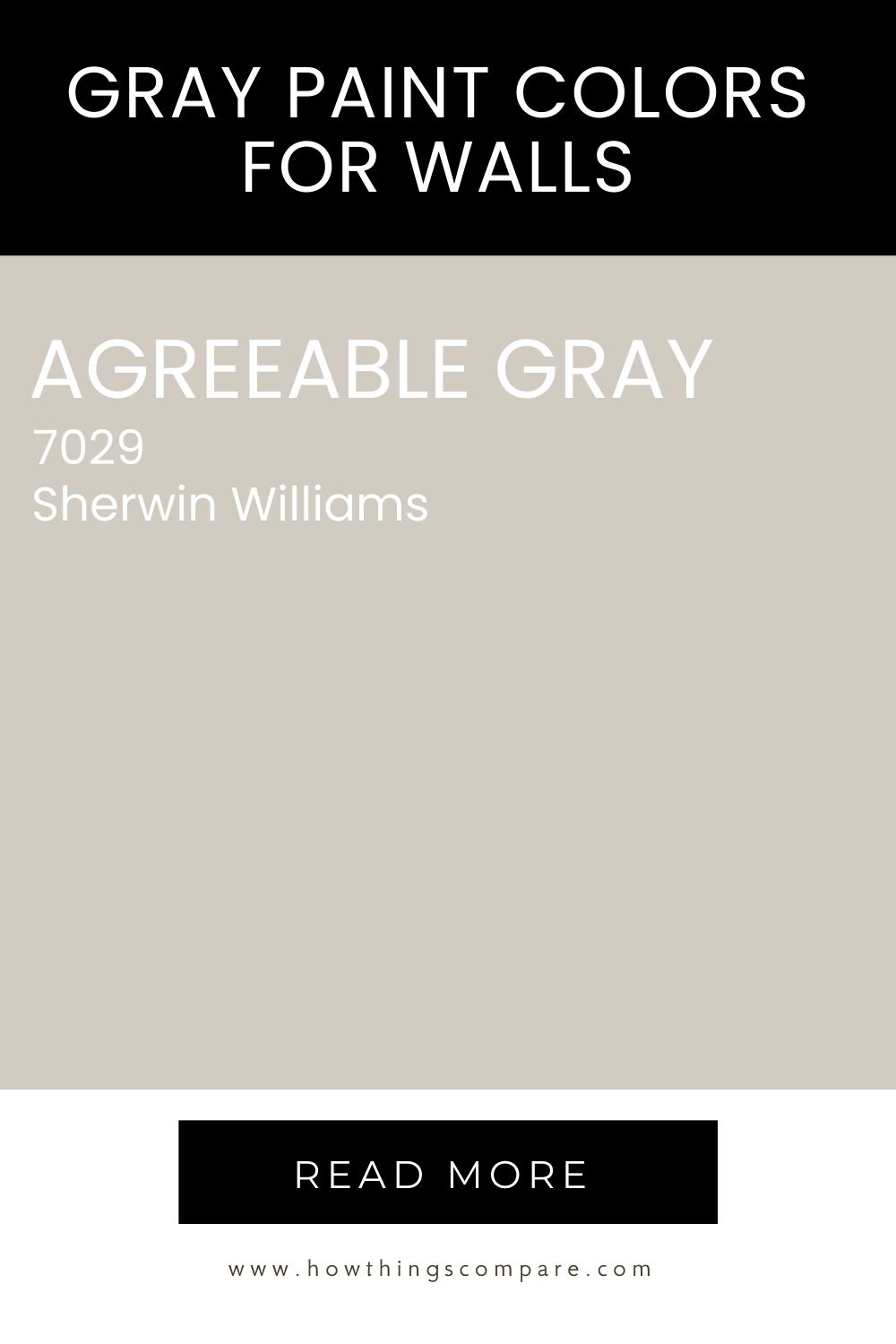
Hex code: #D1CBC1
RGB: 209 / 203 / 193
LRV: 60
Sherwin-Williams Peel-and-Stick Paint Sample by Samplize – Agreeable Gray (7029) – Neutral – Adhesive Backing, 9 x 14.75 in3. Peppercorn 7674 – Sherwin Williams
Peppercorn is a beautifully balanced, slightly desaturated gray from Sherwin Williams that works as both a neutral backdrop and a bold accent color. It’s a surprisingly liberating choice for those who love color — rather than defaulting to white walls, you can use this deep gray as a sophisticated canvas for rich hues like smoky purple, teal, and burgundy, as well as softer tones like blush pink, lavender, and aqua.
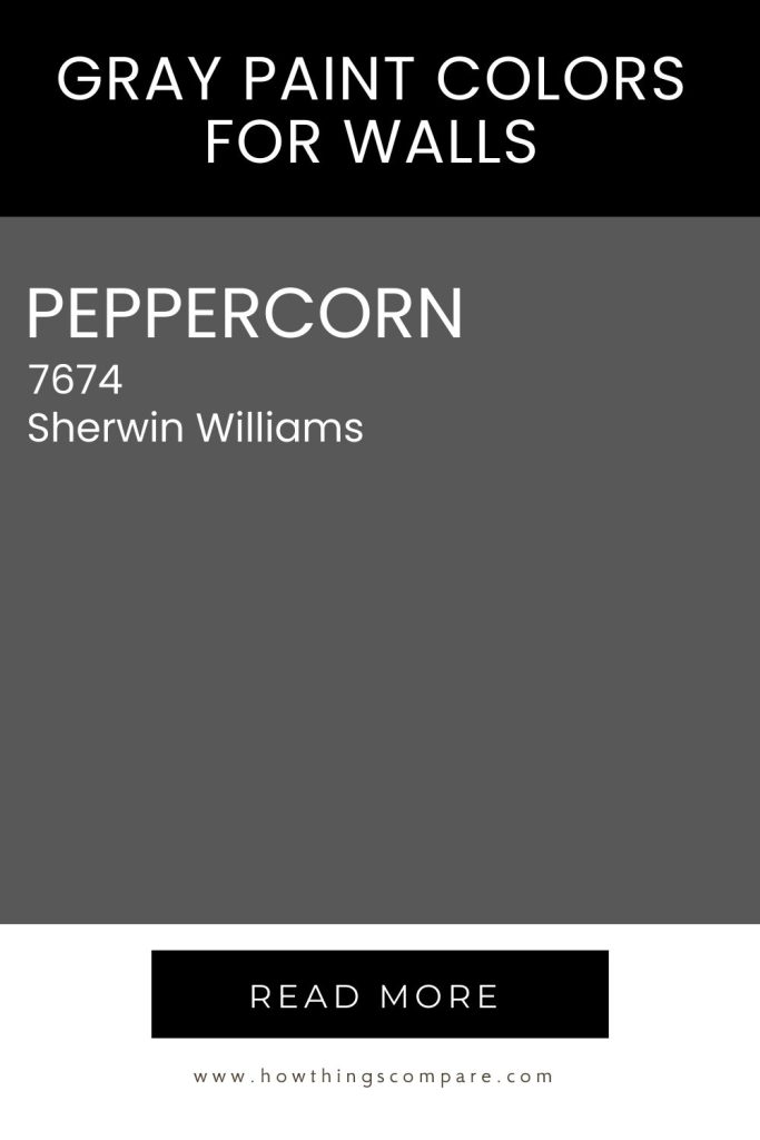
Hex code: #585858
RGB: 88 / 88 / 88
LRV: 10
Peel-and-Stick Paint Sample – Peppercorn (7674) – Sherwin-Williams
4. Morning Fog 6255 Sherwin Williams
Morning Fog from Sherwin-Williams is a lovely base shade of gray with enough heft to hold color against strong contrast. Be aware that it does lean cool; if you pair it with rich warm shades, it may appear a bit muddy.
This color would be a terrific choice for walls with a lot of texture. It throws a lovely shadow color. If you’re breaking away from nothing but white walls. you could use this color to create a striking accent wall.
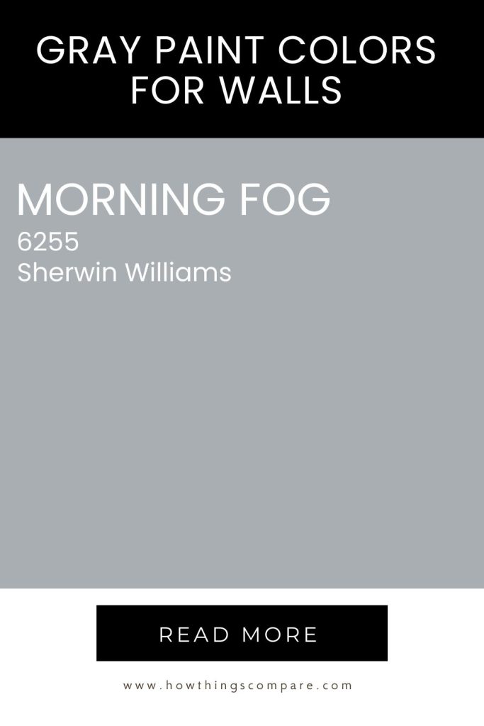
Hex code: #A8AEB1
RGB: 168 / 174 / 177
LRV: 42
Sherwin-Williams Peel-and-Stick Paint Sample by Samplize – Morning Fog (6255) – Neutral Gray – Adhesive Backing, 9 x 14.75 in5. Network Gray SW 7073 Sherwin Williams
Network Gray SW 7073 by Sherwin Williams is a versatile, medium-toned gray with subtle blue undertones that give it a cool, contemporary edge without feeling cold or flat. With an LRV of 37, it sits on the darker side of the spectrum, meaning it adds depth and a sense of sophistication to a room — making it a particularly strong choice if you want walls that feel purposeful and refined rather than simply neutral.
It works best in well-lit spaces, where its blue undertones can truly shine, and pairs beautifully with crisp white trim — Extra White or Eider White are both excellent companions. Its balanced tone means it works equally well as a backdrop for both warm and cool decor, giving you plenty of flexibility when it comes to furniture and accent colors.
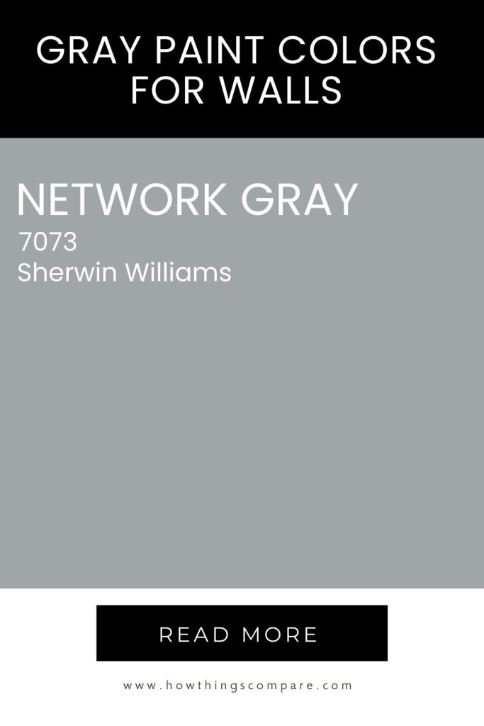
Hex code: #A0A5A7
RGB: 160 / 165 / 167
LRV: 37
Sherwin-Williams Peel-and-Stick Paint Sample by Samplize – Network Gray (7073) – Neutral Gray – Adhesive Backing, 9 x 14.75 in6. African Gray SW 9162 Sherwin Williams
African Gray SW 9162 by Sherwin Williams is a rich, medium-toned gray with cool blue undertones that give it a calm, sophisticated feel without veering into cold or stark territory. African Gray is a great choice for adding depth and intimacy to a room — particularly in spaces with good natural light where it can truly come into its own.
It pairs beautifully with crisp whites like Pure White SW 7005 for a clean, striking contrast, and works just as well alongside warm neutrals and natural textures for a more grounded, layered look. It’s a versatile shade that feels equally at home in a modern space as it does in a more traditional setting.
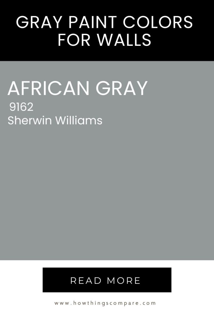
Hex code: #939899
RGB: 147 / 152 / 153
LRV: 31
Sherwin-Williams Peel-and-Stick Paint Sample by Samplize – African Gray (9162) – Neutral Gray – Adhesive Backing, 9 x 14.75 in7. Web Gray 7075 Sherwin Williams
Cool and deep, Web Gray SW 7075 by Sherwin Williams is a neutral with real depth and dimension. Its charcoal-leaning tone leans cool no matter the lighting conditions, giving it a strong, confident presence that makes it a standout choice for accent walls.
With an LRV of 13, it sits firmly in the darker category, absorbing more light than it reflects and creating an intimate, atmospheric feel in any space. It pairs beautifully with crisp whites like Extra White or Pure White for a striking contrast, and holds its own alongside warm neutrals and rich jewel tones alike — making it as versatile as it is bold.
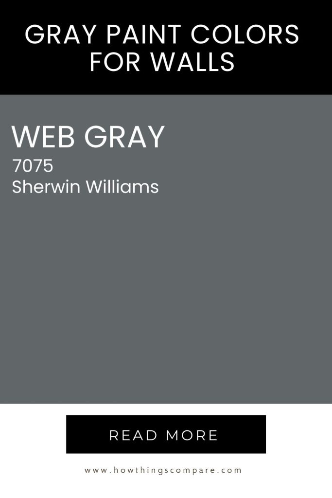
Hex code: #616669
RGB: 97 / 102 / 105
LRV: 13
Sherwin-Williams Peel-and-Stick Paint Sample by Samplize – Web Gray (7075) – Neutral – Adhesive Backing, 9 x 14.75 in