Purple is simply a combination of red and blue. If you add green, you will add a smoky tone. At one point in time, both red dyes and blue tinting were expensive and hard to come by.
Luckily, you no longer have to be royal to wear or decorate your space with purple!
The shades in this comparison will hold their own, but many of them will also back down and serve as an excellent foil for other blended shades, such as green or coral.
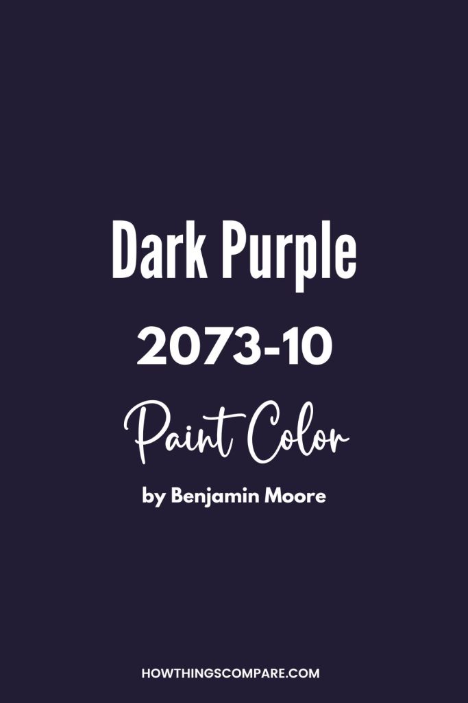
1) Dark Purple 2073-10 Benjamin Moore
Dark purple is a beautifully balanced color with just enough green in the mix to take the edge off. If you intend to put this color on a wall, this shade may allow you to play a bit.
For example, you may want to try out different sheens. It will take time to allow each layer to cure, but you could paint a wall in a flat shade of this and add a semi-gloss stripe or a textured pattern with a stippling brush.
Use light colors in combination with this shade, such as a pale gray-green or a pale, well-balanced gray.
RGB: 152, 29, 151
Hex Code: #221C35

Need to know how much paint for your project?
Calculate gallons needed and estimated cost — free.

Peel-and-Stick Paint Sample – Dark Purple (2073-10) – Purple – Benjamin Moore
2) Concord Grape SW 6559 Sherwin Williams
Concord Grape SW 6559 is a bold, vibrant purple with red undertones that delivers high impact and creative energy. This rich hue adds a touch of drama and personality, making it a favorite for accent walls, playrooms, studios, or statement front doors.
Pair it with crisp white, soft gray, or even chartreuse for a modern twist. It’s a trending choice for artistic, confident interiors that stand out.
RGB: 71, 58, 89
Hex Code: #473A59
Peel-and-Stick Paint Sample – Concord Grape (6559) – Sherwin-Williams

Paint Color Samples
Would you like to sample these paint colors? I recommend using a peel and stick paint sample from SAMPLIZE. Peel and stick paint samples are very affordable and easy to use. They are also clean and environmentally friendly!

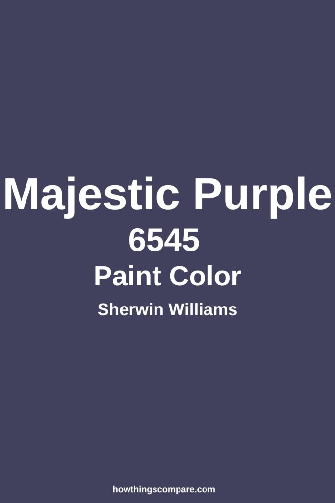
3) Majestic Purple SW 6545 Sherwin Williams
Majestic purple is a deeply saturated shade that leans toward blue. It’s cool enough that it could serve as a wonderful foil for other cool shades as long as they’re not too dark.
For example, bright white trim would look terrific against this color. Pale gray shades and very light shades of pink will also work well with Majestic purple.
If you’re looking for an accent wall for a playroom or an older child’s bedroom, this color will serve.
RGB: 65, 65, 94
Hex Code: #41415E
Peel-and-Stick Paint Sample – Majestic Purple (6545) – Purple – Sherwin-Williams

4) Eggplant (1379) – Benjamin Moore
Eggplant is a beautifully balanced shade that may appear wine or burgundy in full daylight. Because it has a bit more red than blue, this is an ideal color to add old-world elegance to a space.
If your home is currently all one color, try adding eggplant fabric on furniture or invest in a rug that features this shade. If you want to put it on a wall, take care not to use it in a space that is already quite colorful.
You may create a visual space that makes it hard to focus on just one shade.
RGB: 93, 55, 84
Hex Code: #5D3754
Peel-and-Stick Paint Sample – Eggplant (1379) – Black – Benjamin Moore

5) Izmir Purple SW 6825 Sherwin Williams
Izmir Purple is a rich, jewel-toned purple with strong blue undertones, giving it a luxurious and energetic feel. It sits between amethyst and plum, leaning slightly cool, and delivers bold color without becoming too dark or overpowering.
Named after the vibrant Turkish city of Izmir, this shade evokes creativity, confidence, and cultural richness. Use Izmir Purple on one wall to make a statement in a living room, bedroom, or dining area. It adds depth and elegance when balanced with soft neutrals.
Also popular in home offices and powder rooms!
RGB: 79,68,111
Hex Code: #4F446F
Peel-and-Stick Paint Sample – Izmir Purple (6825) – Sherwin-Williams

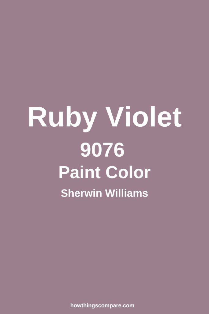
6) Ruby Violet SW 9076 Sherwin Williams
Ruby violet is one of the few shades of dark purple that could, in the right circumstances, be used as a neutral. It is wonderfully balanced and slightly muted, thanks to the green in the mix.
It is saturated, but will not overpower a room. Pair this with other gently blended shades, such as ivory in baskets and wicker furniture, and with sage green in your choice of flooring.
If you love houseplants, this shade will serve as an excellent foil to display your green thumb!
RGB: 155, 127, 140
Hex Code: #9B7F8C
Peel-and-Stick Paint Sample – Ruby Violet (9076) – Purple – Sherwin-Williams

7) English Violet
Like Chinese violet, English violet is beautifully balanced. However, this shade is extremely saturated and will probably not back down. Have some fun and do what you can to push this color to brighten it.
Pale silver-gray upholstery fabrics with loads of texture will glow against this shade. Subtle shades of rose will also take on a life of their own if you have this color on the walls or the floor.
RGB: 86, 60, 92
Hex Code: #563C5C

8) Blue Violet
Blue violet is a shade that will not balance with anything warm. Pair it with blue gray and it will stay purple, If you pair it with something warm, such as a brown side chair or a tan sofa, it will read blue.
Unbalanced colors can make for wonderful decorative choices, but this is a color that could quickly turn an accent wall into a headache if you like things to match. Keep things cool in front of blue violet.
RGB: 138, 43, 226
Hex Code: #8A2BE2

9) Indigo (6531) – Sherwin-Williams
Indigo is a wonderful choice for someone who just wants some kind of color in their home. If you’re renting and can’t paint, an indigo comforter will create an eye-catching accent for other shades.
It works beautifully with pastels, especially if you can stick with very light shades. Pale yellows, pinks, and purples will all glow against indigo.
Curiously, this color may not play with other shades that contain a lot of blue.
RGB: 75, 0, 130
Hex Code: #284a70
Peel-and-Stick Paint Sample – Indigo (6531) – Blue – Sherwin-Williams

10) Northwestern Purple
Purple is a popular color for mascots and sports teams. Northwestern purple is one of the few shades of dark purple that would actually work both on a sports jersey and on your walls.
It does contain a lot of blue and may appear blue if you put too many warm colors in front of it. However, if you have light maple items or painted pieces, this could be a wonderful shade to use.
RGB: 78, 42, 132
Hex Code: #4E2A84

11) Pomp and Power
I must admit, this purple has put me in the mood to redecorate. This is a gorgeous shade that would add tremendous interest to an office or a family room.
If you like antiques and have items that have a red patina, this color will make those items glow It’s just a bit to the cool side, but all that green really tones things down.
For those who’ve been struggling to find the right color for an accent wall in a space that already has a lot of different warm tones, this is a great choice.
RGB: 134, 96, 142
Hex Code: #86608E

12) Palatinate
Palatinate hearkens back to the old royalty that was purple. This is a color that will add gravity to your space.
For those who currently have pale gray on their walls but are looking to warm things up, drapes or a box valance in palatinate purple would be an excellent choice.
Look for this color in a textured fabric, such as velvet or suede, to gain the full benefit of this rich, slightly warm shade.
RGB: 114, 36, 108
Hex Code: #72246C


