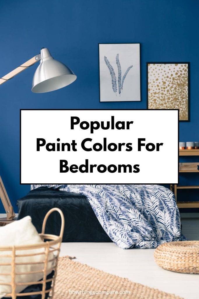
When it comes to creating a calming, sophisticated bedroom retreat, blue is one of the most versatile and enduring color choices you can make.
From deep, moody navies to rich jewel tones, blue paint has a unique ability to make a space feel both cozy and refined.
In this article, we explore three stunning paint colors for bedrooms. Hale Navy, Royal Indigo, Kensington Blue and why each one is a great choice for your bedroom walls.
Before you commit to buying a paint color, I recommend trying a color sample first. Click the link below each color to get a peel and stick color sample from Samplize.
Need to know how much paint for your project?
Calculate gallons needed and estimated cost — free.
Definitions
Hex Code
A hex code is a six-character alphanumeric code used to represent a specific color by defining the combination of red, green, and blue (RGB) values that make it up. Each pair of characters in the code corresponds to one of the three color channels. Hex codes are widely used by web designers and developers because they offer a compact, standardized way to specify colors in HTML, CSS, and other digital design tools, making color referencing faster and more efficient than writing out full RGB values.
RGB Code
RGB stands for Red, Green, and Blue — the three primary colors of light. Every color on a digital screen is created by combining these three channels at varying intensities, each ranging from 0 to 255. The RGB color model has roots in the early study of light and color perception and became widely adopted in print media throughout the 20th century, appearing in everything from cartoons to advertisements.
It is worth noting an important distinction between paint colors and digital colors. In painting and print, the traditional primary colors are red, blue, and yellow, and combining all pigments together produces black. In the light spectrum, however, the primary colors are red, green, and blue, and combining all light together produces white. This is why a prism can split white light into the full visible color spectrum.
LRV (Light Reflectance Value)
LRV, or Light Reflectance Value, measures how much light a paint color reflects off a surface. It is expressed on a scale from 0 to 100, where 0 represents absolute black, which absorbs all light, and 100 represents absolute white, which reflects all light. In practical terms, the higher a color’s LRV, the brighter and lighter it will appear on your walls. LRV is a useful tool when selecting paint colors, as it helps predict how light or dark a color will look in a space under real lighting conditions.
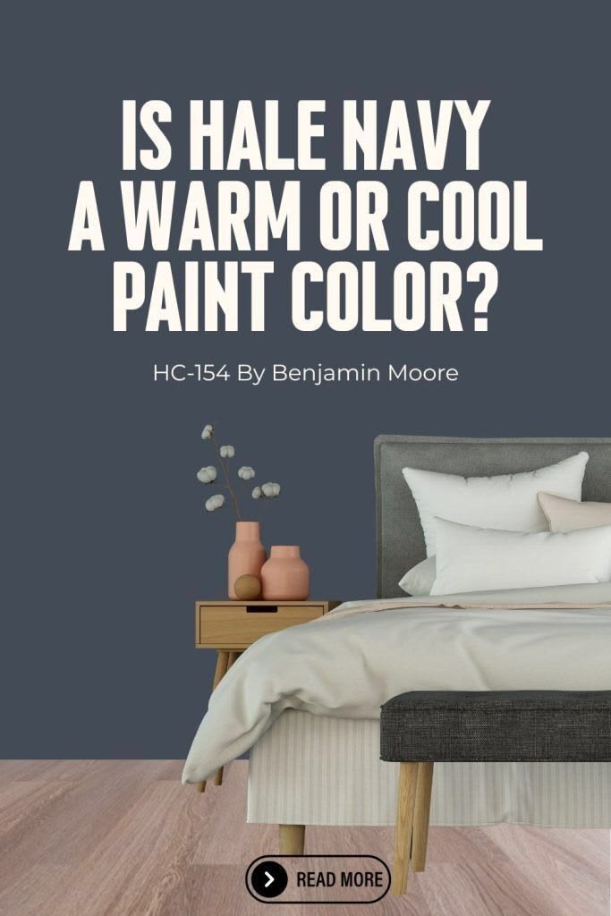
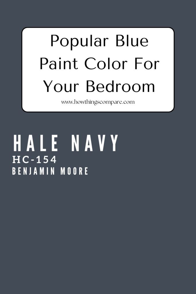
Hale Navy (HC-154) by Benjamin Moore
A popular shade of blue for bedroom walls is Hale Navy (HC-154) by Benjamin Moore. This is a classic, deep navy blue. It is a rich, sophisticated color that brings a sense of elegance and timelessness to any space. Its versatility makes it suitable for a variety of design styles, from traditional to modern.
Hale Navy Hex code: #434b56
Hale Navy RGB: 67, 76, 86

Is Hale Navy a warm or cool color?
Hale Navy (HC-154) by Benjamin Moore is generally considered a cool color, as it’s a deep, classic navy blue. However, it has some interesting complexity — it can read slightly warm in certain lighting conditions due to subtle undertones that lean toward green or even a muted purple, depending on the light in your space. It acts as a chameleon color.
So while it sits firmly in the cool color family, it’s worth testing a sample in your specific room before committing, since natural vs. artificial lighting can shift how it appears on your walls.
Common Uses for Hale Navy (HC-154) by Benjamin Moore:
Accent Walls: Perfect for creating a striking, sophisticated focal point in living rooms, bedrooms, or dining rooms. Its deep, classic navy tone adds depth and drama without feeling overwhelming, especially when paired with crisp white trim.
Cabinetry: Works beautifully on kitchen or bathroom cabinets, adding a touch of timeless sophistication. It pairs exceptionally well with brass, gold, or chrome hardware, and looks stunning against white or light gray countertops.
Exterior: One of Hale Navy’s most popular uses — it is ideal for front doors, shutters, trim, or even the entire exterior of a home. It delivers strong curb appeal with a classic, enduring look that complements a wide range of architectural styles.
Furniture: Great for refinishing furniture pieces like dressers, bookshelves, or side tables, giving them a polished, designer feel that works in both traditional and contemporary interiors.
Home Offices and Libraries: Adds a sense of depth, focus, and professionalism, making it an excellent choice for workspaces and libraries where a grounded, authoritative atmosphere is desired.
Bedrooms: Hale Navy’s deep, calming tone makes it a natural fit for bedrooms, creating a cozy and restful environment whether used on all four walls or as a bold feature wall paired with soft, neutral bedding.
Dining Rooms: Its rich, moody character sets an elegant and intimate tone in dining rooms, making it a popular choice for creating a refined atmosphere perfect for entertaining.
Entryways and Hallways: Makes a confident and welcoming first impression, setting the tone for the rest of the home with its classic, deep navy presence.
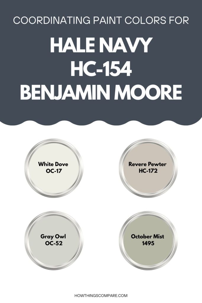
Colors that Complement Hale Navy (HC-154) by Benjamin Moore:
1. Whites and Neutrals: These lighter shades provide a crisp, clean contrast that allows Hale Navy to stand out while keeping the overall palette feeling balanced and fresh.
- White Dove (OC-17): A soft, warm white that creates a classic, inviting contrast against Hale Navy’s deep tone.
- Simply White (OC-117): A bright, clean white that enhances the richness of Hale Navy without feeling stark or cold.
- Revere Pewter (HC-172): A warm, versatile gray-beige that softens the boldness of Hale Navy and adds an earthy, grounded feel to the palette.
2. Grays: Cool and neutral grays work naturally alongside Hale Navy, creating a sophisticated, composed look.
- Stonington Gray (HC-170): A cool, medium gray that pairs effortlessly with Hale Navy for a polished, balanced combination.
- Gray Owl (OC-52): A soft, light gray with subtle warmth that offers a gentle contrast without competing with Hale Navy’s depth.
3. Golds and Yellows: Warm golds and yellows bring energy and contrast to Hale Navy, highlighting its cool depth with a touch of vibrancy.
- Hawthorne Yellow (HC-4): A warm, cheerful yellow that creates a bold and lively contrast, ideal for accents or complementary spaces.
- Concord Ivory (HC-12): A muted, antique gold tone that adds understated elegance and warmth when paired with Hale Navy.
4. Greens: Soft, muted greens share a natural kinship with navy blue, creating a calming and cohesive palette inspired by nature.
- Saybrook Sage (HC-114): A muted, earthy green that pairs harmoniously with Hale Navy, offering a relaxed and organic feel.
- October Mist (1495): A delicate, silvery green that adds a fresh, airy quality and pairs beautifully with Hale Navy’s boldness.
5. Other Blues: Pairing Hale Navy with other blues creates a layered, monochromatic look that feels intentional and cohesive.
- Van Deusen Blue (HC-156): A slightly lighter, more relaxed blue that complements Hale Navy while adding tonal variety to the palette.
- Blue Note (2129-30): A similarly deep, moody blue that creates a seamless, sophisticated monochromatic combination when used alongside Hale Navy.
Hale Navy (HC-154) by Benjamin Moore is a versatile and timeless color that can add depth, sophistication, and elegance to any space. Pair it with complementary colors to create a balanced and cohesive design.
Hale Navy LRV
Hale Navy has an LRV of 8.36 which is an extremely low value, placing this color at the very dark end of the scale. To put it in perspective, absolute black has an LRV of 0 and absolute white has an LRV of 100, so a value of 8.36 means Hale Navy reflects only a small fraction of the light that hits it, absorbing the vast majority instead.

Get a peel and stick paint color sample of Hale Navy (HC-154) here.
Paint Color Samples
Would you like to sample these paint colors? I recommend using a peel and stick paint sample from SAMPLIZE. Peel and stick paint samples are very affordable and easy to use. They are also clean and environmentally friendly!
Advantages of using peel and stick paint samples:
- EASY TO USE: Simply move your SAMPLIZE paint sample around the room to test under a variety of lighting conditions.
- AFFORDABLE: Budget-friendly solution and no more buying inaccurate swatches, rollers, wasted paint.
- SUPER FAST DELIVERY: Depending on your location, 1 day delivery is possible.
- ORDER FROM HOME: Save a trip to the store looking for samples.
- NO MESS: SAMPLIZE uses real paint samples with zero-mess
- NO WASTE: No leftover cans or wasted paint.

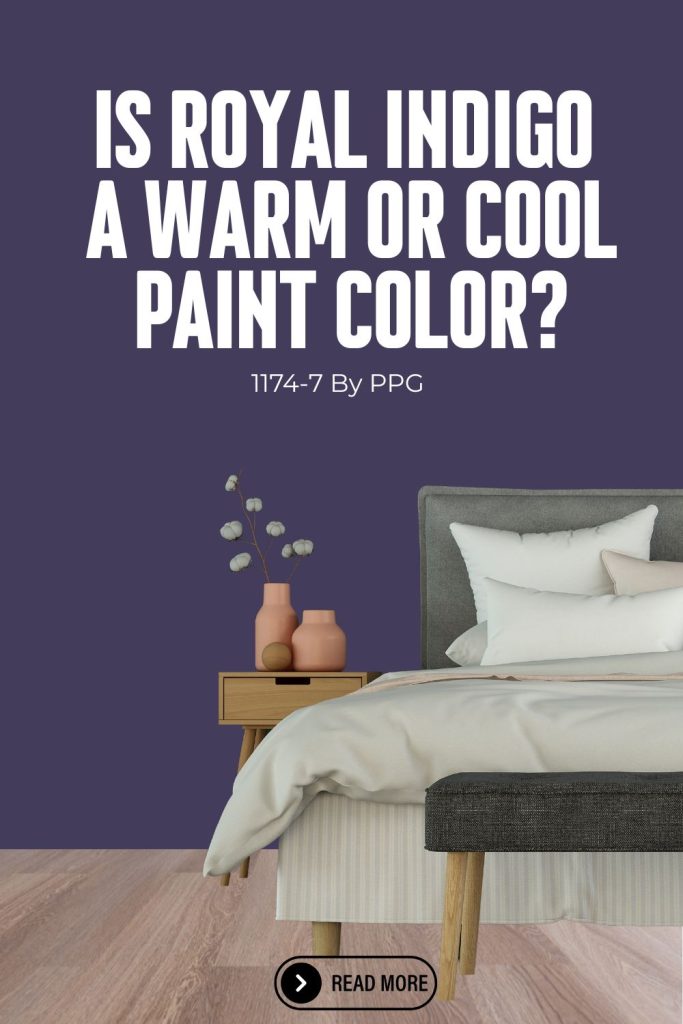
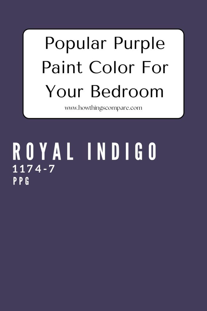
Royal Indigo (PPG 1174-7) by PPG
Another popular paint color for bedrooms is Royal Indigo (PPG 1174-7) by PPG. This is a deep, luxurious blue with purple undertones. This rich, bold color exudes elegance and sophistication, making it an excellent choice for creating dramatic and impactful spaces.
Royal Indigo Hex code: #433C5A
Royal Indigo RGB: 78, 66, 96

Is Royal Indigo a warm or cool color?
Royal Indigo (PPG 1174-7) by PPG is a cool color. It’s a deep, rich indigo-blue with violet undertones, which places it firmly in the cool spectrum. The purple-leaning undertones give it a slightly mysterious, jewel-toned quality that can feel both dramatic and elegant in a bedroom setting.
Like most deep colors, lighting will play a role in how it reads on your walls — in warmer light it may bring out its violet undertones more, but it remains a distinctly cool-toned shade overall.
Common Uses for Royal Indigo (PPG 1174-7) by PPG:
Accent Walls: Ideal for creating a bold, dramatic focal point in living rooms, dining rooms, or bedrooms. Its deep indigo-violet tone adds instant richness and dimension to any space.
Cabinetry: Works beautifully on kitchen or bathroom cabinets, adding a touch of luxury and sophistication. It pairs especially well with gold or brushed brass hardware for a jewel-toned, high-end look.
Furniture: Perfect for refinishing furniture pieces such as dressers, bookshelves, or accent chairs, transforming ordinary pieces into eye-catching statement items with a deep, moody elegance.
Home Offices and Libraries: Adds depth, gravitas, and a professional look that makes it well-suited for workspaces, studies, or libraries where a focused, intellectually stimulating atmosphere is desired.
Entryways and Hallways: Provides a striking and memorable first impression, making guests feel the drama and sophistication of the color from the moment they walk through the door.
Bedrooms: Its deep, enveloping tone creates a cozy, cocoon-like atmosphere that is ideal for rest and relaxation, particularly in rooms where you want a moody, intimate feel.
Dining Rooms: Royal Indigo’s rich, jewel-toned character makes it an excellent choice for dining rooms, where it sets an elegant and intimate mood for evening entertaining.
Exterior Front Doors: Its bold, deep hue makes a powerful statement on a front door, offering strong curb appeal and a sense of distinction that sets a home apart.
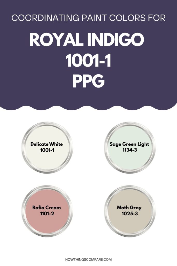
Colors that Complement Royal Indigo:
1. Whites and Neutrals: Light, neutral shades provide a clean contrast that allows Royal Indigo’s deep, jewel-toned richness to take center stage while keeping the overall palette feeling balanced.
- Delicate White (PPG1001-1): A crisp, pure white that creates a sharp, striking contrast against Royal Indigo, ideal for trim, ceilings, or adjoining walls.
- Moth Gray (PPG1025-3): A soft, warm gray that complements Royal Indigo’s depth without competing with it, adding a subtle, grounding quality to the palette.
- Silver Feather (PPG1004-1): A light, airy gray that offers a gentle, harmonious contrast, keeping the overall look sophisticated and understated.
2. Golds and Yellows: Warm golds and yellows create a striking complementary contrast with Royal Indigo’s cool violet-blue tone, bringing energy and warmth to the palette.
- Golden Plumeria (PPG1218-5): A rich, warm yellow that adds a vibrant, cheerful contrast, working especially well as an accent color alongside Royal Indigo.
- Spiced Honey (PPG1207-7): A deep, muted gold that enhances the luxurious quality of Royal Indigo, creating a regal and refined color combination.
3. Greens: Muted, natural greens share an organic harmony with Royal Indigo, offering a calming and balanced pairing that feels grounded and fresh.
- Olive Sprig (PPG1125-4): An earthy, muted green that pairs naturally with Royal Indigo, softening its boldness while maintaining a sophisticated, nature-inspired feel.
- Sage Green Light (PPG1134-3): A soft, silvery sage green that adds a fresh, calming touch and complements Royal Indigo without overpowering it.
4. Blues and Purples: Pairing Royal Indigo with other blues and purples creates a rich, layered monochromatic look that feels deeply intentional and cohesive.
- Blue Hyacinth (PPG1160-6): A slightly lighter, cooler blue that complements Royal Indigo beautifully, adding tonal variety while keeping the palette unified.
- Grape Juice (PPG1248-7): A deep, moody purple that sits naturally alongside Royal Indigo, creating a dramatic and seamless monochromatic combination.
5. Earth Tones: Warm earth tones provide a grounding contrast to Royal Indigo’s cool intensity, adding warmth and balance to the overall palette.
- Raffia Cream (PPG1101-2): A soft, warm beige that tempers the boldness of Royal Indigo and adds an inviting, cozy quality to the pairing.
- Bungalow Taupe (PPG1008-5): A sophisticated, medium taupe that adds depth and a contemporary feel, balancing Royal Indigo’s richness with understated warmth.
Royal Indigo (PPG 1174-7) by PPG is a versatile and luxurious color that can add depth, sophistication, and elegance to any space. Pair it with complementary colors to create a balanced and cohesive design.
Royal Indigo LRV
Hale Navy has an LRV of 7 which is an extremely low value, placing this color at the very dark end of the scale. To put it in perspective, absolute black has an LRV of 0 and absolute white has an LRV of 100, so a value of 7 means Royal Indigo reflects only a small fraction of the light that hits it, absorbing the vast majority instead.

Get a peel and stick paint color sample of Royal Indigo (PPG 1174-7) here.
Do Light Bulbs Affect How Paint Colors Look?
Absolutely. Just like natural light, artificial lighting changes how paint appears. The color temperature of your light bulbs—measured in Kelvins (K)—plays a big role.
- Lower K (2700K–3000K) = warm, yellow light (soft white)
- Higher K (4000K–5000K+) = cool, white to bluish light (bright/daylight)
Choosing the right bulb can make a big difference in how your paint color looks on the wall.
I recommend using these types of light bulbs.
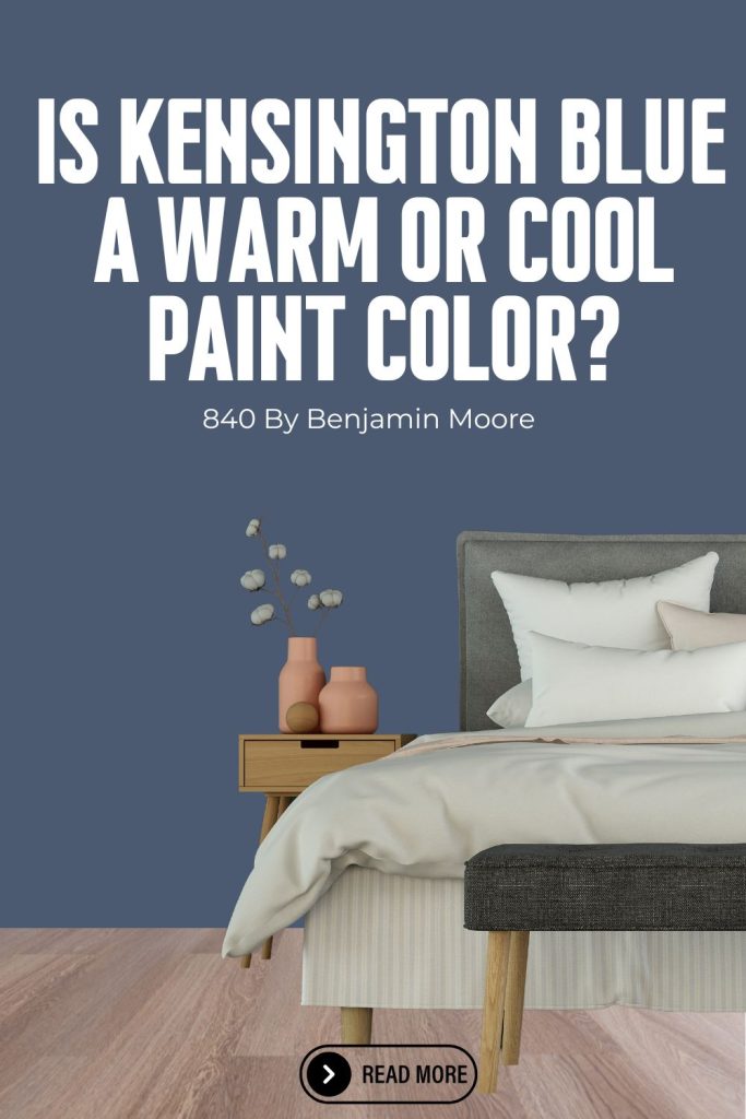
Kensington Blue (840) by Benjamin Moore
Another popular blue paint color for bedrooms is Kensington Blue (840) by Benjamin Moore. This is a vibrant, mid-tone blue that brings a lively yet sophisticated feel to any space. This versatile shade of blue can add a touch of classic elegance or modern chic, depending on how it is used in a room.
Kensington Blue Hex code: #4b5a71
Kensington Blue RGB: 76 / 91 / 114

Is Kensington Blue a warm or cool color?
Kensington Blue (840) by Benjamin Moore is a cool color. It’s a medium-toned, classic blue with crisp, clean undertones that keep it solidly in the cool family. It has a timeless, somewhat traditional feel — think of it as a refined, versatile blue that doesn’t lean too warm or too green, making it a reliable choice for bedrooms where you want a calming, airy atmosphere.
It’s one of those blues that tends to stay true to what you see on the swatch, though as always, testing it in your room’s specific lighting is a good idea before committing.
Common Uses for Kensington Blue (840) by Benjamin Moore:
Accent Walls: Ideal for creating a bold, sophisticated statement in living rooms, bedrooms, or dining rooms. Its medium-toned, classic blue hue adds depth without overwhelming a space.
Cabinetry: Works beautifully on kitchen or bathroom cabinets, providing a fresh, polished look that pairs well with white or brass hardware for a timeless finish.
Furniture: Perfect for refinishing furniture pieces like dressers, bookshelves, or accent tables, adding a pop of color that feels elevated rather than overly casual.
Home Offices and Libraries: Adds a sense of calm and focus, making it a great choice for workspaces where a cool, composed atmosphere helps with productivity.
Children’s Rooms: A fun yet refined color that can bring energy and creativity to a child’s bedroom or playroom without feeling too loud or overstimulating.
Bedrooms: Its cool, calming tone makes it a natural fit for bedrooms, whether used on all four walls or as a single feature wall, promoting relaxation and rest.
Exterior Shutters and Front Doors: Kensington Blue translates well to exterior use, adding classic curb appeal when used on shutters, front doors, or trim details.
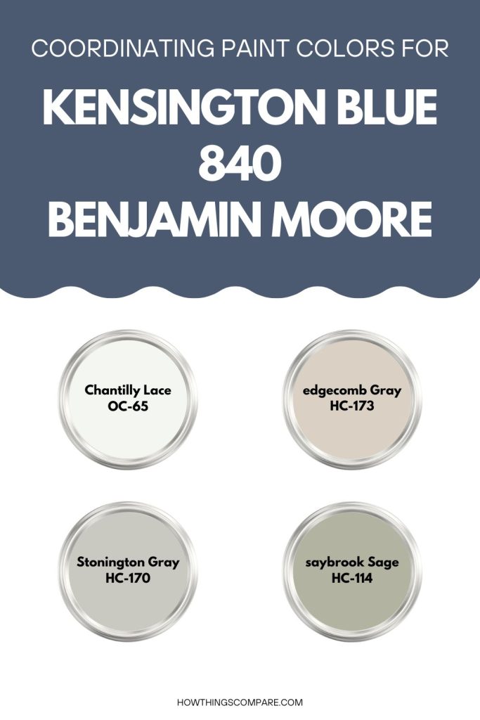
Colors that Complement Kensington Blue:
Whites and Neutrals: Light, neutral shades pair effortlessly with Kensington Blue, providing a clean contrast that lets its classic, medium-toned blue shine without overwhelming the space.
- White Dove (OC-17): A soft, warm white that creates a timeless and inviting contrast against Kensington Blue, working beautifully on trim, ceilings, or adjacent walls.
- Chantilly Lace (OC-65): A bright, crisp white that enhances the vibrancy of Kensington Blue, making it feel fresh and lively in any room.
- Edgecomb Gray (HC-173): A light, warm neutral gray that offers a subtle and elegant pairing, softening Kensington Blue’s coolness with just enough warmth.
2. Grays: Cool and mid-toned grays complement Kensington Blue naturally, creating a polished and cohesive palette that feels calm and well-balanced.
- Stonington Gray (HC-170): A cool, versatile gray that pairs effortlessly with Kensington Blue, producing a clean, balanced, and sophisticated look.
- Coventry Gray (HC-169): A deeper, richer gray that adds a layer of sophistication to the pairing, ideal for creating a more dramatic and refined color scheme.
3. Yellows and Golds: Warm yellows and golds create a lively complementary contrast with Kensington Blue’s cool tone, injecting energy and warmth into the palette.
- Hawthorne Yellow (HC-4): A warm, sunny yellow that provides a cheerful and bold contrast, working well as an accent color in spaces that feature Kensington Blue.
- Concord Ivory (HC-12): A muted, antique gold that adds understated warmth and elegance, complementing Kensington Blue without overpowering it.
4. Greens: Soft, muted greens share a natural harmony with Kensington Blue, evoking a relaxed, nature-inspired palette that feels fresh and calming.
- Saybrook Sage (HC-114): An earthy, muted green that pairs naturally and harmoniously with Kensington Blue, adding an organic, grounded quality to the overall look.
- Guilford Green (HC-116): A soft, classic green with a slightly warm undertone that adds a fresh, garden-inspired touch and complements Kensington Blue beautifully.
5. Other Blues: Layering Kensington Blue with other blues creates a cohesive, tonal palette that feels intentional, serene, and deeply sophisticated.
- Hale Navy (HC-154): A deeper, richer navy that pairs naturally with Kensington Blue, adding depth and creating a polished monochromatic or tonal color scheme.
- Boothbay Gray (HC-165): A soft blue-gray that bridges the gap between blue and neutral, providing a serene and balanced contrast that complements Kensington Blue’s classic tone.
Kensington Blue (840) by Benjamin Moore is a versatile and vibrant color that can add energy, sophistication, and elegance to any space. Pair it with complementary colors to create a balanced and cohesive design.
Kensington Blue LRV
Kensington Blue has an LRV of 11.97 which is an extremely low value, placing this color at the very dark end of the scale. To put it in perspective, absolute black has an LRV of 0 and absolute white has an LRV of 100, so a value of 11.97 means Kensington Blue reflects only a small fraction of the light that hits it, absorbing the vast majority instead.

Get a peel and stick paint sample of Kensington Blue (840) here.
Planning a paint project?
Having the right tools for the job is essential for getting smooth, professional results you’ll be proud of while saving time and avoiding costly mistakes.
Check out my list of pro painters tools here.