When it comes to refreshing a room with color, few shades make a statement quite like the blue-green family. Teal, turquoise, and Aqua tones have a unique ability to energize a space while still maintaining a sense of calm — a balance that is difficult to achieve with many other colors.
In this article, we take a closer look at three standout shades in this family: Teal 2055-10 by Benjamin Moore, Holiday Turquoise (0075) by Sherwin-Williams, and Cool Aqua (2056-40) by Benjamin Moore.
Definitions
Hex Code
A hex code is a six-character alphanumeric code used to represent a specific color by defining the combination of red, green, and blue (RGB) values that make it up. Each pair of characters in the code corresponds to one of the three color channels. Hex codes are widely used by web designers and developers because they offer a compact, standardized way to specify colors in HTML, CSS, and other digital design tools, making color referencing faster and more efficient than writing out full RGB values.
RGB Code
RGB stands for Red, Green, and Blue — the three primary colors of light. Every color on a digital screen is created by combining these three channels at varying intensities, each ranging from 0 to 255. The RGB color model has roots in the early study of light and color perception and became widely adopted in print media throughout the 20th century, appearing in everything from cartoons to advertisements.
It is worth noting an important distinction between paint colors and digital colors. In painting and print, the traditional primary colors are red, blue, and yellow, and combining all pigments together produces black. In the light spectrum, however, the primary colors are red, green, and blue, and combining all light together produces white. This is why a prism can split white light into the full visible color spectrum.
LRV (Light Reflectance Value)
LRV, or Light Reflectance Value, measures how much light a paint color reflects off a surface. It is expressed on a scale from 0 to 100, where 0 represents absolute black, which absorbs all light, and 100 represents absolute white, which reflects all light. In practical terms, the higher a color’s LRV, the brighter and lighter it will appear on your walls. LRV is a useful tool when selecting paint colors, as it helps predict how light or dark a color will look in a space under real lighting conditions.
Teal 2055-10 Benjamin Moore
Benjamin Moore’s Teal is a rich, deep shade that combines blue and green tones to create a sophisticated and vibrant look. Teal is versatile and can be used in various design styles, from modern to traditional.
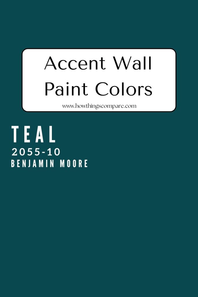
Teal Hex code: #08484E
Teal RGB: 8, 72, 78
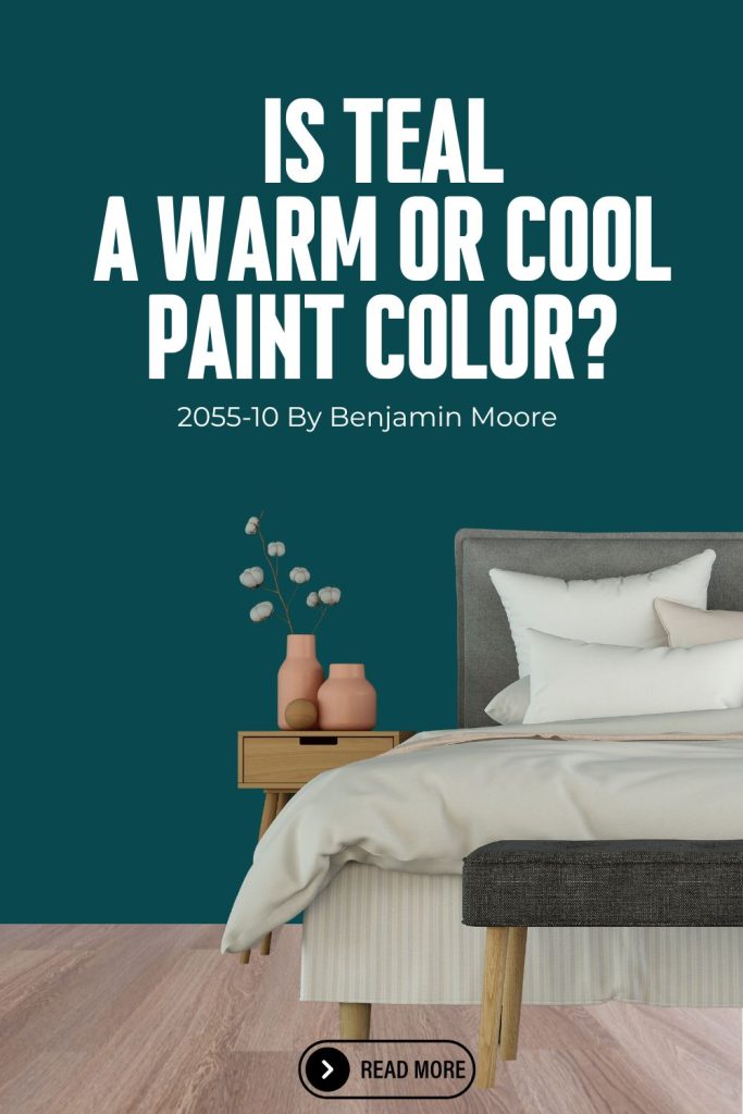
This image shows Benjamin Moore Teal 2055-10.

Need to know how much paint for your project?
Calculate gallons needed and estimated cost — free.
Is Teal a warm or cool color?
Teal 2055-10 by Benjamin Moore is generally considered a cool color, as it sits in the blue-green family which is firmly in the cool spectrum of the color wheel.
However, like many teals, it has a complexity to it — its green component can give it a slightly warmer quality compared to a pure blue, meaning it can feel subtly warmer than a straight navy or blue depending on the lighting conditions in your space. Overall though, it reads as a cool, refreshing tone rather than a warm one.
Common Uses for Teal 2055-10 by Benjamin Moore
Accent Walls: Teal is an excellent choice for creating a striking accent wall in living rooms, bedrooms, or dining areas. Its rich, saturated tone adds depth and visual interest without requiring the entire room to be painted, making it a great way to introduce bold color in a controlled way.
Cabinetry: It works beautifully on kitchen cabinets or bathroom vanities, adding a vibrant pop of color that feels fresh and contemporary. It pairs especially well with white countertops, natural wood accents, and gold or brushed brass hardware for a polished, designer look.
Furniture: Painting a furniture piece such as a bookshelf, dresser, or side table in Teal is a great way to introduce color into a space without committing to a full paint job. It can transform an ordinary piece into an eye-catching focal point that anchors the room.
Entryways: Teal makes a bold and memorable statement in entryways and foyers, setting a welcoming, stylish tone from the moment guests walk through the door. Its depth and richness create a strong first impression that carries throughout the home.
Bedrooms: Teal works well in bedrooms, particularly as a feature wall behind the bed. Its cool, blue-green tone promotes a sense of calm and relaxation while adding a layer of sophistication and personality to the space.
Home Offices and Libraries: The depth and richness of Teal make it a compelling choice for home offices and libraries, where it creates a focused, creative atmosphere that feels both energizing and grounded.
Exterior Front Doors and Shutters: Teal translates beautifully to exterior use, making a bold and inviting statement on front doors or shutters. It adds strong curb appeal and a sense of personality that sets a home apart from its neighbors.
Teal coordinating colors
- Whites and Neutrals
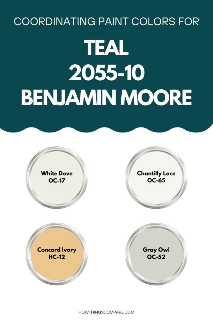
- White Dove (OC-17) by Benjamin Moore: A soft, warm white that creates a clean and classic contrast against Teal, working beautifully on trim, ceilings, and adjacent walls.
- Chantilly Lace (OC-65) by Benjamin Moore: A bright, crisp white that enhances the vibrancy of Teal and keeps the overall palette feeling fresh and lively.
- Edgecomb Gray (HC-173) by Benjamin Moore: A warm, light neutral that softens the boldness of Teal while adding an understated elegance to the pairing.
2. Golds and Yellows
- Hawthorne Yellow (HC-4) by Benjamin Moore: A warm, cheerful yellow that creates a bold and energetic contrast alongside Teal, ideal for accents and complementary spaces.
- Concord Ivory (HC-12) by Benjamin Moore: A muted, antique gold tone that adds warmth and sophistication when paired with Teal.
3. Corals and Terracottas
- Clay Beige (HC-81) by Benjamin Moore: A warm, earthy tone that provides a grounding contrast to Teal, adding warmth and balance to the overall palette.
- Healing Aloe (1552) by Benjamin Moore: A soft, muted coral that pairs naturally with Teal, creating a warm and inviting combination.
4. Blues and Blue-Greens
- Hale Navy (HC-154) by Benjamin Moore: A deep, rich navy that pairs beautifully with Teal, adding depth and creating a sophisticated tonal palette.
- Newburyport Blue (HC-155) by Benjamin Moore: A medium blue that bridges the gap between teal and navy, creating a cohesive and harmonious blue-green palette alongside Teal.
5. Grays
- Stonington Gray (HC-170) by Benjamin Moore: A cool, versatile gray that complements Teal naturally, creating a polished and balanced color scheme.
- Gray Owl (OC-52) by Benjamin Moore: A soft, light gray with subtle warmth that offers a gentle and harmonious contrast without competing with Teal’s boldness.
Teal LRV
Teal has an LRV of 6.49 which is an extremely low value, placing this color at the very dark end of the scale. To put it in perspective, absolute black has an LRV of 0 and absolute white has an LRV of 100, so a value of 6.49 means Teal reflects only a small fraction of the light that hits it, absorbing the vast majority instead.

Get a peel and stick paint sample of Teal by Benjamin Moore here.
Paint Color Samples
Would you like to sample these paint colors? I recommend using a peel and stick paint sample from SAMPLIZE. Peel and stick paint samples are very affordable and easy to use. They are also clean and environmentally friendly!
Advantages of using peel and stick paint samples:
- EASY TO USE: Simply move your SAMPLIZE paint sample around the room to test under a variety of lighting conditions.
- AFFORDABLE: Budget-friendly solution and no more buying inaccurate swatches, rollers, wasted paint.
- SUPER FAST DELIVERY: Depending on your location, 1 day delivery is possible.
- ORDER FROM HOME: Save a trip to the store looking for samples.
- NO MESS: SAMPLIZE uses real paint samples with zero-mess
- NO WASTE: No leftover cans or wasted paint.

Holiday Turquoise 0075 Sherwin-Williams
Holiday Turquoise (0075) by Sherwin-Williams is a vibrant, cheerful shade that strikes an energetic balance between blue and green. Its lively, refreshing character has the ability to instantly brighten a space, making it a versatile choice for a wide range of interior and exterior applications. Whether used as a bold accent or as the primary color in a room, Holiday Turquoise brings a sense of energy and personality that few colors can match.
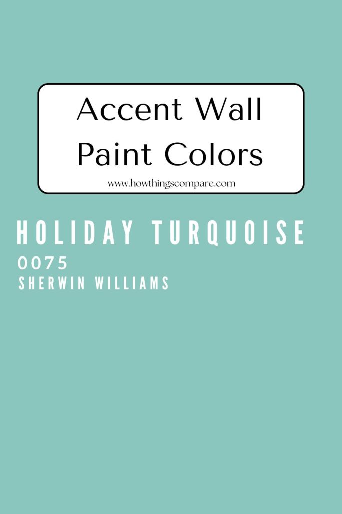
Holiday Turquoise Hex code: #8AC6BD
Holiday Turquoise RGB: 138, 198, 189
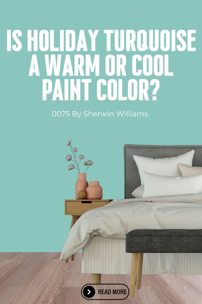
This image shows Holiday Turquoise (0075) by Sherwin-Williams. Hex code: #8DC8BF

Is Holiday Turquoise a warm or cool color?
Holiday Turquoise (SW 0075) by Sherwin-Williams is a cool color. Like most turquoise shades, it sits in the blue-green family on the color wheel, placing it firmly in the cool spectrum.
That said, its green component gives it a slightly warmer quality than a pure blue, lending it a lively, energetic character that feels a touch more vibrant and dynamic than cooler, more blue-leaning shades.
Overall, however, it reads as a cool color with a fresh, refreshing quality that is characteristic of true turquoise tones.
Common uses for Holiday Turquoise by Sherwin Williams
Accent Walls: Holiday Turquoise is an excellent choice for creating a bold and eye-catching accent wall in living rooms, bedrooms, or dining areas. Its vibrant blue-green tone adds instant energy and personality to a space without requiring the entire room to be painted.
Children’s Rooms and Nurseries: Its playful yet soothing character makes it equally suitable for nurseries and children’s rooms, providing a cheerful and creative backdrop that feels fun without being overwhelming.
Bathrooms: Holiday Turquoise works beautifully in bathrooms, evoking a fresh, spa-like quality reminiscent of calm ocean waters. Whether used on all four walls or on a vanity, it transforms the space into a serene and refreshing retreat.
Kitchens: In the kitchen, it can inspire creativity and joy, making cooking a more delightful experience. It works particularly well on kitchen cabinets or as a wall color paired with white cabinetry and warm wood or brass accents.
Bedrooms: Holiday Turquoise’s medium LRV and calming blue-green tone make it a natural fit for bedrooms, where it creates a tranquil, restful atmosphere that promotes relaxation without feeling dark or heavy.
Entryways and Hallways: It is well suited for entry and hallway walls, where its vibrant, welcoming tone makes a memorable first impression and sets an uplifting, lively tone for the rest of the home.
Holiday Turquoise coordinating colors:
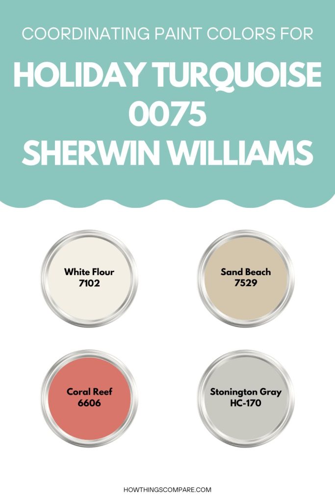
- Whites and Creams: Clean whites and soft creams are among the most natural partners for Holiday Turquoise, providing a crisp contrast that allows its vibrant blue-green tone to stand out while keeping the overall palette feeling light and balanced.
- White Flour (SW 7102): A soft, creamy white that adds contrast and keeps the space feeling light and airy alongside Holiday Turquoise.
- Sand Beach (SW 7529): A subtle, warm beige that grounds the boldness of Holiday Turquoise, creating a calming and well-balanced combination.
2. Corals and Pinks: Warm corals and soft pinks sit opposite turquoise on the color wheel, making them a natural complementary pairing that brings warmth and visual contrast to the palette.
- Coral Reef (SW 6606): A playful and vibrant coral that enhances the tropical character of Holiday Turquoise and provides lively visual interest.
3. Navy and Deep Blues: Pairing Holiday Turquoise with a deep navy creates a sophisticated, coastal-inspired palette that feels intentional and cohesive.
- Naval (SW 6244): A deep, rich navy blue that complements Holiday Turquoise beautifully, lending a sophisticated and timeless coastal quality to the pairing.
4. Soft Grays: Cool, light grays provide a modern and understated backdrop that allows Holiday Turquoise to take center stage without the overall palette feeling too bold or busy.
Holiday Turquoise LRV
Holiday Turquoise (SW 0075) by Sherwin-Williams has an LRV of 50.95, placing it almost exactly in the middle of the 0 to 100 scale. This is a notably balanced value — it is neither a light, airy color nor a dark, heavy one, but rather a true mid-tone that sits comfortably between the two extremes.
This means that Holiday Turquoise will reflect roughly half of the light that hits it, making it a versatile color that adapts well to a variety of lighting conditions. In a room with abundant natural light, it will feel vibrant and energized, allowing its lively blue-green character to shine at its fullest. In a room with more limited light, it will settle into a slightly deeper, richer version of itself without becoming overwhelmingly dark or heavy.

Get a peel and stick paint sample of Holiday Turquoise by Sherwin Williams here.
Do Light Bulbs Affect How Paint Colors Look?
Absolutely. Just like natural light, artificial lighting changes how paint appears. The color temperature of your light bulbs—measured in Kelvins (K)—plays a big role.
- Lower K (2700K–3000K) = warm, yellow light (soft white)
- Higher K (4000K–5000K+) = cool, white to bluish light (bright/daylight)
Choosing the right bulb can make a big difference in how your paint color looks on the wall.
I recommend using these types of light bulbs.
Cool Aqua 2056-40 Benjamin Moore
Cool Aqua (2056-40) by Benjamin Moore is a vibrant and refreshing shade that combines the calming qualities of blue with the invigorating aspects of green. Cool Aqua is a versatile and dynamic color that can be used in various design styles, from modern and contemporary to coastal and tropical. Its ability to evoke feelings of calmness and energy makes it a popular choice for many interior and exterior applications.
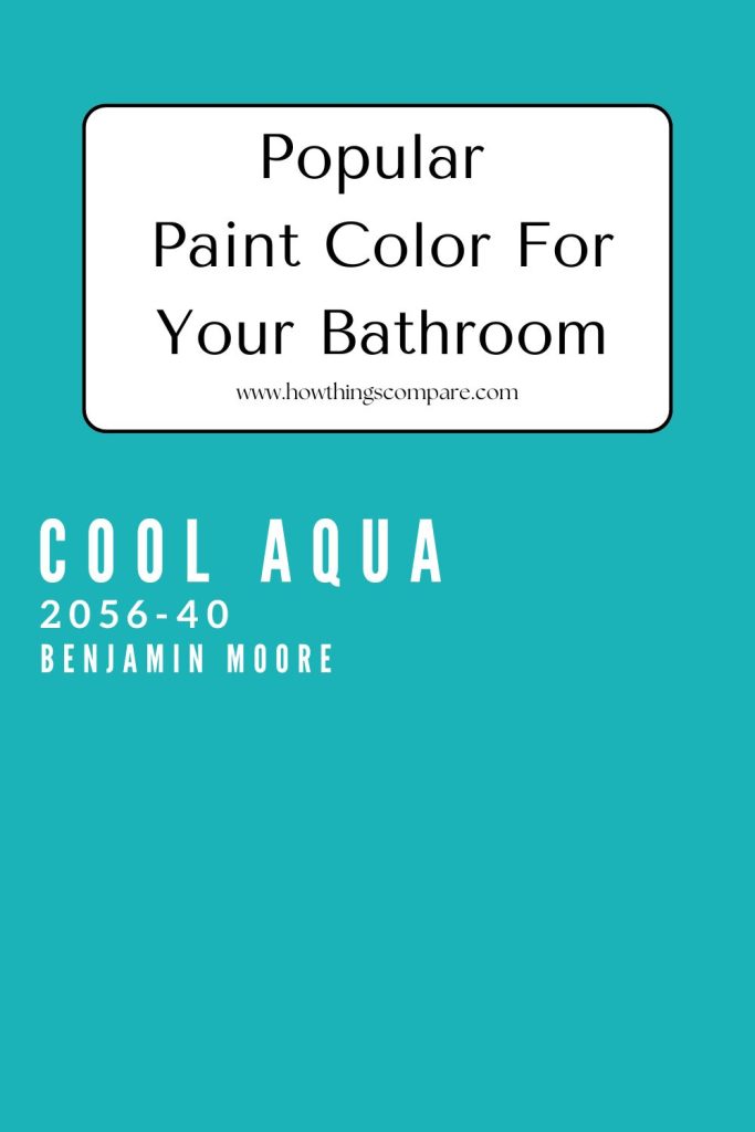
Cool Aqua Hex code: #1BB3B7
Cool Aqua RGB: 27, 179, 183
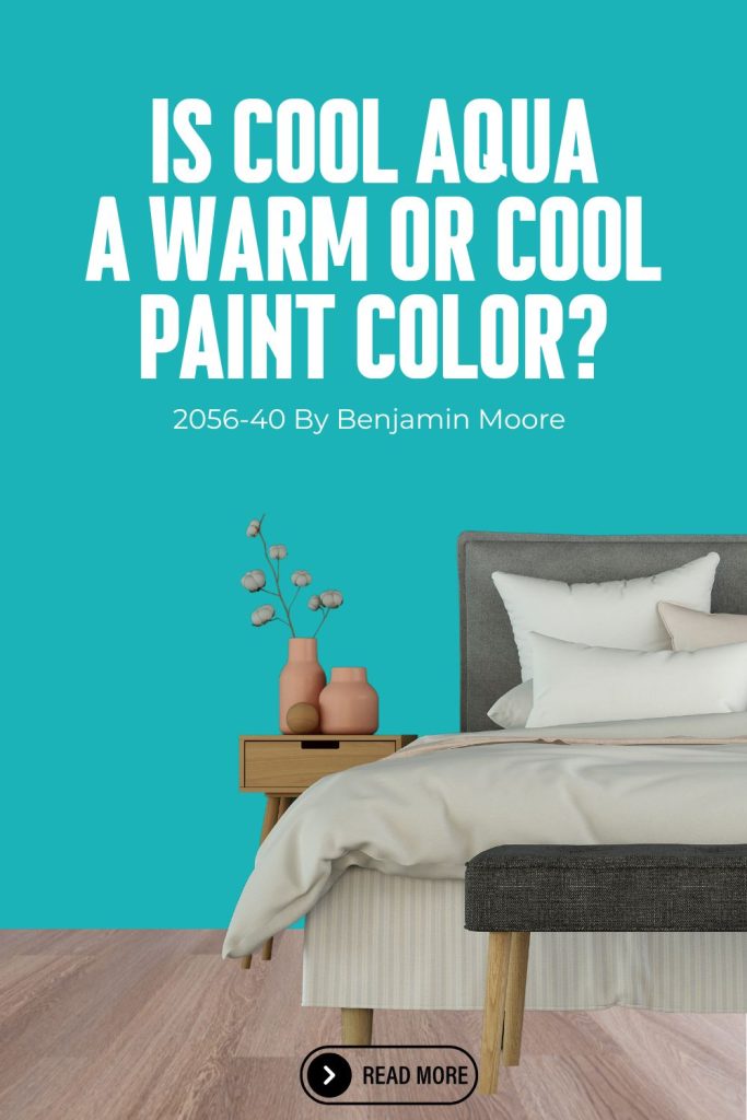
The following image shows Cool Aqua (2056-40) by Benjamin Moore. Hex code: #1BB3B7.

Is Cool Aqua a warm or cool color?
Cool Aqua (2056-40) by Benjamin Moore is a cool color, as its name suggests. It sits in the blue-green family on the color wheel, giving it a fresh, light, and airy quality that is characteristic of cool tones.
Compared to deeper shades like Teal 2055-10 or Holiday Turquoise, Cool Aqua leans lighter and more blue, which reinforces its cool, crisp character. Its higher LRV also contributes to its fresh, open feel, making it one of the more distinctly cool shades in the blue-green family.
Common uses for Cool Aqua 2056-40 Benjamin Moore
Bathrooms: Cool Aqua can create a serene, spa-like atmosphere, making it an excellent choice for bathrooms.
Kitchens: It works well on kitchen cabinets or as a backsplash color, adding a fresh and clean look.
Living Rooms: Use it to bring a lively and energetic feel to living spaces, either on walls or through accent pieces.
Bedrooms: This color can create a calming yet uplifting environment, perfect for bedrooms.
Outdoor Spaces: Ideal for patio furniture, planters, or exterior doors, Cool Aqua brings a vibrant and cheerful touch to outdoor areas.
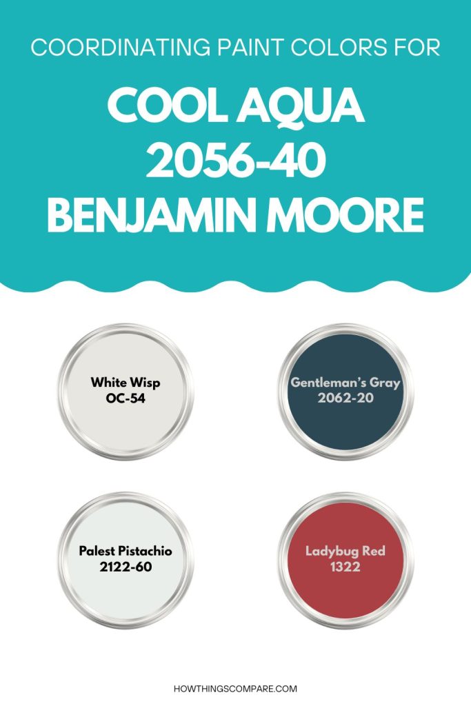
Cool Aqua Coordinating Colors:
Whites and Neutrals: Crisp whites and soft neutrals can balance the vibrancy of Cool Aqua, creating a clean and airy look.
- White Wisp OC-54
Navy Blue: Pairing Cool Aqua with deeper shades of blue can create a sophisticated and nautical theme.
- Gentleman’s Gray 2062-20
Soft Grays: Light gray tones can create a modern and elegant palette when combined with Cool Aqua.
- Palest Pistachio 2122-60
Red: Red and Cool Aqua work well together because they sit near opposite each other on the color wheel, creating a natural complementary contrast that makes each color appear more vivid and dynamic.
- Ladybug Red 1322
Cool Aqua LRV
Cool Aqua (2056-40) by Benjamin Williams has an LRV of 36.77, which places this color in the medium-dark range of the scale, meaning it absorbs more light than it reflects and will read as a noticeably deep, saturated shade on your walls.
In practical terms, it will add a sense of depth, warmth, and intimacy to a space, making it a strong choice for creating a cocooning, atmospheric feel — though it is worth noting that rooms with limited natural light may feel somewhat darker and smaller with a color at this LRV.

Get a peel and stick paint sample of Cool Aqua by Benjamin Moore here.
Planning a paint project?
Having the right tools for the job is essential for getting smooth, professional results you’ll be proud of while saving time and avoiding costly mistakes.
Check out my list of pro painters tools here.
