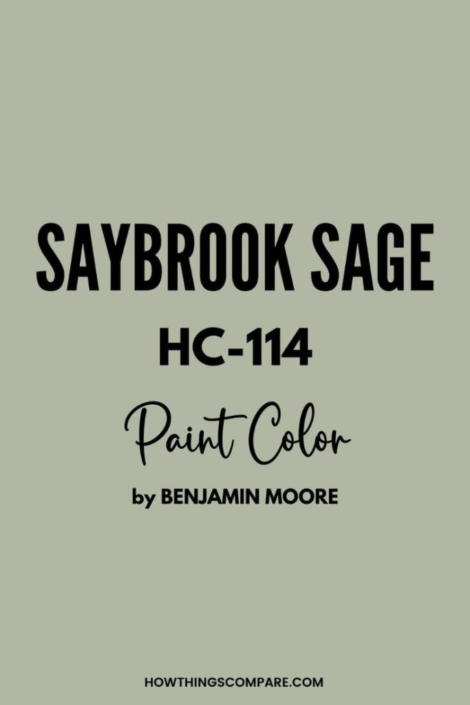
Saybrook Sage by Benjamin Moore is a soft, muted green with earthy undertones that brings calm and sophistication to any space. Whether you’re using it on your walls, cabinetry, or exterior siding, this versatile shade pairs beautifully with a wide range of complementary colors.
In this guide, we’ll explore 5 perfect paint colors that match effortlessly with Saybrook Sage — from white tones and rich neutrals to accent hues that bring depth and contrast.
Whether you’re planning a full room makeover or simply refreshing a space, these curated color combinations will help you create a cohesive and timeless look.
The hex code for Saybrook Sage is #b2b4a1.
Saybrook Sage in Interior Design
Saybrook Sage is a versatile paint color that establishes a mood of tranquility and elegance in interior design. It pairs well with a range of colors and suits various decor styles, from modern to earthy.
Incorporating Saybrook Sage in Living Rooms
Your living room can achieve a serene atmosphere with sage green walls, acting as a neutral backdrop that allows for various decor styles. Choose sofa coverings in complementary neutral colors, or add a dash of sophistication with bold black or silver accents. Consider an accent wall in sage green if you prefer a subtle hint of color.
Saybrook Sage Bedrooms
Bedrooms benefit from the calming effect of sage green, enhancing the sense of tranquility. Use this color for soft furnishings like curtains, bedding, or an accent wall. Harmonize with light woods for a natural look or deep browns for richness.
Elegant Saybrook Sage Bathrooms
Transform your bathroom into a refined retreat with Saybrook Sage. Incorporating sage tiles or a wallpaper pattern can infuse elegance. Pair with neutral tones and elements like white porcelain and silver fixtures for a timeless appeal.
Saybrook Sage Kitchens and Cabinets
For a kitchen with a modern yet timeless vibe, Saybrook Sage kitchens cabinets offer a unique alternative to traditional wood tones. Pair with earth tones and natural materials like marble or granite for a cohesive look.
Accentuating with Saybrook Sage Decor
Incorporate home decor items in Saybrook Sage, such as throw pillows, vases, or artwork, to enhance your space subtly. These touches can tie a room together and introduce color without overwhelming.
Neutral Tones and Natural Elements
Complement Saybrook Sage with a palette of neutral tones like beige, soft grays, and ivory. Incorporating natural elements like wood, greenery, and earthy decor will create a balanced and inviting space.
1. White Dove (OC-17) Benjamin Moore
White Dove paint color by Benjamin Moore is a beautiful complement to Saybrook Sage thanks to its soft, warm undertones. Unlike cool or stark whites, White Dove offers a gentle contrast that enhances Saybrook Sage’s muted green tones without overpowering them. The combination feels calm, elegant, and effortlessly balanced—ideal for creating a relaxed, nature-inspired space.
This pairing works well in both modern and traditional interiors. Use Saybrook Sage on walls and White Dove on trim, ceilings, or cabinetry for a clean, cohesive look. Together, they create a timeless palette that’s perfect for kitchens, living rooms, and bedrooms where warmth and sophistication are key.


Paint Color Samples
Would you like to sample these paint colors? I recommend using a peel and stick paint sample from SAMPLIZE. Peel and stick paint samples are very affordable and easy to use. They are also clean and environmentally friendly!
Advantages of using peel and stick paint samples:
- EASY TO USE: Simply move your SAMPLIZE paint sample around the room to test under a variety of lighting conditions.
- AFFORDABLE: Budget-friendly solution and no more buying inaccurate swatches, rollers, wasted paint.
- SUPER FAST DELIVERY: Depending on your location, 1 day delivery is possible.
- ORDER FROM HOME: Save a trip to the store looking for samples.
- NO MESS: SAMPLIZE uses real paint samples with zero-mess
- NO WASTE: No leftover cans or wasted paint.
Click the image or scan the QR code below!

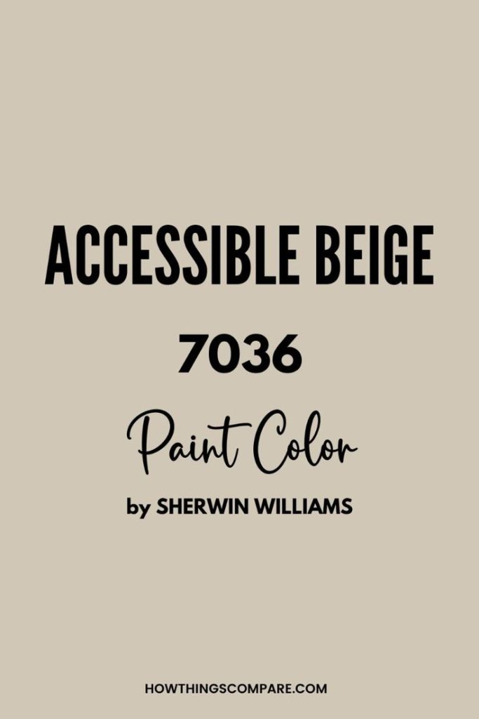
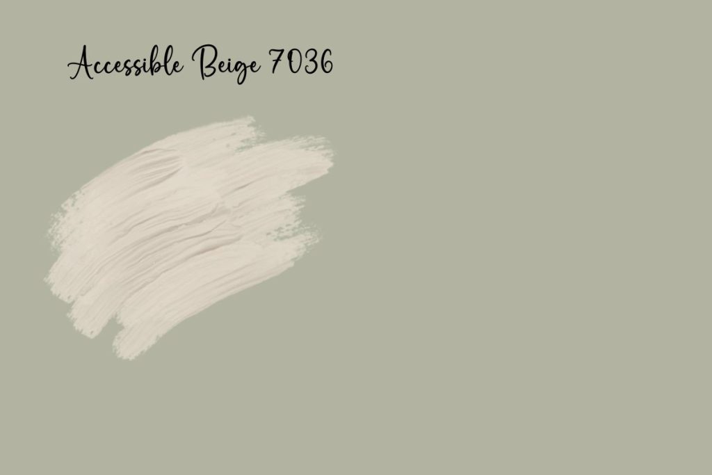
2. Accessible Beige (7036) Sherwin-Williams
Accessible Beige by Sherwin-Williams is an ideal match for Saybrook Sage because of its warm, versatile undertones that pair beautifully with earthy greens. Unlike cooler greiges, Accessible Beige leans slightly warm without being too yellow, which complements the soft, muted quality of Saybrook Sage.
The two colors share a grounded, nature-inspired feel that creates a sense of balance and calm, making them perfect for spaces that feel both welcoming and sophisticated.
This combination works especially well in open floor plans or adjacent rooms where color flow matters. Use Accessible Beige on walls and Saybrook Sage as an accent on cabinets, furniture, or even an adjoining room for a seamless transition.
Together, they offer a timeless palette that’s cozy yet refined—ideal for living rooms, kitchens, or bedrooms that aim for a soft, organic aesthetic.
Planning a paint project?
Having the right tools for the job is essential for getting smooth, professional results you’ll be proud of while saving time and avoiding costly mistakes.
Check out my list of pro painters tools here.
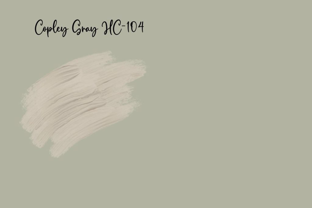
3. Copley Gray (HC-104) Benjamin Moore
Copley Gray by Benjamin Moore pairs beautifully with Saybrook Sage because both colors share rich, earthy undertones that create a grounded and cohesive look. Copley Gray is a warm, medium-toned gray with subtle green undertones, which echo the soft, muted green of Saybrook Sage.
When used together, these colors complement each other rather than compete, resulting in a palette that feels natural, elegant, and harmonious.
This combination is especially effective in traditional or transitional spaces where depth and character are desired. Saybrook Sage can be used on walls or cabinetry to introduce color, while Copley Gray adds contrast through trim, furniture, or accent walls.
The pairing brings warmth and subtle sophistication, making it a great choice for living rooms, dining rooms, or studies that aim for a refined yet comfortable atmosphere.

Do Light Bulbs Affect How Paint Colors Look?
Absolutely. Just like natural light, artificial lighting changes how paint appears. The color temperature of your light bulbs—measured in Kelvins (K)—plays a big role.
- Lower K (2700K–3000K) = warm, yellow light (soft white)
- Higher K (4000K–5000K+) = cool, white to bluish light (bright/daylight)
Choosing the right bulb can make a big difference in how your paint color looks on the wall.
I recommend using these types of light bulbs.
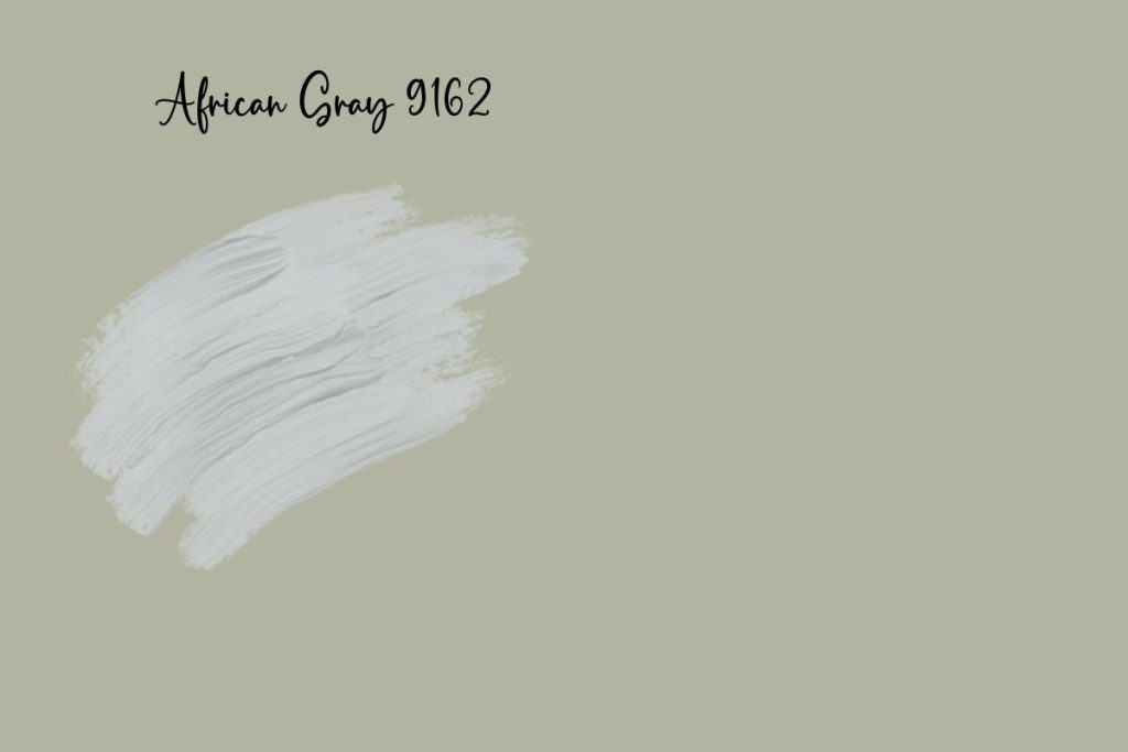
4. African Gray (9162) Sherwin-Williams
African Gray by Sherwin-Williams is a striking complement to Saybrook Sage because it brings a cool, moody balance to the warm, earthy green.
African Gray is a deep, slate-toned gray with blue undertones, which contrasts beautifully with the soft, muted green of Saybrook Sage. This contrast adds visual depth and interest while still maintaining a nature-inspired, calming palette.
Together, these colors create a sophisticated, grounded look that’s ideal for modern and transitional interiors. Use Saybrook Sage on walls to introduce warmth and a subtle pop of color, and bring in African Gray through cabinetry, an accent wall, or even interior doors for a bold, polished finish.
The blend of earthy green and cool gray gives any space a serene yet stylish vibe that feels timeless and refined.
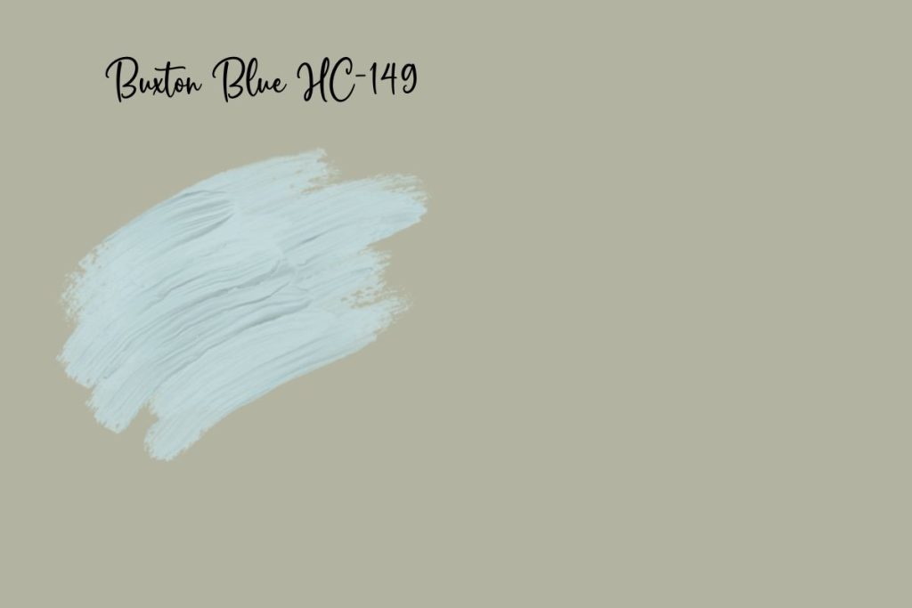
5. Buxton Blue (HC-149) – Benjamin Moore
Buxton Blue by Benjamin Moore is a beautiful complement to Saybrook Sage because it shares the same soft, nature-inspired quality while offering a cooler, breezy contrast.
Buxton Blue is a muted blue with hints of gray and green, which allows it to harmonize effortlessly with the warm, earthy green of Saybrook Sage. The pairing feels fresh yet grounded, creating a soothing color palette that’s perfect for relaxed and inviting interiors.
These two colors work especially well together in coastal, cottage, or transitional spaces. Use Saybrook Sage on main walls or furniture pieces, and introduce Buxton Blue through accent walls, built-ins, or accessories like curtains and rugs.
Together, they provide a calm, layered look that brings the outdoors in—ideal for bedrooms, bathrooms, or entryways that aim to feel welcoming, soft, and timeless.

Visit OUR SHOP for stunning paint color palettes!
Click the image or link here.
Frequently Asked Questions
Which complementary colors are recommended to pair with Saybrook Sage in a kitchen setting?
For a kitchen setting, earthy tones such as creams or light browns work well with Saybrook Sage to create a warm and inviting space. Metallic finishes like copper or gold can also add a touch of elegance to kitchen cabinets or walls.
What color palette is advisable for a wedding that includes Saybrook Sage as a theme?
For a wedding palette, consider Saybrook Sage with soft neutrals like ivory and beige for a delicate look, or pair with blush pink and lavender for a romantic atmosphere. Accents of gold can bring a touch of sophistication to the color scheme.
How can I incorporate Saybrook Sage into a living room design effectively?
To incorporate Saybrook Sage into your living room, use it on a feature wall or in upholstery, complemented by neutrals like light gray or beige. Textural elements like wood or linen can add depth to the design.
Can gray be paired with Saybrook Sage, and if so, which shades are most harmonious?
Gray can certainly be paired with Saybrook Sage. Opt for lighter shades of gray to maintain a soft, tranquil aesthetic, or choose a charcoal gray for a bolder contrast that still harmonizes with sage green’s muted tones.
How does mustard yellow complement Saybrook Sage in interior decor?
Mustard yellow can act as a vibrant accent color that contrasts nicely with the subdued nature of Saybrook Sage. It adds a warm and optimistic punch to the room, especially effective in decorative pillows, art, or drapery.
What are the best color combinations when using Saybrook Sage and navy for a cohesive look?
Combine Saybrook Sage with navy blue for a classic and sophisticated look. To keep the palette cohesive, incorporate varying shades of green and blue, or introduce white or light gray as a neutral buffer between the stronger colors.