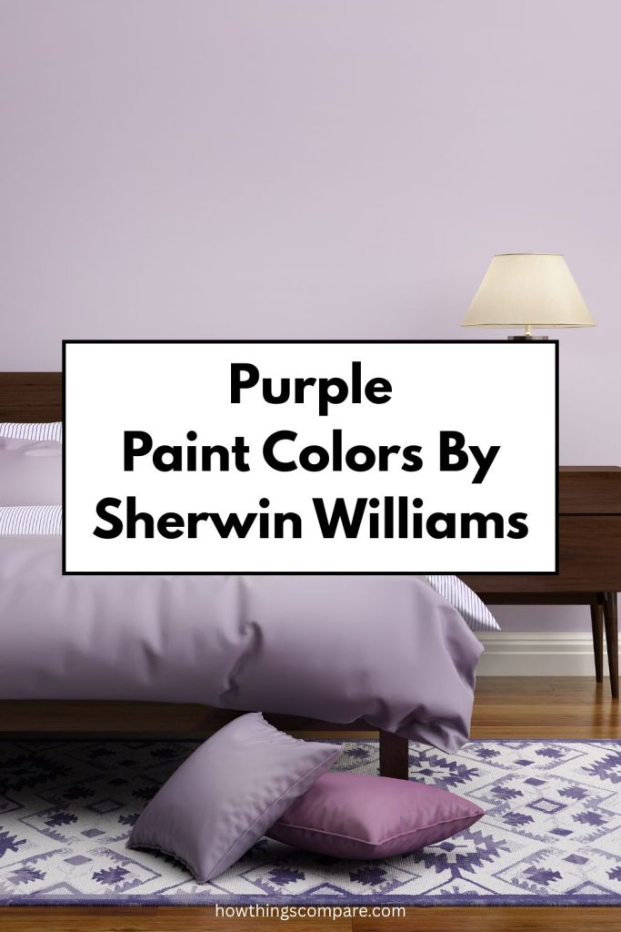
When it comes to adding a touch of elegance, creativity, or calm to your home, few colors are as versatile as purple, violet, and lavender.
Each of these shades brings its own unique personality, from the bold richness of purple to the soft serenity of lavender.
This article shows how these colors work in different spaces, the moods they create, and the best ways to pair them with complementary hues.
Plus, I’ll share complementary color pairings, similar shades, and my top picks for purple, violet, and lavender paint colors.

Need to know how much paint for your project?
Calculate gallons needed and estimated cost — free.
Definitions
Hex Code
The attributed hex codes for each color is a hexadecimal method of determining the combination of red, blue and green that goes into creating a color.
The important thing about a hex code is that it is shorter; being able to lose the three digits of each of the RGB code allows coders and designers to more efficiently note which colors they want to be included in their web pages and layouts.
RGB Code
RGB values represent the intensity of Red, Green, and Blue light in a specific color, ranging on a scale from 0 to 255.
LRV
LRV, or Light Reflectance Value, is a measurement that indicates the amount of light a paint color reflects. It is expressed as a percentage, ranging from 0% (absolute black, which absorbs all light) to 100% (absolute white, which reflects all light).
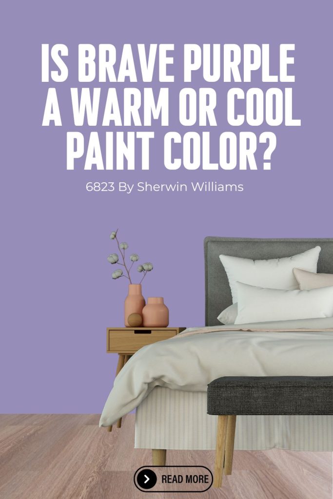
Brave Purple (SW 6823) by Sherwin-Williams
My favorite shade of purple is Brave Purple (SW 6823) by Sherwin-Williams. This is a rich and vibrant purple shade. It exudes confidence and sophistication, making it a bold choice for various interior and exterior design projects.

Is Brave Purple a warm or cool color?
Brave Purple (SW 6823) by Sherwin-Williams is a deep, captivating paint color with cool, jewel-toned undertones that create a bold and artistic atmosphere. Rooted in rich violet tones, Brave Purple sits in the cool color family, offering a dramatic, sophisticated quality that adds a sense of creativity and luxury to any space.
It’s a great choice for those looking to make a daring statement while bringing a sense of depth and intrigue to their home. Brave Purple’s intense, moody tone makes it perfect for creating a stunning accent wall or an immersive, gallery-like feel in any room, pairing beautifully with crisp whites, warm golds, and deep charcoals in both modern and traditional home styles.

Best Uses for Brave Purple:
- Accent Walls: This color works wonderfully as an accent wall in living rooms, bedrooms, or dining areas to add a pop of color and make a statement.
- Furniture: Use Brave Purple on furniture pieces such as cabinets, bookshelves, or a feature piece of furniture to create a focal point in the room.
- Kids’ Rooms and Playrooms: Its vibrant hue can add a playful and energetic vibe, perfect for children’s spaces.
- Entryways: Create a welcoming and stylish entryway with this striking purple.
- Exterior Trim or Front Door: For a unique and eye-catching exterior, use Brave Purple on the front door or trim.
Colors that Compliment Brave Purple:
- Neutrals:
- Snowbound (SW 7004): A crisp, clean white that allows Brave Purple to stand out.
- Agreeable Gray (SW 7029): A warm gray that balances the boldness of Brave Purple.
- Alabaster (SW 7008): A soft, warm white that complements the richness of Brave Purple.
- Blues:
- Naval (SW 6244): A deep navy blue that pairs elegantly with Brave Purple.
- Misty (SW 6232): A light blue-gray that provides a soft contrast.
- Greens:
- Jade Dragon (SW 9129): A deep green that creates a luxurious and harmonious look.
- Sea Salt (SW 6204): A light, calming green that adds a serene touch.
- Yellows and Golds:
- Butterscotch (SW 6370): A warm yellow that adds a cheerful contrast.
- Goldenrod (SW 6677): A muted gold that complements the richness of Brave Purple.
Using Brave Purple (SW 6823) thoughtfully can add depth, elegance, and a touch of drama to any space.

Brave Purple Hex code
The hex code for Brave Purple paint color is #968DB8.
Brave Purple LRV
The LRV for Brave Purple is 29.

Brave Purple RGB
The RGB for Brave Purple is R 150 / G 141 / B 184.
Get a peel and stick paint sample of Brave Purple by Sherwin Williams here.
Paint Color Samples
Would you like to sample these paint colors? I recommend using a peel and stick paint sample from SAMPLIZE. Peel and stick paint samples are very affordable and easy to use. They are also clean and environmentally friendly!
Advantages of using peel and stick paint samples:
- EASY TO USE: Simply move your SAMPLIZE paint sample around the room to test under a variety of lighting conditions.
- AFFORDABLE: Budget-friendly solution and no more buying inaccurate swatches, rollers, wasted paint.
- SUPER FAST DELIVERY: Depending on your location, 1 day delivery is possible.
- ORDER FROM HOME: Save a trip to the store looking for samples.
- NO MESS: SAMPLIZE uses real paint samples with zero-mess
- NO WASTE: No leftover cans or wasted paint.
Vigorous Violet (SW 6838) by Sherwin-Williams
I love Vigorous Violet (SW 6838) by Sherwin-Williams. This is a bright, bold purple that brings a vibrant and energetic feel to any space. This lively color is perfect for making a statement and adding a touch of playfulness and creativity to your design.

Best Uses for Vigorous Violet:
- Accent Walls: Ideal for creating a focal point in living rooms, bedrooms, or dining areas.
- Children’s Rooms: Adds a fun and lively atmosphere to kids’ bedrooms and playrooms.
- Creative Spaces: Perfect for art studios, home offices, or any area where creativity is encouraged.
- Furniture: Can be used to paint furniture pieces like chairs, tables, or cabinets to introduce a pop of color.
- Entryways: Use it on doors or entryway walls for a welcoming and dynamic entrance.
Colors that Complement Vigorous Violet:
- Neutrals:
- Pure White (SW 7005): A clean, crisp white that helps Vigorous Violet stand out.
- Repose Gray (SW 7015): A soft gray that provides a balanced backdrop.
- Eider White (SW 7014): A light, neutral tone that offers a subtle contrast.
- Greens:
- Great Green (SW 6430): A bright, lively green that pairs well with the energy of Vigorous Violet.
- Softened Green (SW 6177): A muted green that provides a calming complement.
- Blues:
- Dynamic Blue (SW 6958): A bright blue that adds a playful contrast.
- Sleepy Blue (SW 6225): A softer blue that offers a more relaxed pairing.
- Yellows and Golds:
- Lemon Twist (SW 6909): A cheerful yellow that enhances the vibrancy of Vigorous Violet.
- Glimmer (SW 6476): A soft, golden hue that adds warmth.
- Pinks:
- Rosebud (SW 6835): A bright pink that creates a bold, fun look.
- Lite Lavender (SW 6554): A lighter purple-pink that softens the intensity of Vigorous Violet.
Using Vigorous Violet (SW 6838) can bring a sense of excitement and creativity to any room. Pair it with complementary colors to enhance its boldness and create a cohesive design.

Vigorous Violet Hex code
The hex code for Vigorous Violet paint color is #7c5a7e.
Vigorous Violet LRV
The hex code for Vigorous Violet is 13.
Vigorous Violet RGB
The RGB for Vigorous Violet is R124 / G90 / B126

Get a peel and stick sample of Vigorous Violet by Sherwin Williams here.
Dried Lavender (SW 9072) by Sherwin-Williams
A stunning shade of lavender is Dried Lavender (SW 9072) by Sherwin-Williams. This is a soft, muted lavender hue that evokes a sense of calm and tranquility. This subtle and elegant color is versatile, making it a great choice for various design applications where a touch of gentle sophistication is desired.

Best Uses for Dried Lavender:
- Bedrooms: Creates a serene and relaxing atmosphere, perfect for restful spaces.
- Living Rooms: Adds a touch of elegance and softness, ideal for cozy and inviting living areas.
- Bathrooms: Enhances a spa-like feel, contributing to a peaceful and soothing environment.
- Nurseries: Provides a calming and nurturing color suitable for baby’s rooms.
- Hallways and Entryways: Offers a welcoming and understated sophistication as you enter the home.
Colors that Complement Dried Lavender:
- Neutrals:
- Pure White (SW 7005): A clean white that provides a crisp and fresh contrast.
- Agreeable Gray (SW 7029): A warm gray that balances the softness of Dried Lavender.
- Alabaster (SW 7008): A warm white that complements the gentle hue of Dried Lavender.
- Greens:
- Sea Salt (SW 6204): A light green that adds a refreshing touch.
- Sage Green Light (SW 2851): A muted green that pairs well with the subdued tone of Dried Lavender.
- Blues:
- Sleepy Blue (SW 6225): A soft blue that enhances the calming effect.
- Rainwashed (SW 6211): A light blue-green that provides a serene complement.
- Pinks and Mauves:
- Mauve Mystique (SW 9076): A deeper mauve that adds depth and richness.
- Intimate White (SW 6322): A light pink that offers a delicate and harmonious pairing.
- Warm Accents:
- Creamy (SW 7012): A warm, creamy white that adds a touch of warmth.
- Humble Gold (SW 6380): A soft gold that introduces a subtle and elegant warmth.
Dried Lavender (SW 9072) is a versatile and tranquil color that can create a serene and elegant ambiance in any space. Pair it with complementary colors to enhance its gentle beauty and achieve a balanced and harmonious design.

Dried Lavender Hex code
The hex code for Dried Lavender is #8595AA.
Dried Lavender LRV
The LRV for Dried Lavender is 29.

Dried Lavender RGB
The RGB for Dried Lavender is 133 / 149 / 170.
Get a peel and stick sample of Dried Lavender buy Sherwin Williams here.
