When it comes to painting your home, choosing the right white paint can be tricky. Sherwin Williams offers some of the best white paint colors you can find. From warm whites to cool tones, there’s a shade for every room.
You might wonder which white will look best in your space. Popular options like Alabaster, Pure White, and Snowbound are great places to start. Each has its unique charm and works well in different lighting.
Finding the perfect white paint color can transform your home. With Sherwin Williams’ range, you’re sure to discover the perfect shade to make your space shine.
Click the link below each color to get a peel and stick color sample from Samplize.
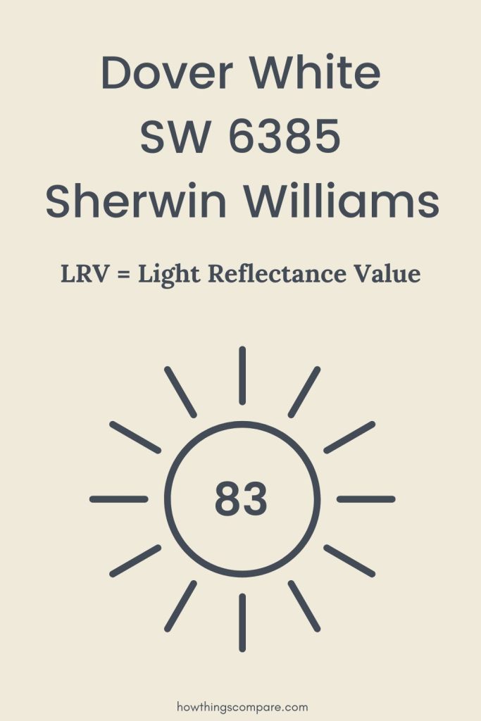
1. Dover White SW 6385
Dover White is one of Sherwin Williams’ most popular colors. This paint color is a soft, warm white. It pairs well with many other colors, making it versatile for various rooms.
RGB: 240, 234, 219
Hex Code: #F0EADB

Need to know how much paint for your project?
Calculate gallons needed and estimated cost — free.
Key Features
- Color Code: SW 6385
- Finish Options: Available in flat, satin, semi-gloss, and gloss finishes.
- Light Reflectance: Has a Light Reflectance Value (LRV) of 83, meaning it reflects a lot of light, making spaces feel brighter and larger.
Recommended Uses
- Living Rooms: Works great for walls and trim, offering a cozy, welcoming feel.
- Bedrooms: Provides a serene backdrop ideal for relaxation.
- Kitchens: Complements cabinets and countertops, adding a touch of elegance.
Tips for Use
- Use in rooms with natural light to maximize its brightness.
- Pair with darker shades for contrast, like grays or navy blues.
- Ideal for both traditional and modern decor styles.

Is Dover White SW 6385 a warm or cool color?
Dover White by Sherwin-Williams is a warm white paint color with creamy, yellow undertones that bring a soft and welcoming feel to any space. With an LRV of 83, it sits firmly in the warm white family — bright enough to keep rooms feeling open but never stark or cold.
It’s a great choice for living rooms and bedrooms where you want a classic, cozy white that feels intentional without leaning too far into cream or beige territory.
What is the LRV of Dover White SW 6385?
Dover White has a Light Reflectance Value (LRV) of 83, meaning it reflects 83% of the light that hits it. This makes it a bright, light color that can help open up a space and make it feel airy and fresh. Its soft, warm undertones add a gentle coziness without feeling stark or cold.
Paint Color Samples
Would you like to sample these paint colors? I recommend using a peel and stick paint sample from SAMPLIZE. Peel and stick paint samples are very affordable and easy to use. They are also clean and environmentally friendly!
Advantages of using peel and stick paint samples:
- EASY TO USE: Simply move your SAMPLIZE paint sample around the room to test under a variety of lighting conditions.
- AFFORDABLE: Budget-friendly solution and no more buying inaccurate swatches, rollers, wasted paint.
- SUPER FAST DELIVERY: Depending on your location, 1 day delivery is possible.
- ORDER FROM HOME: Save a trip to the store looking for samples.
- NO MESS: SAMPLIZE uses real paint samples with zero-mess
- NO WASTE: No leftover cans or wasted paint.

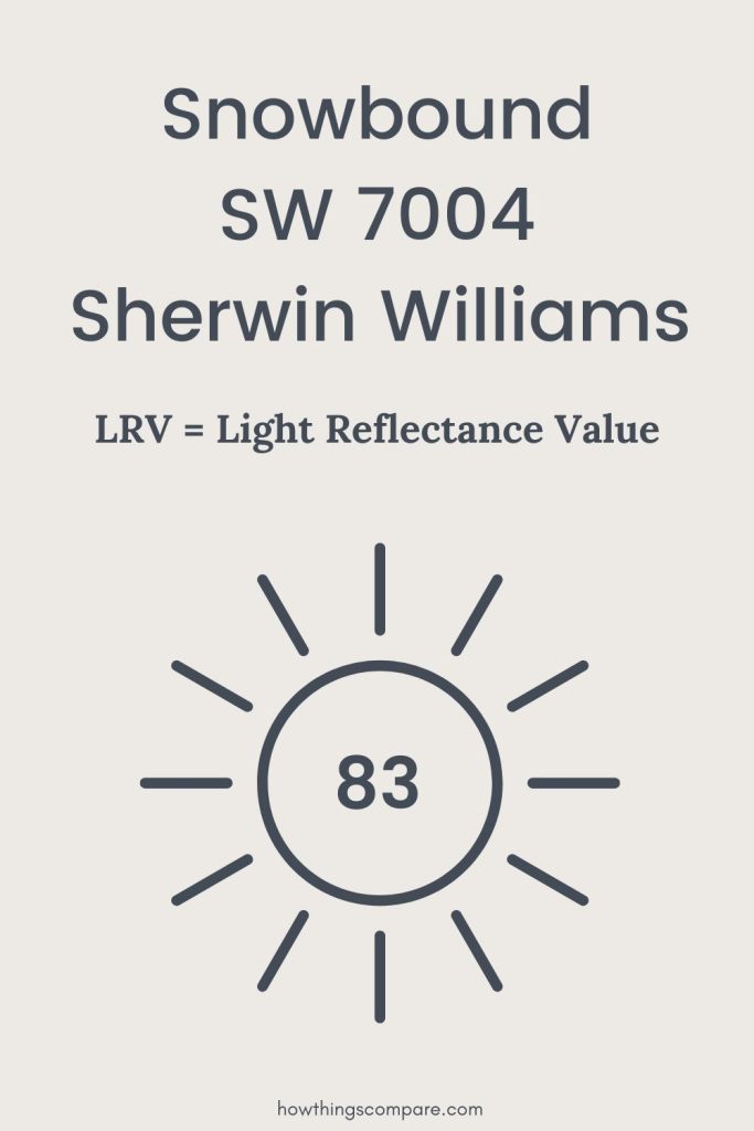
2. Snowbound SW 7004
Snowbound is a popular white paint color from Sherwin Williams. It has a cool undertone that can make any room feel fresh and modern.
Use Snowbound in living rooms and bedrooms for a clean, crisp look. It pairs well with both cool and warm colors, making it a versatile choice for any style.
For exterior use, Snowbound provides a bright, clean appearance that stands out in the sunlight. This makes it an excellent option for a fresh, welcoming home facade.
When considering trim or ceilings, Snowbound is a smart choice due to its neutral base and ability to complement other colors effectively.
RGB: 237, 234, 229
Hex Code: #EDEAE5
| Uses | Benefits |
|---|---|
| Living Rooms | Crisp and modern look |
| Bedrooms | Fresh, clean appearance |
| Exterior Facades | Bright and welcoming |
| Trim and Ceilings | Complements other colors well |

Snowbound has a Light Reflectance Value (LRV) of 83, which means it reflects a lot of light. This helps to brighten up spaces, making them feel larger and more open.
Remember to test Snowbound in different lighting conditions. It can sometimes appear more gray or blue depending on the lighting in your room.
Snowbound’s ability to work in various settings makes it a go-to white for many homeowners and designers.

Is Snowbound SW 7004 a warm or cool color?
Snowbound by Sherwin-Williams is a warm white paint color with soft gray and faint violet undertones that give it a quiet, sophisticated feel. With an LRV of 83, it sits on the warmer side of white while remaining lighter and less creamy than traditional warm whites.
It’s a great choice for spaces where you want warmth without any yellow — particularly in rooms with mixed lighting where a chameleon white that adapts to its surroundings is exactly what you need.
What is the LRV of Snowbound SW 7004?
Snowbound has a Light Reflectance Value (LRV) of 83, meaning it reflects 83% of the light that hits it. This makes it a bright, light color that can help open up a space and make it feel fresh and expansive. Its soft gray and faint violet undertones add a quiet sophistication that keeps it from feeling too creamy or yellow while still maintaining a warm, inviting quality.
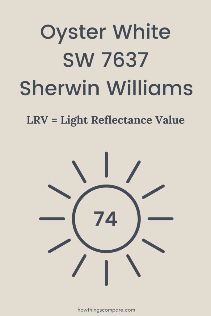
3. Oyster White SW 7637
Oyster White is a versatile color from Sherwin Williams. It features a soft blend of gray and beige, also known as greige.
This paint color works well in many settings.
- Living Rooms: Creates a calm, inviting space.
- Bedrooms: Adds a touch of elegance.
- Kitchens: Complements both modern and traditional décor.

Pros
- Neutral Tone: Suits various styles, from contemporary to rustic.
- Light Enhancing: Brightens up smaller rooms.
- Flexibility: Pairs well with both light and dark colors.
Cons
- Subtlety: May lack impact in large, open areas.
- Maintenance: Light colors can show dirt more easily.
When you choose Oyster White, you’re getting a paint color that offers subtle sophistication and versatility. It can be the perfect backdrop for your favorite décor pieces.
RGB: 226, 221, 208
Hex Code: #E2DDD0

Is Oyster White SW 7637 a warm or cool color?
Oyster White by Sherwin-Williams is a warm white paint color with a complex mix of gray, green and faint yellow undertones that create a refined, understated elegance. With an LRV of 74, it sits at the warmer and slightly deeper end of the white spectrum — adding warmth and depth without tipping into beige.
It’s a great choice for living rooms and dining rooms where you want a sophisticated white backdrop that complements both warm and cool elements in your space.
What is the LRV of Oyster White SW 7637?
Oyster White has a Light Reflectance Value (LRV) of 74, meaning it reflects 74% of the light that hits it. This makes it a moderately bright color that adds warmth and depth without overwhelming a space with brightness. Its complex gray, green and faint yellow undertones give it a refined, understated character that most traditional whites simply can’t achieve.
Planning a paint project?
Having the right tools for the job is essential for getting smooth, professional results you’ll be proud of while saving time and avoiding costly mistakes.
Check out my list of pro painters tools here.
4. Alabaster SW 7008
Alabaster by Sherwin Williams is a classic choice that suits many styles. It’s a warm white paint that gives a cozy feel to any room.
You might find it great for living rooms, bedrooms, and even kitchens. It pairs well with natural wood tones and both contemporary and traditional decor.
RGB: 242, 238, 231
Hex Code: #EEEAE0

Key Features:
- Name: Alabaster (SW 7008)
- Type: Warm White
- Use: Walls, Trim, Cabinets
Here are some places where Alabaster shines:
- Living Rooms: Creates a welcoming atmosphere.
- Bedrooms: Provides a calming effect.
- Kitchens: Complements white cabinets and modern appliances.
Popular Combinations:
- Neutral Palettes: Combine with beiges or light grays.
- Bold Accents: Goes well with navy or black for a striking contrast.

Is Alabaster SW 7008 a warm or cool color?
Alabaster by Sherwin-Williams is a warm white paint color with soft, creamy undertones that create a cozy and inviting feel. With a hue value of 46°, Alabaster sits comfortably in the warm color family, offering just the right touch of warmth without appearing too yellow or beige.
It’s a great choice for those looking to brighten their space while maintaining a soft, natural look. Alabaster’s warmth makes it perfect for creating a welcoming atmosphere in both modern and traditional homes.
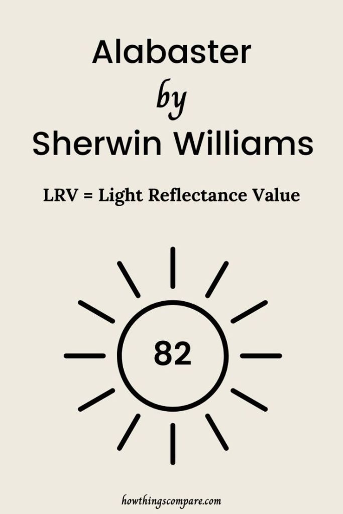
What is the LRV of Alabaster SW 7008?
Alabaster has a Light Reflectance Value (LRV) of 82, meaning it reflects 82% of the light that hits it. This makes it a bright, light color that can help open up a space and make it feel airy and fresh. Its soft, warm undertones add a gentle coziness without feeling stark or cold.
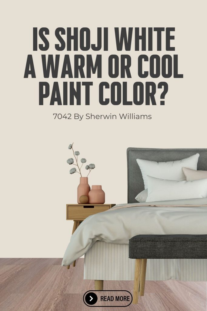
5. Shoji White SW 7042
Shoji White is a popular choice for a clean and versatile look. It’s a warm, soft white with a hint of beige, making it perfect for both modern and traditional spaces.
RGB: 230, 223, 211
Hex Code: #E6DFD3

Details:
- Color Code: SW 7042
- LRV (Light Reflectance Value): 74
- Undertones: Subtle hints of beige
Shoji White can adapt to different lighting conditions, making it suitable for any room in your home. It works well in living rooms, bedrooms, and kitchens.
Pairing Suggestions:
- Trim Colors: Pure White (SW 7005)
- Accent Colors: Accessible Beige (SW 7036), Peppercorn (SW 7674)
This color creates a cozy and inviting atmosphere. You can use it on walls, cabinetry, and even ceilings. Its neutral undertone ensures it complements a variety of furniture and decor styles.
Advantages:
- Versatile and adaptable
- Warm and inviting
- Complements various decor styles
Shoji White provides a perfect balance if you want something warmer than plain white but still light and airy.

Is Shoji White SW 7042 a warm or cool color?
Shoji White by Sherwin-Williams is a warm white paint color with soft beige and gray undertones that create a calm, naturally balanced feel. With an LRV of 74, it sits comfortably in the warm white family — bright enough to keep spaces feeling light and airy but grounded enough to never feel stark or clinical.
It’s a great choice for living rooms, bedrooms and open concept spaces where you want a warm neutral white that bridges the gap between crisp white and soft greige without fully committing to either.
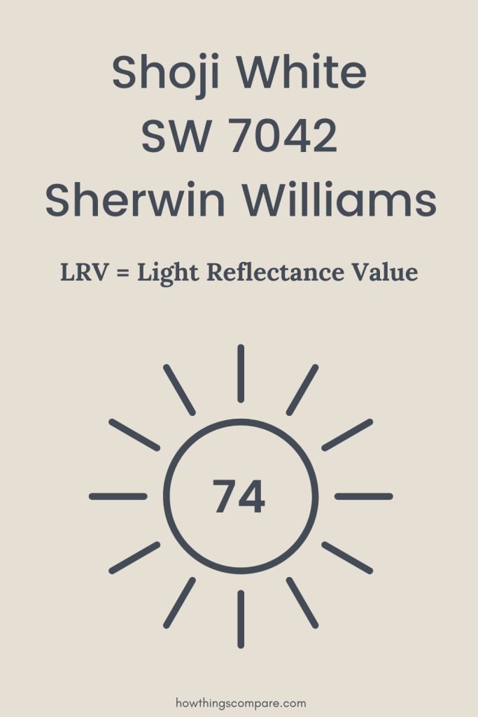
What is the LRV of Shoji White SW 7042?
Shoji White has a Light Reflectance Value (LRV) of 74, meaning it reflects 74% of the light that hits it. This makes it a moderately bright color that adds warmth and depth to walls without overwhelming a space with brightness. Its soft beige and greige undertones give it a naturally balanced quality that sits comfortably between a crisp white and a light neutral without fully committing to either.
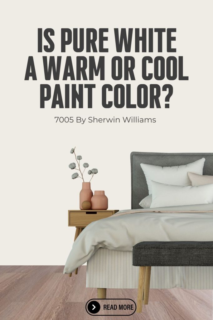
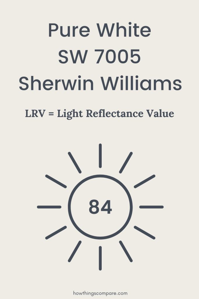
6. Pure White SW 7005
Pure White is a favorite from Sherwin Williams. This shade is highly versatile. It works well in various rooms.
RGB: 238, 236, 229
Hex Code: #EEECE5

Key Features
- Color Code: SW 7005
- Light Reflectance Value (LRV): 84
- Finish Options: Available in flat, satin, semi-gloss, and gloss finishes.
You will appreciate the clean, crisp look of Pure White. It enhances natural light in a room.
Ideal Spaces
- Living Rooms: Brightens and opens up spaces.
- Bedrooms: Creates a serene and peaceful ambiance.
- Kitchens: Offers a modern, clean appearance.
Coordinating Colors
- Sherwin Williams Repose Gray (SW 7015)
- Sherwin Williams Extra White (SW 7006)
- Sherwin Williams Alabaster (SW 7008)
These colors complement Pure White well, creating a harmonious palette.
Application Tips
- Primer: Use a high-quality primer for the best results.
- Coats: Apply two to three coats for even coverage.
Pure White is easy to clean and maintain. You will find it a great choice for high-traffic areas.

Is Pure White SW 7005 a warm or cool color?
Pure White by Sherwin-Williams is a warm white paint color with soft, barely-there yellow undertones that keep it from feeling cold or sterile. With an LRV of 84, it sits at the brighter end of the warm white family — one of the highest light-reflecting whites in the Sherwin-Williams lineup without crossing into stark bright white territory.
It’s a great choice for bedrooms, living rooms and trim work where you want a clean, crisp white that still feels warm and inviting rather than clinical or flat.
What is the LRV of Pure White SW 7005?
Pure White has a Light Reflectance Value (LRV) of 84, meaning it reflects 84% of the light that hits it. This makes it one of the brightest warm whites in the Sherwin-Williams lineup — ideal for spaces that need maximum light reflection without the harshness of a stark cool white. Its barely-there yellow undertones keep it feeling clean and fresh rather than creamy or heavy.
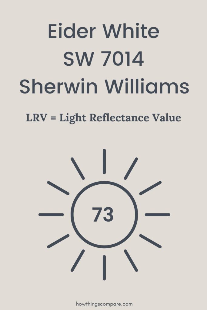
7. Eider White SW 7014
Eider White is a soft, off-white shade from Sherwin Williams. It has a subtle hint of gray that adds depth without leaning too cool or warm.
RGB: 225, 221, 214
Hex Code: #E1DDD6

Key Features
- LRV: 73
- Undertones: Gray with a hint of purple
Best Uses
- Living Rooms: Adds brightness while providing a warm, cozy feel.
- Bedrooms: Creates a calm and serene atmosphere for relaxation.
- Kitchens: Works well with both modern and classic styles.
Pairing Suggestions
- Trim Colors: Use crisp white trims to contrast and highlight Eider White.
- Accent Colors: Try pairing with charcoal gray or soft blues for balance.
- Furniture: Natural wood or white furniture complements this color well.
Tips for Use
- Lighting: Test in natural and artificial light to see how it changes throughout the day.
- Sample Size: Always use a sample swatch before committing to ensure it works with your space.

Is Eider White SW 7014 a warm or cool color?
Eider White by Sherwin-Williams is a warm white paint color with soft gray and faint purple undertones that give it a cool, sophisticated edge while still sitting comfortably in the warm white family. With an LRV of 73, it sits at the deeper end of the warm white spectrum — adding more depth and character to walls than most traditional whites.
It’s a great choice for living rooms, bedrooms and open concept spaces where you want a warm white with enough substance to stand on its own rather than disappearing into the background.
What is the LRV of Eider White SW 7014?
Eider White has a Light Reflectance Value (LRV) of 73, meaning it reflects 73% of the light that hits it. This makes it a moderately bright color that adds more depth and substance to walls than most traditional whites. Its soft gray and faint purple undertones give it a sophisticated, greige-adjacent quality that makes it one of the most interesting and versatile whites in the Sherwin-Williams collection.