In this article, you will learn about Urbane Bronze and Tricorn Black paint colors including a side-by-side comparison. If you are considering either of these colors, the following information will help you make the right decision.

Need to know how much paint for your project?
Calculate gallons needed and estimated cost — free.
Urbane Bronze vs Tricorn Black: Paint Colors Compared
Using deep paint colors in your decor is a wonderful way to create a soothing, restful space. Both Urbane Bronze and Tricorn Black offer a lush background for a simple decor and may be a terrific choice for bedrooms and relaxing family rooms.
It is important that you not crowd these colors. If your decorating style includes a pottery collection that is rich in color, use a light background for your display and use one of these shades on another wall.


Visit OUR SHOP for stunning paint color palettes!
Click the image or link here.
Urbane Bronze SW 7048
Urbane Bronze by Sherwin Williams is a rich combination of brown and gray that may actually read green in the right light. By the numbers, this color is on the warm side of the spectrum.
Pair this shade with other warm blends, from ivory to terra cotta, for best effect.
This color will be easy to tip in different directions. If you use this paint color with natural ivory tones, such as warm un-dyed canvas tab curtains, you may find that this paint reads a deep olive green.
Yellow light will also increase the tendency of green to stand out.
Use wood tones with a hint of warmth, such as pale oak or a medium-stained maple, to increase the brown inherent in this color. Don’t be afraid to use strong metal tones with this color.
Bright brass will boost the brown, as will copper.
If possible, avoid applying cool light colors on your Urbane Brown walls. Shining a blue light on this paint color will turn it muddy. To bring out the gray tones in this paint, pair it with medium-toned whites. Avoid bright shades of white as these contain blue.

You can also boost the gray in this color by using primary colors as accents. For example, a royal blue stripe in a throw or cushion will dull the brown and bring out the gray.
A cherry red vase or a bright yellow sunflower will also bring out the rich gray that is possible.
To get the very best out of your Urbane Bronze, look for ways to incorporate rich reds into your decor. Colors such as wine and burgundy will bring out both the brown and the gray.
If you can use red tones with a lot of texture, such as velvet or suede, the tone of your walls will be even more interesting.
Dark paint colors can be tough to apply evenly. If you need to do any patching before you apply your Urbane Bronze, take the time to sand and prime before you apply this paint color.
Plan for 2 coats and mix your paint in large containers before you put it on the walls. Variations in your color mix can lead to unfortunate challenges if you plan to paint gallon-by-gallon.
There are many decorators who enjoy putting wall colors on the ceiling as well. There’s no reason not to put a dark color on your ceiling, but you will want to make sure that you have multiple light sources working from a variety of angles in the space to avoid the “cave” feeling.
If you want to use Urbane Bronze on all the walls in a space, consider using reflective objects to increase light bounce. A mirrored tray on a side table will throw more light than a plain table, even if it’s polished to a high gloss.
A large wall mirror, a metal sculpture or a clock face with a brass rim will add visual interest without overloading the space with color.
RGB: 84, 80, 74
Hex Code: #54504A

Paint Color Samples
Would you like to sample these paint colors? I recommend using a peel and stick paint sample from SAMPLIZE. Peel and stick paint samples are very affordable and easy to use. They are also clean and environmentally friendly!
Advantages of using peel and stick paint samples:
- EASY TO USE: Simply move your SAMPLIZE paint sample around the room to test under a variety of lighting conditions.
- AFFORDABLE: Budget-friendly solution and no more buying inaccurate swatches, rollers, wasted paint.
- SUPER FAST DELIVERY: Depending on your location, 1 day delivery is possible.
- ORDER FROM HOME: Save a trip to the store looking for samples.
- NO MESS: SAMPLIZE uses real paint samples with zero-mess
- NO WASTE: No leftover cans or wasted paint.
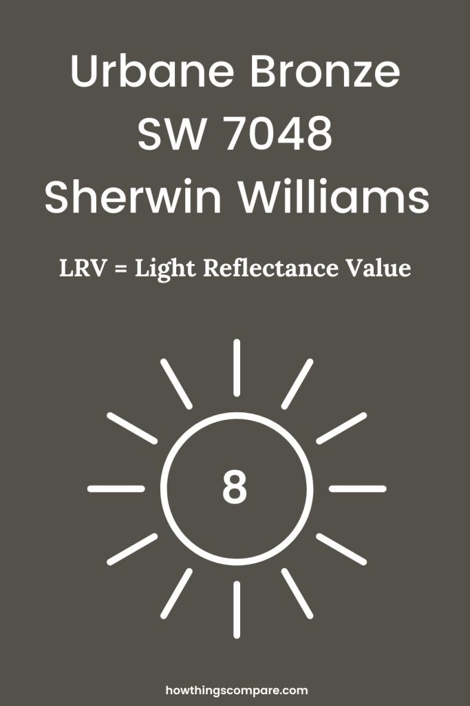
Urbane Bronze SW 7048 by Sherwin-Williams LRV
Urbane Bronze has an LRV (Light Reflectance Value) of 8. This means that the color reflects 8% of the light that hits it making it a very dark color.
Peel-and-Stick Paint Sample – Urbane Bronze (7048) – Sherwin-Williams
Tricorn Black SW 6258
Tricorn Black by Sherwin Williams is a beautifully balanced shade of black that can serve several purposes in your space. If you’re looking for a strong color for an accent wall or want a rich color to use in your sleeping space, this is an idea choice.
Tricorn Black will easily fade against other colors, though it’s not a great background for a wide variety of color.
If you have a mineral collection loaded with color and you need a backing color for your display shelves, consider a balanced gray to avoid creating a jarring visual contrast.
Use Tricorn Black as a foil for a single large piece or two, rather than many small items.
Where black and dark gray colors can become especially tricky is when you try to put them side by side.
A charcoal gray suede sofa will likely read more blue than gray against this color, because charcoal gray is cool and Tricorn Black is not.
If you place your black leather armchairs in a room painted in this shade, you may find that the wall color appears more gray than black because black leather often has a warm undertone.
Because extremely dark colors take a lot of prep and several coats for best results, it’s very important that you’re sure before you start applying this color.

Invest in a sample container of paint and a couple of large canvases. Paint the canvases and lean them against your favorite furniture pieces before you start putting color on the walls.
Oddly enough, you may find that this color turns a bit chalky if you try to pair it with light shades. If you’re looking for new furniture to use in your newly painted bedroom or family room, consider picking out fabrics with a lot of visual texture and use an eggshell paint instead of a flat for a bit more light bounce.
White often pairs beautifully with black. Use a simple balanced white. Avoid anything with “bright” in the name and do your best not to pair this color with ivory. Cabinets and trim painted ivory may read yellow against Tricorn Black.
Light this color simply. If you like warm light, use warm or yellow light tones consistently in the space. Because this color is so well balanced, it will be hard to push.
However, if you have blue LED bulbs in your ceiling fixtures and yellow bulbs in your table lamps, this wall color may appear muddy.
Tricorn Black should work well with most any wood tone you pair it with. Do be as consistent as possible. If your floors are cherry and your bookcases are yellow oak and your piano is maple, you may create a jarring visual field.
If you love a lot of variety in your wood tones, or you enjoy decorating with antiques, put this color on one wall and try to group one wood tone in front of it.
Take care when applying this color to heavily textured walls. Unlike many colors that produce beautiful shadows, Tricorn Black actually is effectively a shadow color.
Do your best to show off this color without cluttering it up. Light it from below as well as from your ceilings.
Applying very dark paint can be tricky; it can be hard to see drips as you work. It’s also very easy to miss a spot as you roll out your paint. If possible, always paint in full sun.
If you can’t, invest in a couple of work lights and light the wall from below. Putting one light at each corner of the wall you’re working on can actually save you a lot of mess and trouble.
Samples are critical any time you’re using a very dark color. It can also be a good idea to start with an accent wall. If you get one gallon and paint one wall, you can live with it for a time before you buy more paint, mix it together, and paint the rest of your space.
Covering strong accent colors takes a lot of work. Make sure you’re ready for the commitment it will take, both to apply Tricorn Black and to cover it when you’re ready for something else.
RGB: 44, 43, 44
Hex Code: #2C2B2C

Planning a paint project?
Having the right tools for the job is essential for getting smooth, professional results you’ll be proud of while saving time and avoiding costly mistakes.
Check out my list of pro painters tools here.
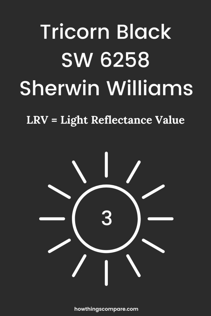
Tricorn Black SW 6258 by Sherwin-Williams LRV
Urbane Bronze has an LRV (Light Reflectance Value) of 3. This means that the color reflects 3% of the light that hits it making it a very dark color. Even darker than Urbane Bronze.
Peel-and-Stick Paint Sample – Tricorn Black (6258) – Sherwin-Williams
Do Light Bulbs Affect How Paint Colors Look?
Absolutely. Just like natural light, artificial lighting changes how paint appears. The color temperature of your light bulbs—measured in Kelvins (K)—plays a big role.
- Lower K (2700K–3000K) = warm, yellow light (soft white)
- Higher K (4000K–5000K+) = cool, white to bluish light (bright/daylight)
Choosing the right bulb can make a big difference in how your paint color looks on the wall.
I recommend using these types of light bulbs.