Maroon, burgundy, and crimson are rich, bold colors that add depth and sophistication to any space. In this article, I’ll dive into the subtle differences between these popular shades of red, exploring their unique undertones and the emotions they bring to a room.
Whether you’re aiming to create a cozy feel in the living room, add drama to your dining area, or make a bold statement with an accent wall, I’ll walk you through the best ways to use each color.
Plus, I’ll share complementary color pairings, similar shades, and my top picks for maroon, burgundy, and crimson paint colors.
Let’s find out if these colors are the right choice for your project!

Need to know how much paint for your project?
Calculate gallons needed and estimated cost — free.
Maroon vs Burgundy vs Crimson Paint Colors
Maroon, burgundy, and crimson are all based on the color red. Red was the color of royalty and was commonly used by those higher up in the religious life in European history.
Historically, red as the color of blood is also the color of martyrdom. In other cultures, red was known as a lucky color; Chinese brides traditionally wore red gowns.
The three colors considered below start with red and blend in nearly equal parts blue and green to both deepen the color and mute the sharp edge or sense of agitation that red can create.
Red is an eye and attention-catching color; there’s a reason that stop signs are red and not something easier on the eye.
If you want to decorate your home with red, a move toward one of the more muted shades is probably a good idea.
Maroon
When shopping for colors named “maroon” it’s a good idea carefully review the RGB code. For a true maroon, you want the Green and Blue codes to be within 20 points of each other.

If that last number is too high, you will start to drift toward shades of purple. Purple is a lovely color, but it’s not burgundy.
If you are mixing on a palette, such as with acrylic paints, start with a decent dollop of red and mix in a bit of blue.
This will trend toward purple, so make sure you add some green to add a bit of smokiness. The extra bump of green acrylic blended in will mute the intensity of any red tone.
If you try to tone it down with black, remember that the black may be either yellow or blue-based. A blue-based black mixed into a burgundy blend that you want to tone down will make it more purple.
To properly add a touch of smokiness to maroon, start with green before you add any darker tints.
To decorate with maroon, be careful using anything based on blue. Remember, when there is more blue than green in any mix, using blue fabrics, pillows, drapes or furniture elsewhere in the room will make the blue in the maroon pop.
If you draw out the blue, you may trend toward purple again.
Maroon color codes
Hex Code: #862633
RGB Code: R 134, G 38, B 51
Paint Color Samples
Would you like to sample these paint colors? I recommend using a peel and stick paint sample from SAMPLIZE. Peel and stick paint samples are very affordable and easy to use. They are also clean and environmentally friendly!
Advantages of using peel and stick paint samples:
- EASY TO USE: Simply move your SAMPLIZE paint sample around the room to test under a variety of lighting conditions.
- AFFORDABLE: Budget-friendly solution and no more buying inaccurate swatches, rollers, wasted paint.
- SUPER FAST DELIVERY: Depending on your location, 1 day delivery is possible.
- ORDER FROM HOME: Save a trip to the store looking for samples.
- NO MESS: SAMPLIZE uses real paint samples with zero-mess
- NO WASTE: No leftover cans or wasted paint.

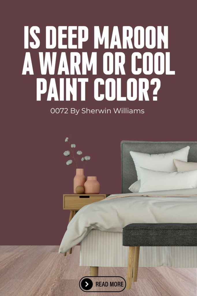
Deep Maroon (SW 0072) by Sherwin-Williams
My favorite shade of Maroon paint color is Deep Maroon (SW 0072) by Sherwin-Williams. Deep Maroon is a rich, dark red with deep brown undertones. This color exudes warmth, sophistication, and a sense of luxury. It can add a dramatic touch to any space, making it a striking choice for various design applications.

Is Deep Maroon a warm or cool color?
Deep Maroon (SW 0072) by Sherwin-Williams is a rich, dramatic paint color with warm, velvety undertones that create a bold and sophisticated feel. Rooted in deep red tones, Deep Maroon sits firmly in the warm color family, offering a moody, luxurious quality that makes a powerful statement in any space.
It’s a great choice for those looking to add depth and character to their home while maintaining a warm, inviting atmosphere. Deep Maroon’s richness makes it perfect for creating a striking focal point, whether used as an accent wall or throughout an entire room, in both modern and traditional homes.

Best uses for Deep Maroon:
- Accent Walls: Perfect for creating a bold statement in living rooms, dining rooms, or bedrooms.
- Dining Rooms: Adds an elegant and inviting atmosphere, ideal for formal dining areas.
- Libraries and Offices: Contributes to a warm, sophisticated environment, suitable for home offices or libraries.
- Front Doors and Trim: Provides a rich, welcoming appearance for exterior doors and trim.
- Furniture: Great for refinishing furniture pieces to add a luxurious touch.
Colors that Complement Deep Maroon:
- Neutrals:
- Pure White (SW 7005): A crisp white that provides a sharp contrast, making Deep Maroon stand out.
- Accessible Beige (SW 7036): A warm beige that complements the richness of Deep Maroon.
- Alabaster (SW 7008): A soft, warm white that balances the depth of Deep Maroon.
- Golds and Yellows:
- Butterscotch (SW 6370): A warm yellow that adds a cheerful contrast.
- Goldenrod (SW 6677): A muted gold that enhances the luxurious feel of Deep Maroon.
- Greens:
- Sage Green Light (SW 2851): A muted green that offers a harmonious and calming complement.
- Garden Sage (SW 7736): A deeper green that pairs elegantly with Deep Maroon.
- Blues:
- Naval (SW 6244): A deep navy blue that adds a sophisticated and classic contrast.
- Misty (SW 6232): A light blue-gray that provides a softer contrast.
- Earth Tones:
- Mega Greige (SW 7031): A warm greige that complements the earthy undertones of Deep Maroon.
- Urbane Bronze (SW 7048): A dark bronze that adds depth and a modern touch.
Deep Maroon (SW 0072) is a versatile and luxurious color that can add depth, warmth, and sophistication to any space. Pair it with complementary colors to create a balanced and cohesive design.

Deep Maroon Hex code
The attributed hex codes for each color is a hexadecimal method of determining the combination of red, blue and green that goes into creating a color.
The important thing about a hex code is that it is shorter; being able to lose the three digits of each of the RGB code allows coders and designers to more efficiently note which colors they want to be included in their web pages and layouts.
Deep Maroon has a hex code of #623F45.
Deep Maroon LRV
LRV, or Light Reflectance Value, is a measurement that indicates the amount of light a paint color reflects. It is expressed as a percentage, ranging from 0% (absolute black, which absorbs all light) to 100% (absolute white, which reflects all light).
Deep Maroon has an LRV of 7.

Deep Maroon RGB
RGB values represent the intensity of Red, Green, and Blue light in a specific color, ranging on a scale from 0 to 255.
Deep Maroon has an RGB of R:98 G:63 B:69.
Deep Maroon similar colors
If you are looking for similar paint colors for Deep Maroon, here are a few popular options:
- Carriage Door SW 7594 – Sherwin Williams
- Red Theatre SW 7584 – Sherwin Williams
- Fired Brick SW 6335 – Sherwin Williams
Get a peel and stick paint sample of Deep Maroon SW 0072 here.
Burgundy
Like maroon, burgundy is a combination of red as a base and blue to add richness with green to tone it down. However, the ratio of red to blue is nearly 4 to 1 when blending burgundy.

Additionally, blue and green are equal when mixing a true burgundy.
Burgundy was once considered a color of luxury. This is a very stable but extremely intense color.
While it may be overpowering in a family room or a bedroom, burgundy is a great choice in an office. If your access to natural light is not great in your office space, consider adding a burgundy accent wall to see how it works in the light available in your home.
To decorate with burgundy, be brave! One of the challenges of working with burgundy is choosing other colors to use in the space.
A wonderful addition to a space decorated in burgundy is anything in shades of olive or sage green. These muted greens will look terrific against a lush burgundy wall painted for a velvet finish.
Make sure to add mirrors to increase light around the space and don’t be afraid of light-toned woods. A pale maple table will also complement burgundy in your decor.
Burgundy color codes:
Hex Code: #773141
RGB Code: R 63, G 16, B 16
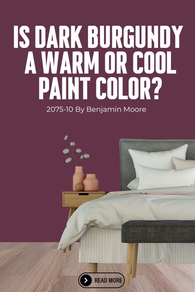
Dark Burgundy (2075-10) by Benjamin Moore
My favorite shade of burgundy is Dark Burgundy (2075-10) by Benjamin Moore. This is a rich, deep red with strong purple undertones. It exudes warmth, elegance, and sophistication, making it a striking choice for various design applications. This color can add a dramatic and luxurious touch to any space.

Is Dark Burgundy a warm or cool color?
Dark Burgundy (2075-10) by Benjamin Moore is a deep, captivating paint color with rich, warm undertones that create a sense of elegance and drama. Rooted in dark red and wine tones, Dark Burgundy sits firmly in the warm color family, offering a luxurious, timeless quality that instantly elevates any space.
It’s a great choice for those looking to make a bold statement while maintaining a warm, sophisticated atmosphere. Dark Burgundy’s depth and richness make it perfect for creating a stunning accent wall or a cozy, intimate feel in any room, complementing both modern and traditional home styles beautifully.

Best Uses:
- Accent Walls: Perfect for creating a bold statement in living rooms, dining rooms, or bedrooms.
- Dining Rooms: Adds a sense of elegance and intimacy, ideal for formal dining spaces.
- Home Offices and Libraries: Contributes to a warm, sophisticated environment suitable for work and study areas.
- Front Doors and Trim: Provides a rich, welcoming appearance for exterior doors and trim.
- Furniture: Great for refinishing furniture pieces to add a touch of luxury and depth.
Colors that Complement Dark Burgundy:
- Neutrals:
- Chantilly Lace (OC-65): A clean, crisp white that provides a sharp contrast, making Dark Burgundy stand out.
- Revere Pewter (HC-172): A warm gray that balances the richness of Dark Burgundy.
- Simply White (OC-117): A soft, warm white that complements the depth of Dark Burgundy.
- Golds and Yellows:
- Hawthorne Yellow (HC-4): A warm yellow that adds a cheerful contrast.
- Weston Flax (HC-5): A soft, muted yellow that enhances the luxurious feel of Dark Burgundy.
- Greens:
- Saybrook Sage (HC-114): A muted green that offers a harmonious and calming complement.
- Hunter Green (2041-10): A deep green that pairs elegantly with Dark Burgundy.
- Blues:
- Hale Navy (HC-154): A deep navy blue that adds a sophisticated and classic contrast.
- Van Deusen Blue (HC-156): A strong blue-gray that provides a balanced contrast.
- Earth Tones:
- Kingsport Gray (HC-86): A warm greige that complements the earthy undertones of Dark Burgundy.
- Kendall Charcoal (HC-166): A dark charcoal that adds depth and a modern touch.
Dark Burgundy (2075-10) by Benjamin Moore is a versatile and luxurious color that can add depth, warmth, and sophistication to any space. Pair it with complementary colors to create a balanced and cohesive design.

Dark Burgundy Hex code
Dark Burgundy has a hex code of #633447.
Dark Burgundy LRV
Dark Burgundy has an LRV of 5.52.

Dark Burgundy RGB
Dark Burgundy has an RGB of 102, 51, 71
Dark Burgundy similar colors
If you are looking for similar paint colors for Dark Burgundy, here are a few popular options:
- Grape Juice 2074-10 – Benjamin Moore
- Bordeaux Red 1365 – Benjamin Moore
- Raisin Torte 2083-10 – Benjamin Moore
Get a peel and stick paint sample of Dark Burgundy (2075-10) here.
Crimson
Crimson is the strongest, richest red in this listing. This is the color of power and is an eye-catching shade. This can be a terrific accent color and could offer a hearty contrast to another deep or strong color.
For example, you may have a living room or family room with a richly textured deep green furniture set.
Crimson, in small doses, could be an excellent color for your pillows or throws.
When considering a pairing of red and green, you may want to avoid it because of the holiday themes associated with it.
If red and green sound too much like Christmas for your taste, consider pairing your favorite crimson items with a deep steel grey.
If you are interested in decorating with crimson, take it slow and build up your stock of decorative items as you get used to the intensity of the color.
It’s important to remember that crimson is not just red. A pure RBG red has no blue or green in it and is nearly fluorescent in tone.
The RGB code listed below for crimson demonstrates that crimson is actually quite complex. The additional tones of blue and green are nearly equal, which will both enrich the red and tone it down a bit when compared to pure red.
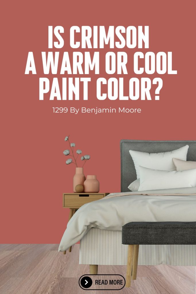
Crimson (1299) by Benjamin Moore
Crimson (1299) by Benjamin Moore is a vibrant, rich red with strong, warm undertones. It evokes feelings of passion, energy, and elegance, making it an eye-catching choice for various design applications. This bold color can create a dramatic and inviting atmosphere in any space.

Is Crimson a warm or cool color?
Crimson (1299) by Benjamin Moore is a bold, vibrant paint color with warm, fiery undertones that create an energetic and passionate atmosphere. Rooted in true red tones, Crimson sits confidently in the warm color family, offering a striking, eye-catching quality that brings life and personality to any space.
It’s a great choice for those looking to make a fearless statement while adding a sense of warmth and intensity to their home. Crimson’s vivid, rich tone makes it perfect for creating a dramatic accent wall or a lively, dynamic feel in any room, pairing beautifully with neutral whites, deep navies, and warm metallic accents in both modern and traditional home styles.

Best Uses:
- Accent Walls: Perfect for adding a dramatic and bold statement in living rooms, dining rooms, or bedrooms.
- Dining Rooms: Creates a warm and inviting ambiance, ideal for formal dining areas.
- Entryways and Hallways: Provides a welcoming and impactful entrance to your home.
- Home Offices and Libraries: Adds a sense of sophistication and energy, suitable for creative and work spaces.
- Furniture: Great for accentuating furniture pieces, such as cabinets, bookshelves, or feature furniture, adding a touch of luxury.
Colors that Complement Crimson:
- Neutrals:
- White Dove (OC-17): A soft, warm white that provides a balanced contrast to Crimson.
- Revere Pewter (HC-172): A warm gray that complements the richness of Crimson.
- Edgecomb Gray (HC-173): A light, neutral gray that offers a subtle and elegant pairing.
- Golds and Yellows:
- Concord Ivory (HC-12): A warm yellow that adds a cheerful and vibrant contrast.
- Hawthorne Yellow (HC-4): A soft, muted yellow that enhances the warmth of Crimson.
- Greens:
- Hollingsworth Green (HC-141): A soft, muted green that offers a calming and harmonious complement.
- Saybrook Sage (HC-114): A deeper green that pairs elegantly with Crimson.
- Blues:
- Hale Navy (HC-154): A deep navy blue that creates a sophisticated and striking contrast.
- Boothbay Gray (HC-165): A blue-gray that provides a balanced and serene contrast.
- Earth Tones:
- Kingsport Gray (HC-86): A warm greige that complements the boldness of Crimson.
- Kendall Charcoal (HC-166): A dark charcoal that adds depth and a modern touch.
Crimson (1299) by Benjamin Moore is a versatile and vibrant color that can add energy, warmth, and sophistication to any space. Pair it with complementary colors to create a balanced and cohesive design.
Crimson Hex code
The hex code for Crimson is #B26057.
Crimson LRV
The LRV for Crimson is 19.58.

Crimson RGB
The RGB for Crimson is R 157, G 34, B 53.
Get a peel and stick paint sample of Crimson (1299) here.
More Info On Corresponding Colors
Grey, green and white will all go well with the colors listed above. For example, a burgundy wall with white trim will look clean and sharp.
A grey carpet can pair beautifully with a maroon sofa or side chair. Finally, crimson can work wonderfully with a rich moss or camo green.
That being said, you really want to keep an eye on the amount of yellow blended into these corresponding colors.
Too much yellow in a tan or green will muddy up your reds. Your accent wall will look wonderful above a grey carpet that has a bit of blue in it, but if the carpet has too much tan or other warm tones blended in, you may have a wonderful-looking wall over carpet that looks dirty no matter what you do.
Test drive your wall color in small swatches and study how these colors change over the course of the day so you can be happy with your choice all day long.
