Choosing the perfect neutral green paint can be a game-changer for any room. This hue brings a sense of calm and sophistication, making it a favorite among designers and homeowners alike. Neutral green paint colors can transform your space, adding a fresh and timeless touch that complements various styles and settings.
Green shades can vary greatly, from soft sage to deeper moss tones. Each offers a unique vibe while maintaining a neutral backdrop. These greens are versatile, providing just the right amount of color without overwhelming the space.
In this article, we highlight seven of the best neutral green paint colors, perfect for anyone looking to refresh their home. Whether you want a subtle hint of color or a bolder statement, these options will inspire and guide your next painting project.

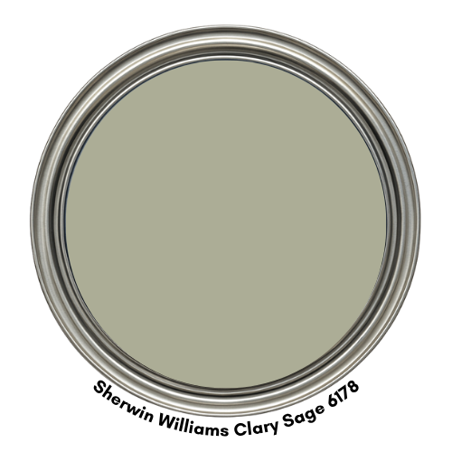
1. Clary Sage SW 6178
Clary Sage by Sherwin-Williams is a soft, muted green with subtle gray undertones that evoke a sense of tranquility and natural elegance. Inspired by the silvery-green leaves of the clary sage plant, this earthy hue brings a grounded, organic feel to any space. Its calming presence makes it ideal for creating serene environments, whether used as a main wall color or as an accent.
One of Clary Sage’s strongest attributes is its versatility. It pairs beautifully with both warm and cool tones, making it easy to coordinate with a wide range of color palettes. When combined with warm woods, creams, and terracotta, it creates a cozy, nature-inspired aesthetic. Paired with crisp whites, charcoal grays, or navy blues, Clary Sage offers a modern yet soothing contrast.
Best uses for Clary Sage:
- Bedrooms and Bathrooms
- Living Rooms and Dining Areas
- Kitchens and Cabinets
- Entryways and Hallways
- Exterior Use
Coordinating colors for Clary Sage include:
Whether you’re aiming for a farmhouse look, a modern minimalist vibe, or a cozy cottage feel, Clary Sage adapts effortlessly, making it a go-to green for many designers and homeowners alike.
- RGB: 172, 173, 150
- Hex Code: #ACAD96
- Light Reflectance Value (LRV): 41

Visit OUR SHOP for stunning paint color palettes!
Click the image or link here.
Peel And Stick Paint Color Samples
Would you like to sample these paint colors? I recommend using a peel and stick paint sample from SAMPLIZE. Peel and stick paint samples are very affordable and easy to use. They are also clean and environmentally friendly!
Advantages of using peel and stick paint samples:
- EASY TO USE: Simply move your SAMPLIZE paint sample around the room to test under a variety of lighting conditions.
- AFFORDABLE: Budget-friendly solution and no more buying inaccurate swatches, rollers, wasted paint.
- SUPER FAST DELIVERY: Depending on your location, 1 day delivery is possible.
- ORDER FROM HOME: Save a trip to the store looking for samples.
- NO MESS: SAMPLIZE uses real paint samples with zero-mess
- NO WASTE: No leftover cans or wasted paint.

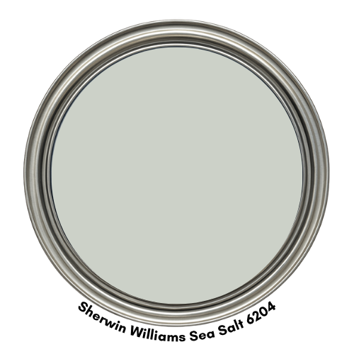
2. Sea Salt SW 6204
Sea Salt by Sherwin-Williams is one of those magical paint colors that seems to change with the light—and that’s exactly why so many people love it. It’s a soft green with just a hint of blue and gray mixed in, giving it a cool, calming vibe that works beautifully in all kinds of spaces.
Depending on the time of day and the lighting, it might look more green in bright sunlight or take on a cooler, bluish-gray tone in dimmer rooms. It always feels fresh and peaceful.
This color is a go-to if you’re looking to create a light and airy atmosphere. It has that spa-like quality that instantly makes a room feel more relaxing and inviting—without being too bold or overwhelming. It’s subtle, but not boring. Soft, but still full of character.
Best uses for Sea Salt:
- Bedrooms and Bathrooms
- Living Rooms and Dining Areas
- Kitchens
- Entryways and Hallways
Sea Salt looks especially beautiful with white trim, natural wood, and woven textures. If you want to add a bit of contrast, try pairing it with deeper tones like navy, charcoal, or even a soft blush.
Coordinating colors for Sea Salt include:
- Comfort Gray SW 6205
- Accessible Beige SW 7036
- Charcoal Blue SW 2739
- RGB: 204, 209, 200
- Hex Code: #CCD1C8
- Light Reflectance Value (LRV): 63
Planning a paint project?
Having the right tools for the job is essential for getting smooth, professional results you’ll be proud of while saving time and avoiding costly mistakes.
Check out my list of pro painters tools here.
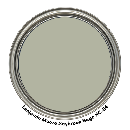
3. Saybrook Sage HC-114
Saybrook Sage by Benjamin Moore is a timeless, muted green that effortlessly brings the outdoors in. With soft gray and earthy undertones, this shade has a grounded, natural quality that feels both calming and refined. It’s the kind of green that doesn’t shout for attention but instead quietly sets the tone for a room—peaceful, balanced, and inviting.
What makes Saybrook Sage so special is its classic versatility. It works beautifully in both traditional homes with rich wood accents and crown molding, as well as more contemporary spaces that favor clean lines and a minimalist feel. The subtle sage tone adds a layer of warmth and depth without being too bold or trendy, making it a perfect long-term choice for your home.
This color pairs effortlessly with soft neutrals like beige, ivory, and cream, but it also plays well with deep browns, crisp whites, and even muted golds or bronzes. It’s a chameleon in the best way—bringing softness when needed, but always with an elegant, natural undertone.
Best uses for Saybrook Sage:
- Living Rooms and Dining Areas
- Entryways and Hallways
- Home office
- Bedrooms
Coordinating colors for Saybrook Sage include:
- RGB: 178, 180, 161
- Hex Code: #B2B4A1
- Light Reflectance Value (LRV): 45
4. Evergreen Fog SW 9130
Evergreen Fog by Sherwin-Williams is a beautifully balanced green with soft gray undertones, offering a calm, grounded feeling that’s both sophisticated and approachable. It’s the kind of color that feels modern yet timeless—fresh but never overwhelming.
There’s a quiet confidence to Evergreen Fog that makes it incredibly easy to live with, whether you’re refreshing a single room or giving your entire home a new look.
This misty green has a natural, organic vibe that instantly brings a sense of peace to a space. It’s subtle enough to be used as a neutral, yet distinct enough to stand out. What really makes Evergreen Fog shine is its versatility—it pairs effortlessly with wood tones, warm creams, deep charcoals, and even soft golds or brass accents.
Whether your style leans farmhouse, contemporary, Scandinavian, or vintage-inspired, this shade creates a cohesive and welcoming backdrop.
Best uses for Evergreen Fog:
- Living Rooms
- Bathrooms
- Home office
- Bedrooms
- Kitchens
Coordinating colors for Evergreen Fog include:
- RGB: 150, 153, 140
- Hex Code: #96998C
- Light Reflectance Value (LRV): 31

5. October Mist 1495
October Mist by Benjamin Moore is a gentle, silvery green with a whisper of gray that brings a calm, collected feel to any space. It’s the kind of color that instantly makes a room feel soft, soothing, and a little more connected to nature—like a quiet morning walk through a misty garden.
This shade is incredibly versatile thanks to its muted, earthy undertone. It pairs effortlessly with creamy whites, soft taupes, warm woods, and even deeper greens or dusty pinks for a more layered, organic look. October Mist doesn’t shout for attention—it gently sets the tone, making it a perfect backdrop for both minimal and richly styled spaces.
October Mist was chosen as Benjamin Moore’s Color of the Year in 2022!
Best uses for October Mist:
- Living Rooms
- Bathrooms
- Home office
- Bedrooms
- Nurseries
- Guest rooms
- Cabinetry
Coordinating colors for October Mist include:
- RGB: 182, 184, 165
- Hex Code: B6B8A5
- Light Reflectance Value (LRV): 46.54

6. Oyster Bay SW6206
Oyster Bay by Sherwin-Williams is a sophisticated, medium-toned green that carries just a whisper of blue and gray—like seafoam mist caught in a morning breeze. This beautifully balanced hue brings a fresh, tranquil energy to any room, making it a popular pick for homeowners who want color without boldness.
There’s something effortlessly soothing about Oyster Bay. It’s soft enough to feel neutral, yet distinct enough to stand out. Its cool undertones give it a clean, airy vibe, especially in spaces that get plenty of natural light.
When paired with white cabinetry and stainless steel appliances, this color feels especially crisp and modern—perfect for kitchens that feel fresh and inviting without being sterile.
Best uses for Oyster Bay:
- Kitchens
- Bathrooms
- Bedrooms
- Living areas
- Hallways
- Entryways
Coordinating colors for Oyster Bay include:
- RGB: 171, 176, 165
- Hex Code: #ABB0A5
- Light Reflectance Value (LRV): 42.39

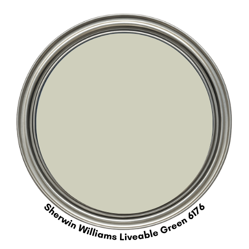
7. Liveable Green SW6176
Liveable Green by Sherwin-Williams is a warm, earthy green that lives up to its name—it’s comfortable, easygoing, and incredibly versatile. This soft sage hue carries just enough warmth to make a space feel cozy, yet it’s muted enough to remain neutral and timeless.
There’s a gentle hint of gray in its base, giving it a subtle sophistication that works beautifully in a variety of home styles—from traditional to modern farmhouse.
What makes Liveable Green truly stand out is how well it plays with other elements in a space. It pairs effortlessly with both light and dark wood tones, helping to tie everything together into a cohesive, harmonious look.
Whether you have oak floors or espresso cabinetry, this color adapts like a chameleon—always enhancing, never clashing.
Best uses for Liveable Green:
- Bedrooms
- Living areas
- Dining rooms
- Entryways
Coordinating colors for Liveable Green include:
- RGB: 207, 207, 188
- Hex Code: #CFCFBC
- Light Reflectance Value (LRV): 61.28